ORC WEek 6: Mood board perfection vs. real life
I’m not going to lie. This bedroom is the hardest room I’ve ever had to design. The challenge is real: it’s a northern facing room, extremely tall and has odd angles. All of these factors mean several UNCHANGEABLE things:
1) The room must painted a darker shade
2) Symmetry is my friend
3) I must use larger prints/images to fill the space vs. smaller objects. Sure I can have smaller objects, but only for smaller moments and vignettes.
When designing a room with all of these factors, no amount of moodboarding or sketching will really compare to the real life feel. And in my case this couldn’t be more true. This means that on-the-fly adjustments are key at this point of the game.
Here are the real-life dilemmas I am facing now that everything is said and done:
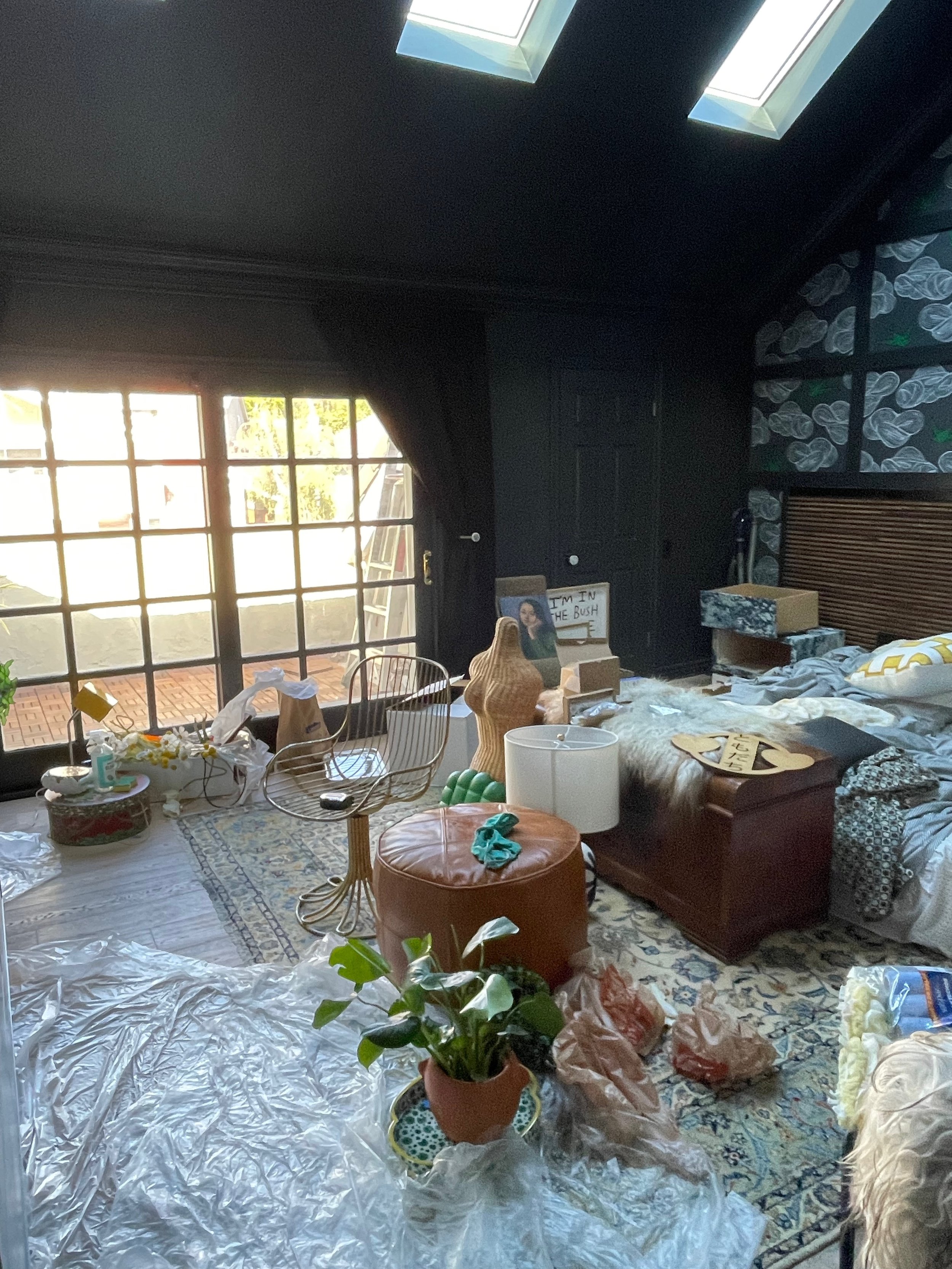
black makes everything even more vivid
Unless you’ve painted an entire room black, one is not prepared for the color explosion that happens once you start adding artwork and furniture to the space. Black seems to have the ability to make certain colors look cheap and tawdry and it is necessary to mellow things out and switch things.
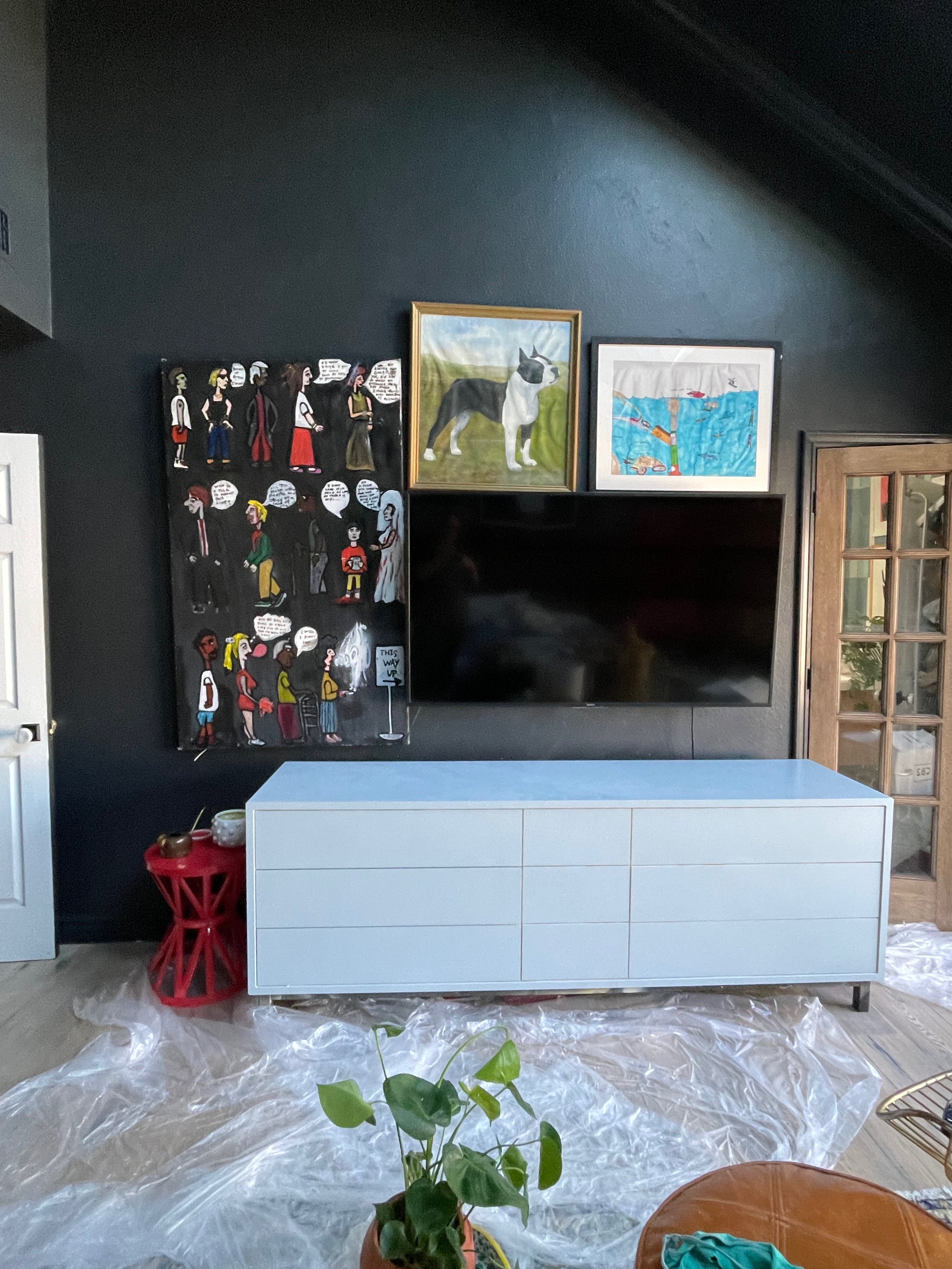
For example, my yellow and white dresser quickly became and eyesore. I love white and yellow. But now I realize that gold yellow really hurts my brain when it’s paired with black. Something about it just reminds me of the early 2000s, frosted tips, pin cushion hair and silver lip gloss. Those things are not bad but it just somehow looked cheap in this room. Ever notice that most maximalist homes with a lot of art are mostly WHITE? This is because everything looks good against a white wall. If you really want to challenge yourself, paint everything black and then see what looks good. Hint: not a lot.
I think I could do a pale-hound yellow or a Backdrop Disco Nap but as luck would have it, I have a lot of Backdrop Early Stuff on hand. What are the odds? Plus, it ties very heavily into a huge art piece I chose to hang over the bed (reveal on Week 8 — it’s too special to reveal early).
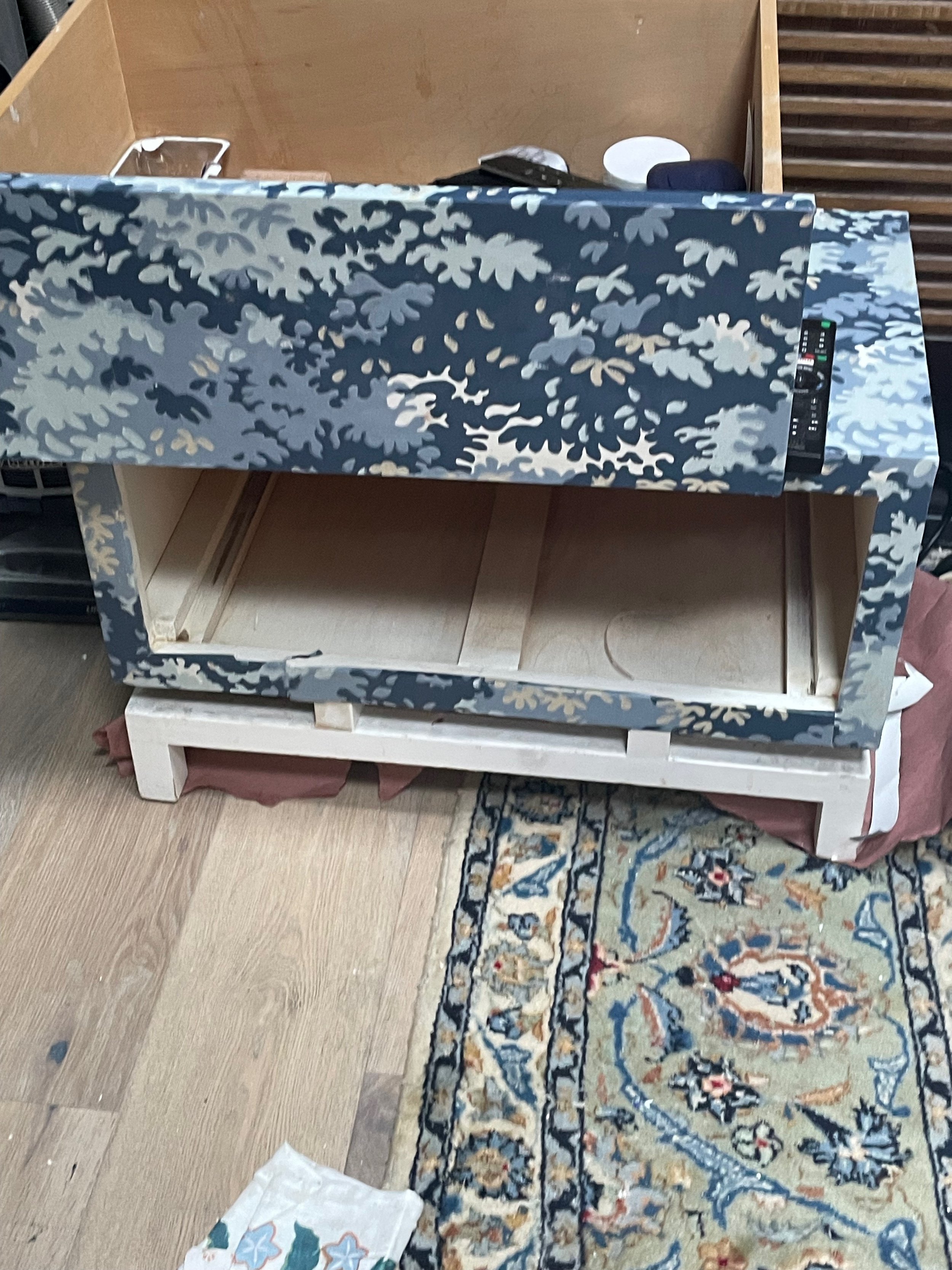
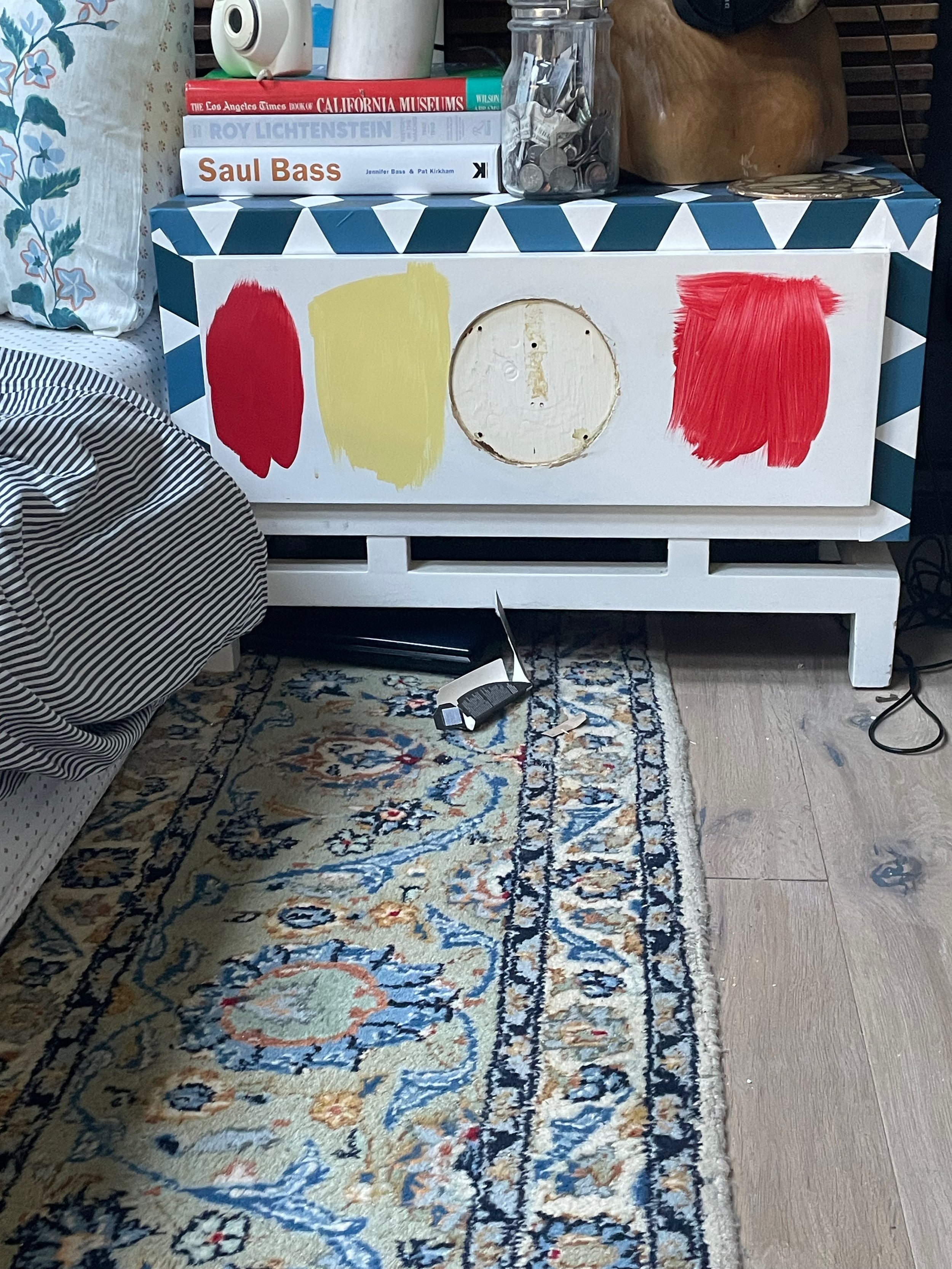
That is NOT A NEW DRESSER, folks. I sanded every inch of that bad boy until it was smooth as a baby’s bottom, primed it, sanded it, primed it, sanded it, primed it, sanded it. That is the second coat of paint and I will most likely do two more coats and finish with a furniture wax. I absolutely love the gentle blue grey in contrast with the black. It will look so beautiful with my styling.
What I also realized when I painted the room black is that I didn’t have enough paintings that blended well. Too many of them have a ton of white and I just was not enjoying the sharp contrast between. It just wasn’t pleasant.
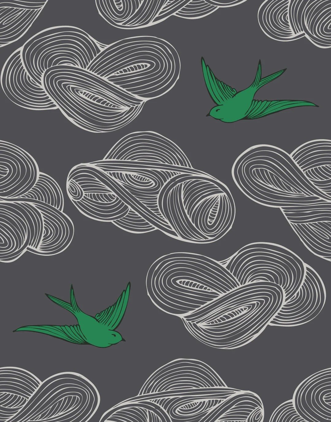
So with that in mind and the deadline coming up, I did the unthinkable. I went to Artfully walls and MOMA design store to purchase some quick ship prints. Please do not just me too harshly. I would normally go the thrifting route, but there was no guarantee I would find what I needed and this deadline is May 26th. The good news is that I have plenty of other original art that is special and unique to me, so I’m not too worried. Here are the two pieces of art that I selected:
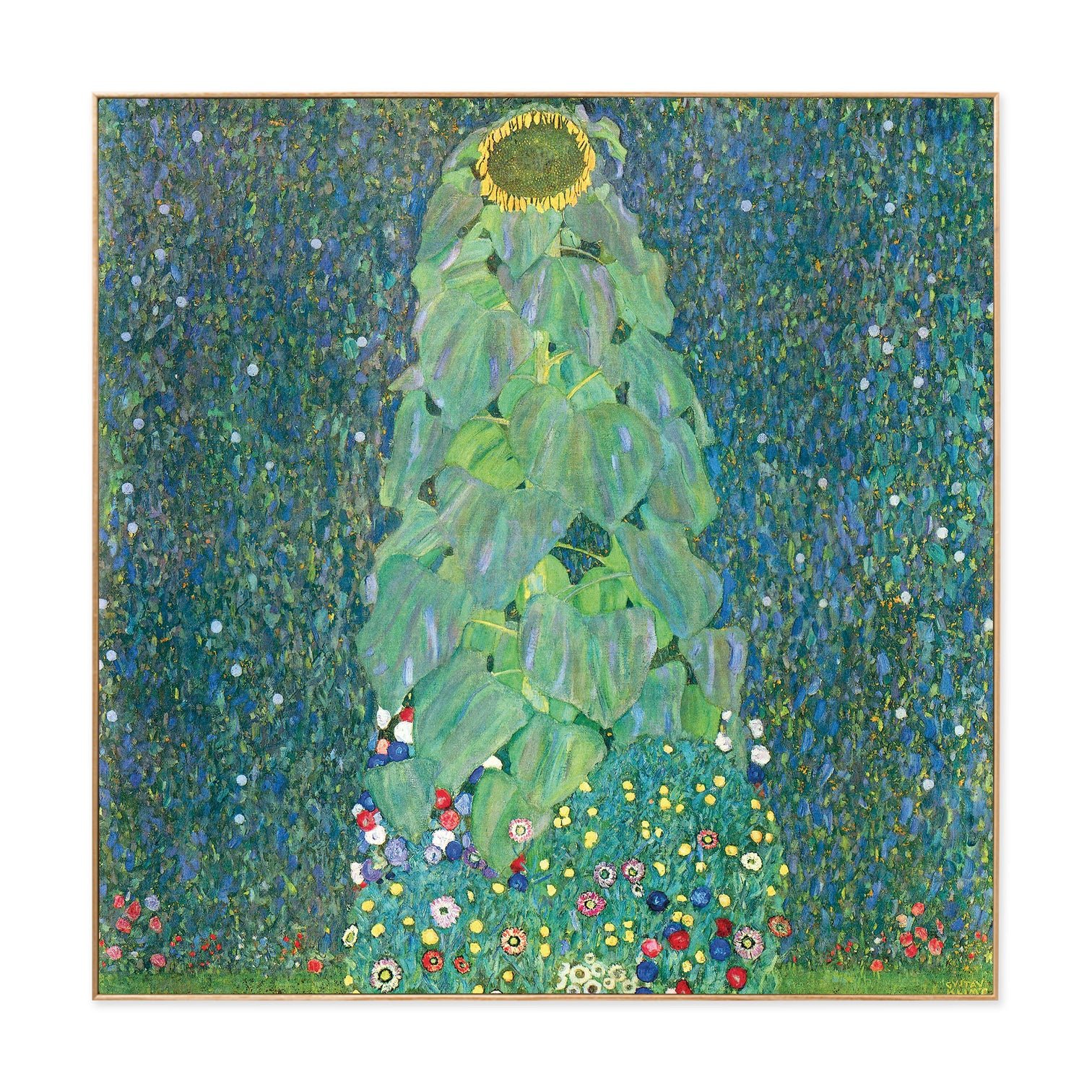
They are framed, relatively inexpensive and they are exactly what a gallery wall needs.
giant room means giant patterns
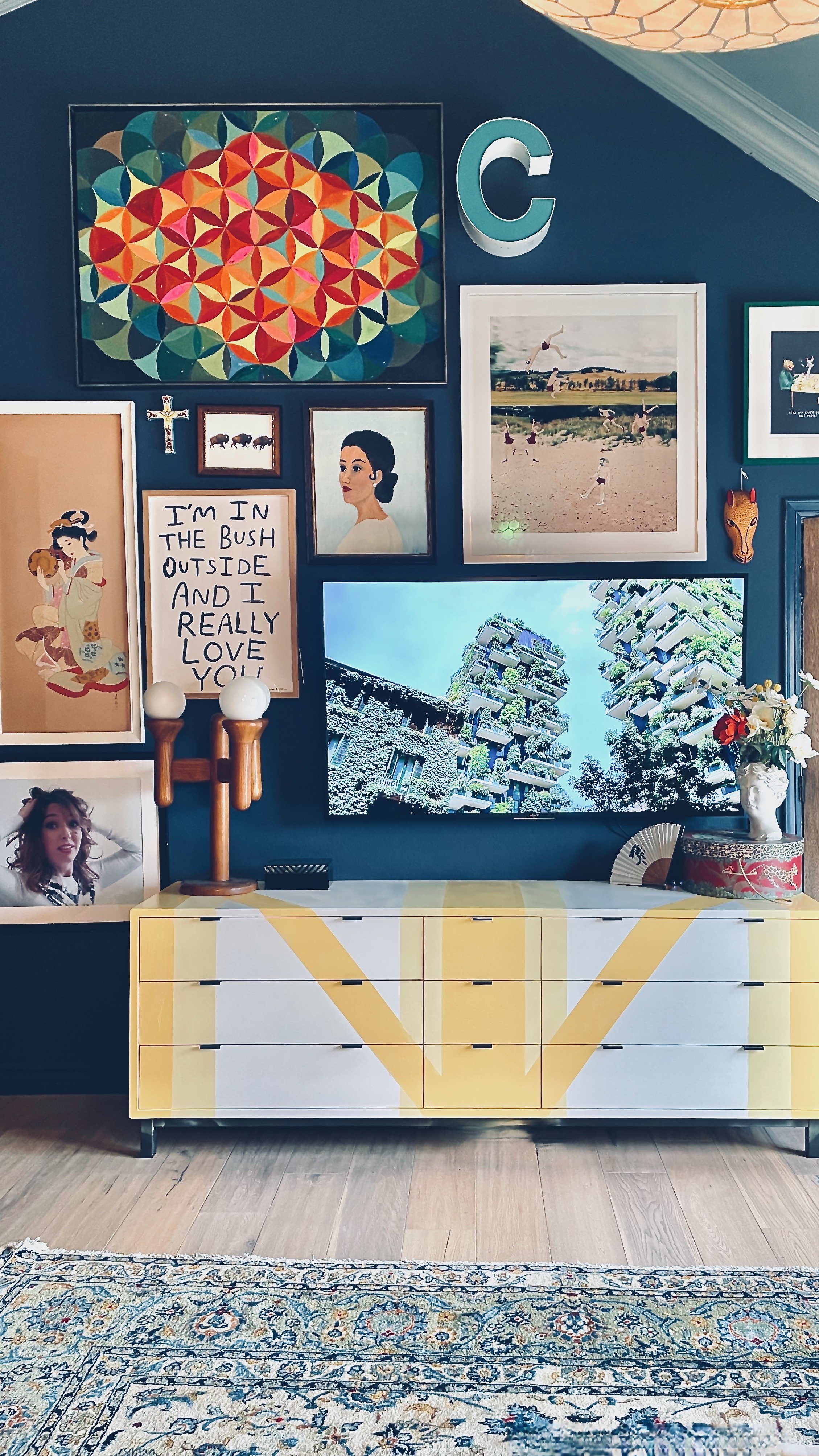
So I have this thing about getting patterns right. I believe the size of the pattern needs to balance not only with the things around it but with the SIZE OF THE ROOM. if you have a giant tall room, like me, do not fill it with tiny patterns.
Case in point:
These nightstands WANT TO BE BOLD but they are literally camouflaged. I am pulling major Angela Chrusciaki vibes for these and going with a coordinated but bold color. I am pulling the color from the rug but only one of the colors that is barely used. I already have a lot of blue in this room (Early Stuff on dresser).
Pattern doesn’t just have to be the obvious pattern one thinks of — a series of images repeating in a consistent manner. No honey, pattern is anything. In fact, if you haven’t already, please check out my pattern mixing tutorial:
How to Mix Patterns Like a Pro
Here are the patterns I’ve got going on so far:
Of course there are lot of other patterns, but those are the main ones.
o symmetry, where art thou?
I know most of my style looks like absolute CHAOS, but I promise you I do rely a lot on symmetry. Now whether I decide to use it in most cases, that remains to be seen. I guess the word I’m really searching for then is…
BALANCE.
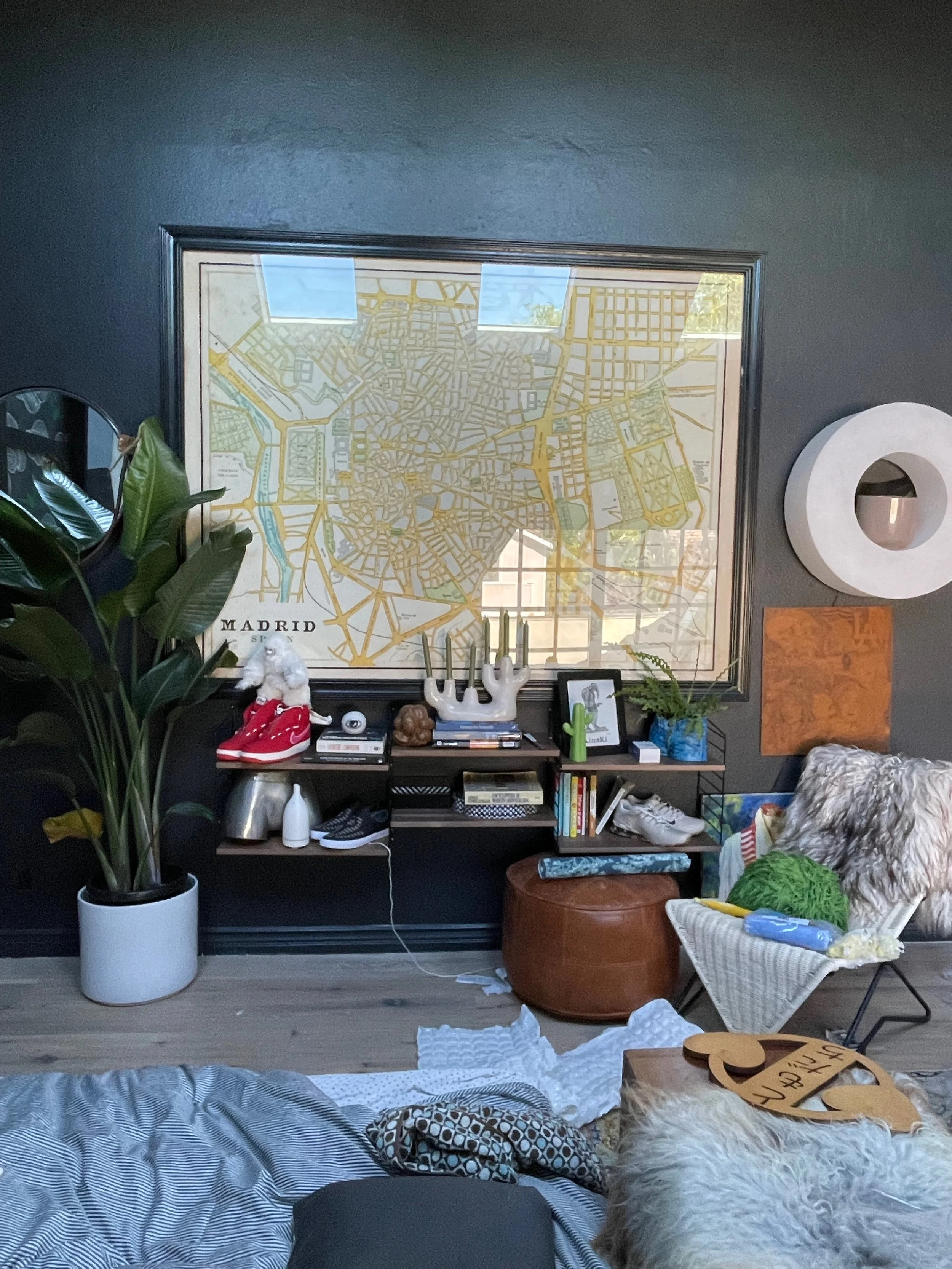
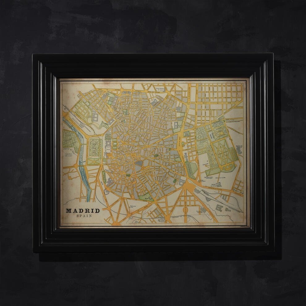
A lopsided room is fine but I must find the equilibrium to balance out the elements. One of the problem areas I have is the wall with the Madrid map:
The BALANCE is all off. The map is a very major element but I want to downplay its importance. While I love the BEAM shelving from DWR, I feel like this wall just WANTS to be something else other than a HUGE painting, a little tiny shelving system, a really cool circle wall light and some other random stuff.
The problems are time and imperfect walls. I actually don’t love floating wall shelves. They are a bit too chunky and indelicate for me but this wall wants to structured symmetry to make it more than just a wall with stuff on it.
Here is the solution:
The shelves are easy installs, no painting. The only modification is that I will have to cut some of the shelves to fit under the Madrid poster. Now this wall will feel like it has purpose!!!
mood board vs. real life
I’m finally beginning to understand why this ONE ROOM CHALLENGE is actually A CHALLENGE. I had mood boarded and planned this space down to the very T from the very beginning. Even though the skylight installation had taken a little longer than expected, I honestly thought it was going to breeze.
Oh how wrong I was. I forgot the most important element of designing a real life room: reality.
You see, when you plan a room, especially one as difficult as this one, the challenge is not the planning. The challenge is trying to adjust to real life. Mood boards cannot account for the feeling of a piece of furniture or how a color might hit your eyes. You simply must be able to adjust in the moment and go with the flow.
The challenge is then to listen to one’s gut and figure out a solution that doesn’t break the bank. In the ORC case, it also means one does not have tons of time. But that’s where my developed taste over the years comes in. Oh and keeping a schedule of all the free return timelines.
Happy Week Six of ORC everyone! And please, please, please check out the other contestants participating this year:
