color and mood
Good morning! I hope you're having a lovely weekend so far and you get to do something today that makes you feel wonderful about life. For me, a dose of "green therapy" (that is, walking around our nearby lake) usually sets me straight. Or, if I'm feeling extra dingy, I have a telephone with my eternally optimistic friend. That's the thing about moods: there's usually something you can do to change them.
In my previous post, I wrote about the importance of establishing moods in our personal space(s). This interior design thing we do is not just a way to impress friends and spend money. To me, a room is like a blank canvas, waiting for you to show your point of view.
Let me also interject my own thoughts here with a glaring reminder that I don't consider myself a minimalist; a minimalist believes "all function, all of the time". Anything deemed extraneous is quickly jettisoned onto the donation pile -- like so many birthday cards and surplus Etsy art purchases. How very sensible. If you are a minimalist, I'm certain there's a blog for you out there, and good luck to you on your smooth journey.
I, however, love to get into the proverbial weeds with my design. I want to get lost down a road, come across some very jaunty green lamp (or a magical yellow wall tint) and add it to my collection. I love the art of using found objects and designing a space that evokes actual, honest-to-goodness feeling. And the quickest way to evoke feeling is...
color
How I typically break down color is "extrovert" and "introvert" or the "look at me" vs. "I'm fine by myself" colors. Any primary, secondary or tertiary color can be broken down in this way. Let's take yellow, for example:

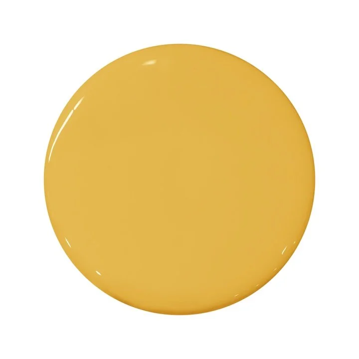
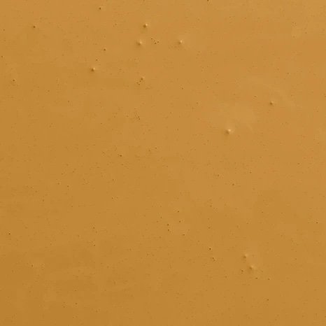
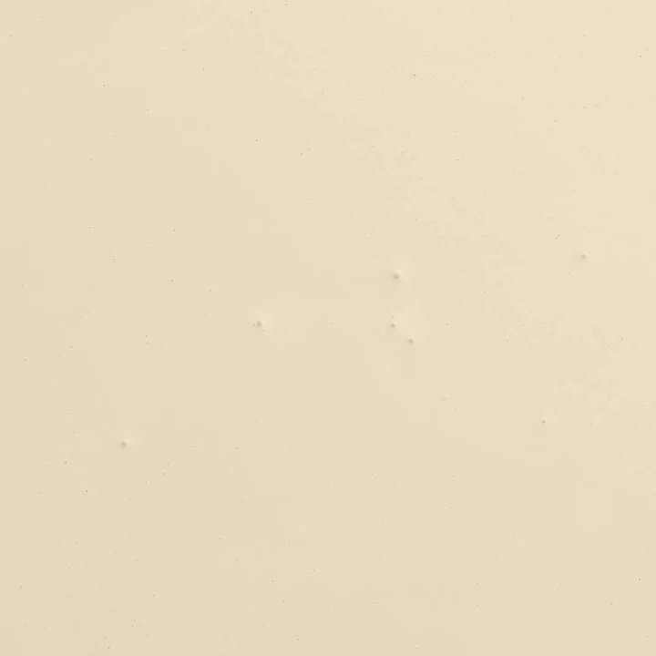
Now which of the above shades would you allow in your bedroom? One shade of yellow seems to bounce off the walls with ADHD-like excitement. Another has a Hey-I'm-yellow-but-I'm-cool-now-let's-go-out-for-ice-cream. The third rides a motorcycle, but also belongs to a wine tasting club. The last shade of yellow probably wants to read a book of poetry and be left alone.
Any shade that adds a little grey/brown to the base color, automatically goes a shade darker/moodier. Similarly, any time white is added it's called a "tint." If you want to achieve maximum moodiness, pick colors that are tones of favorite colors. For "maximum extrovert overload", pick pure colors or tinted colors to create that energy.
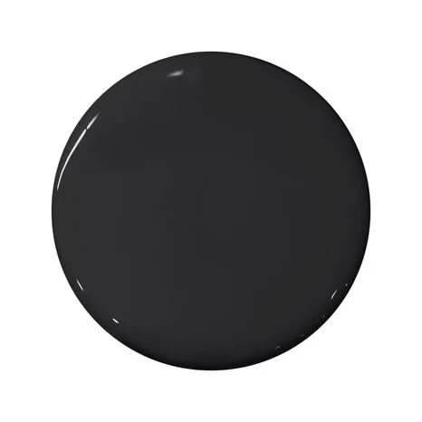
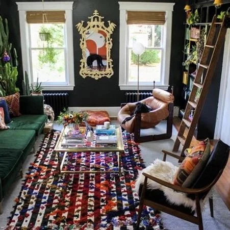
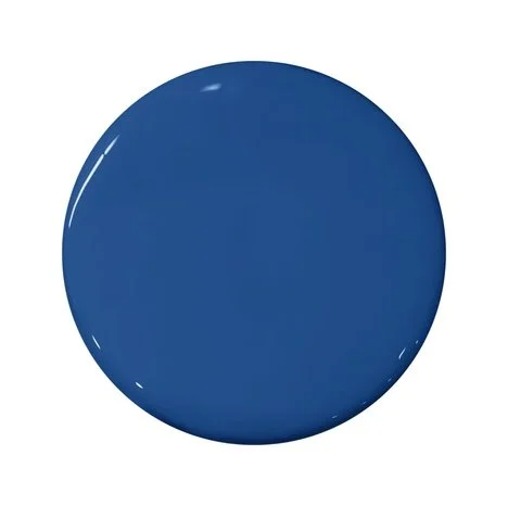
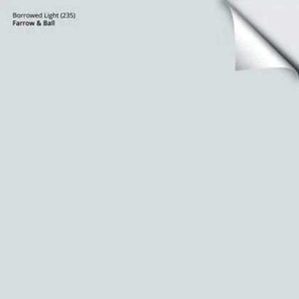
Here are my favorite tones to use in darker, meditative rooms:

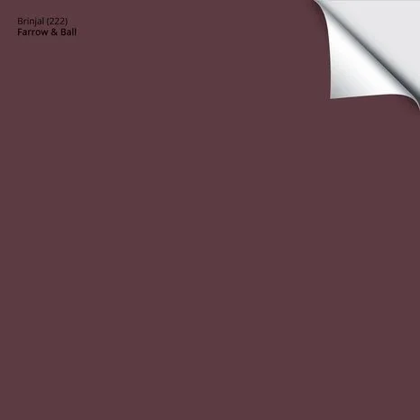


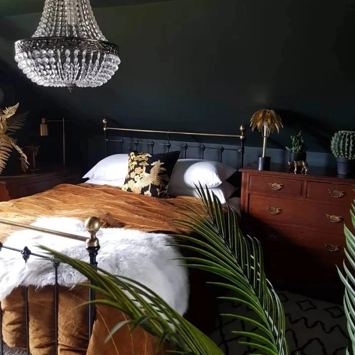
Use these colors on your walls and you'll get something like this:
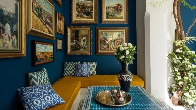
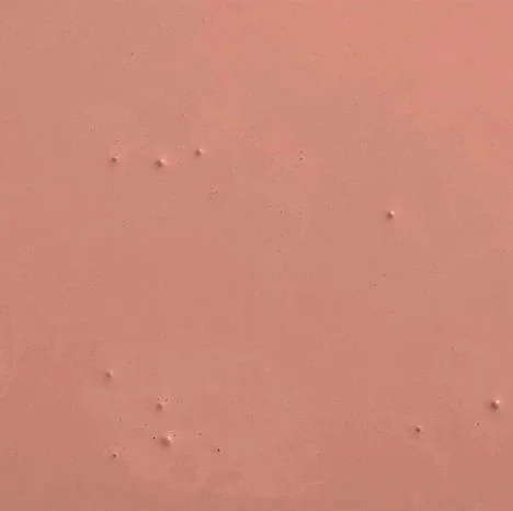
And now the "extrovert" colors:


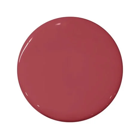
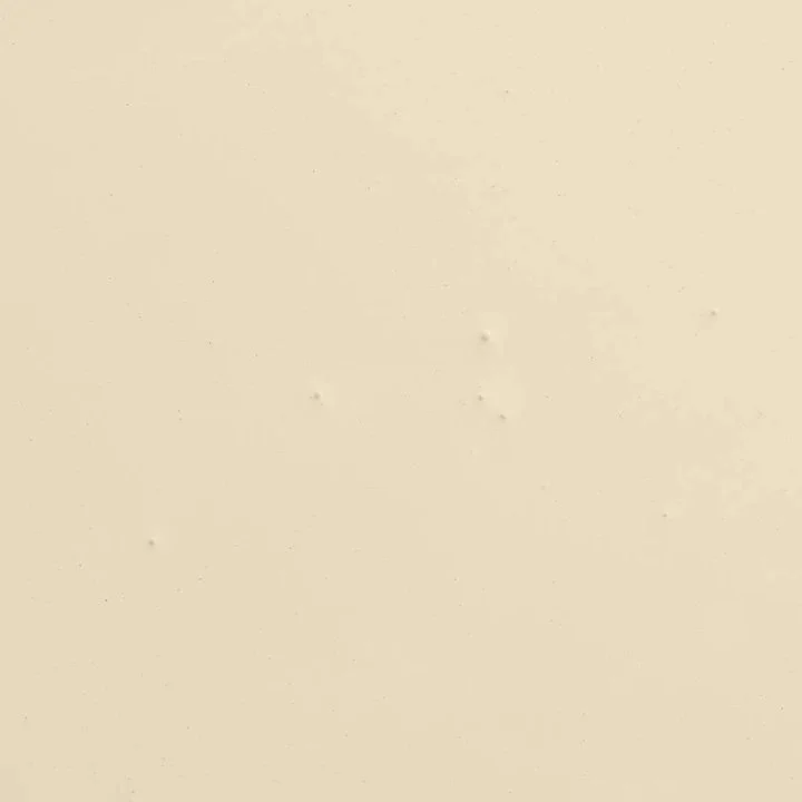
To achieve something like this:
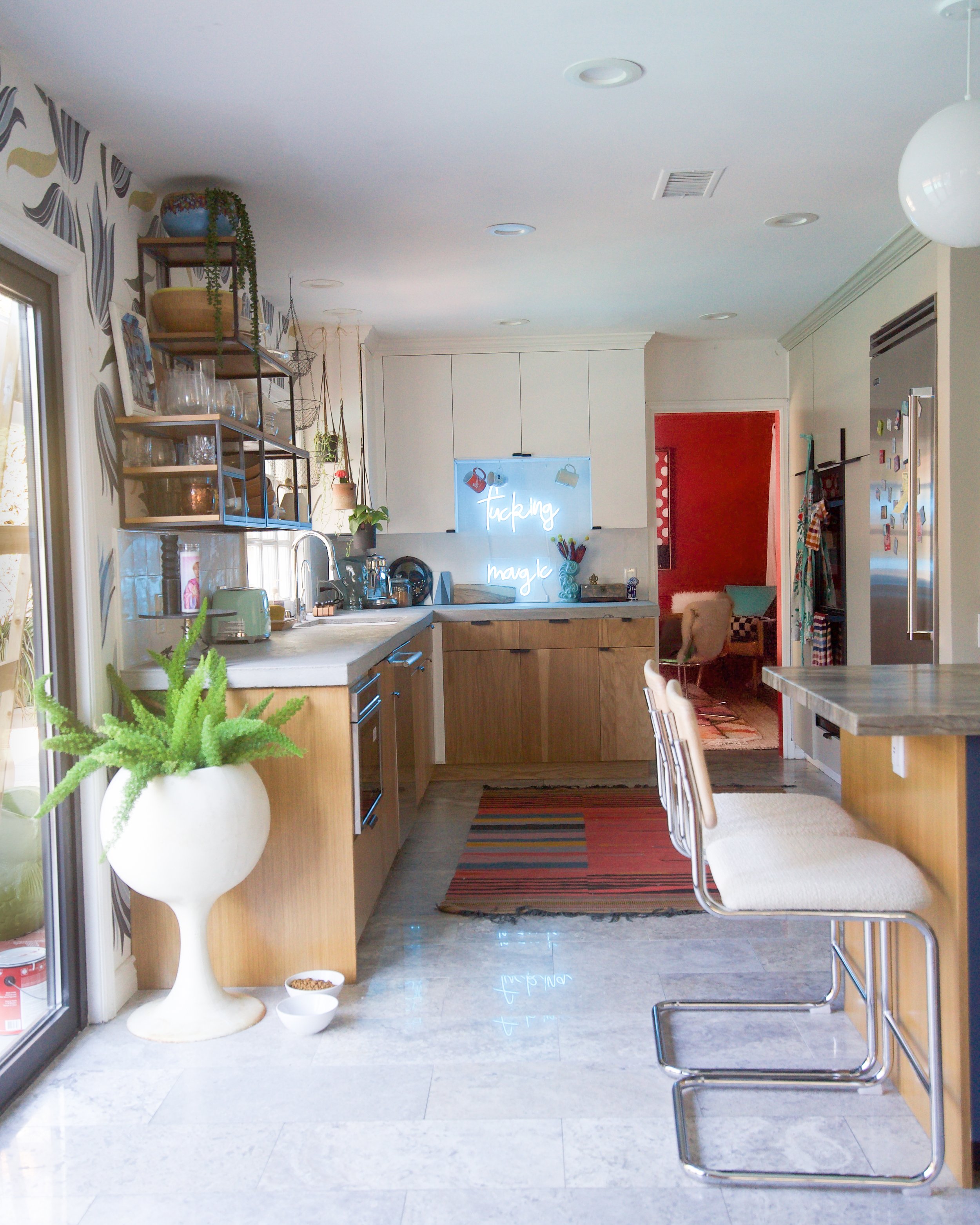
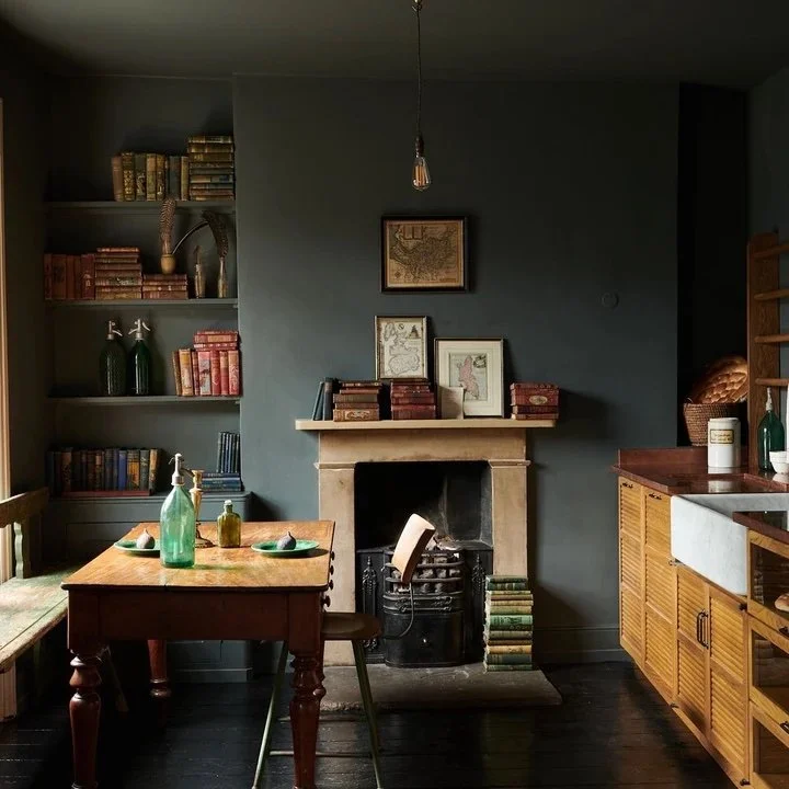
You see how the last photo could go moody but the shade and the light it is especially happy and look-at-me quality?
grounding
Have you ever been so lost in the dreamy eyes of your favorite movie star that you forgot to do the dishes? My point: it's easy to forget that, just because you want a space to be "extrovert", you can't forget to calm it down a bit.
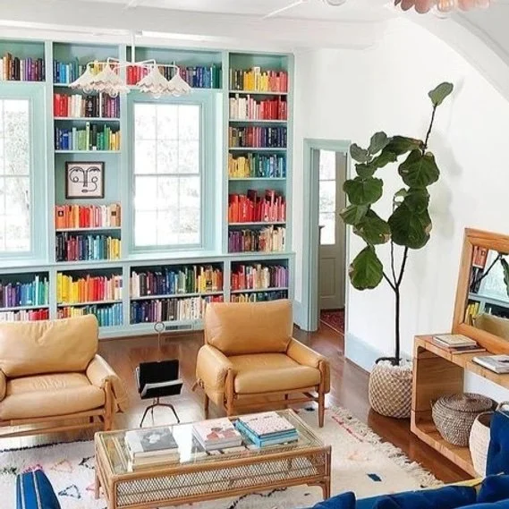
For instance, you could use all of these colors in one space:

It would be one muddy, moody mess! Similarly, if you used all the extrovert colors, it would feel like a life in a cartoon. Yikes. That's a mood. So let's take two colors: one from the introvert pile, and another from the extrovert.
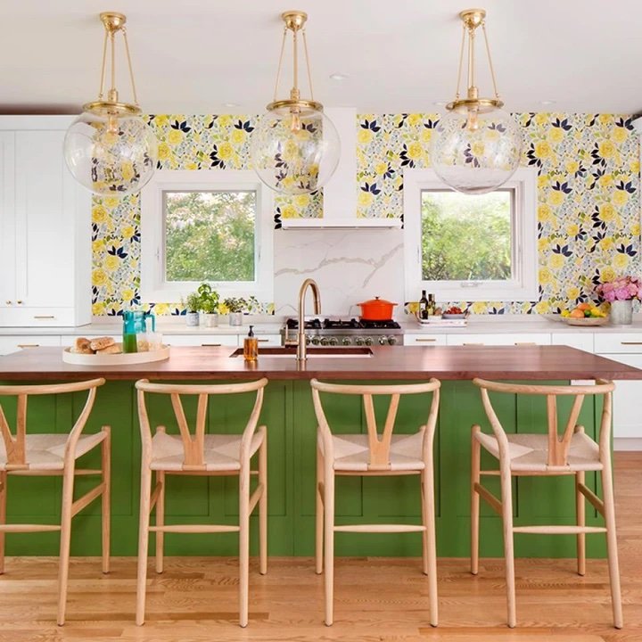
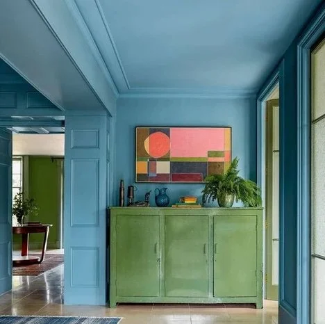
Now, these two are quite the odd couple, I know. I'm sure you feel the same about your colors. However, a quick Google search will prove that designers can -- and will -- use every color combo and ultimately have beautiful results:
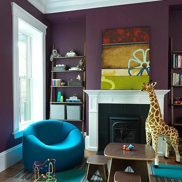
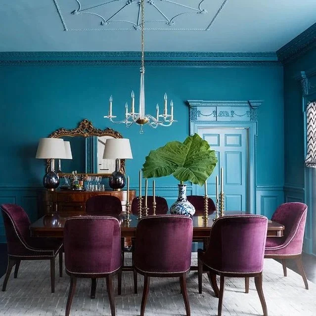
Either room would not work without the balance. And it especially interesting the traditionally "moody" color is a backdrop to a kids room while the happy "extrovert" color is the main focus of a very grown-up dining room.
Now, there are myriad websites and blogs that explain color theory exceptionally well. But spending too much time following over-complicated rules can really interfere with finding the right balance. Color lines are becoming blurred, the world is changing. Hey, let's live "left of center". What the hell.
So raise your coffee cup high and repeat your new mantra after me: "the key to color is balance."
Enjoy your cup o' joe!