now, this is a garage
When the client first came to me, I have to admit… I was a tad skeptical about the eventual outcome. She wanted to redo her garage into a beautiful hangout/music room. I googled “cool/wallpaper/revamp garage” and got a lot of muscle cars and epoxy floors. None of it was beautiful. None of it was my style. None of it. I wanted to prove them ALL wrong. I wanted to create a garage that would break the mold.
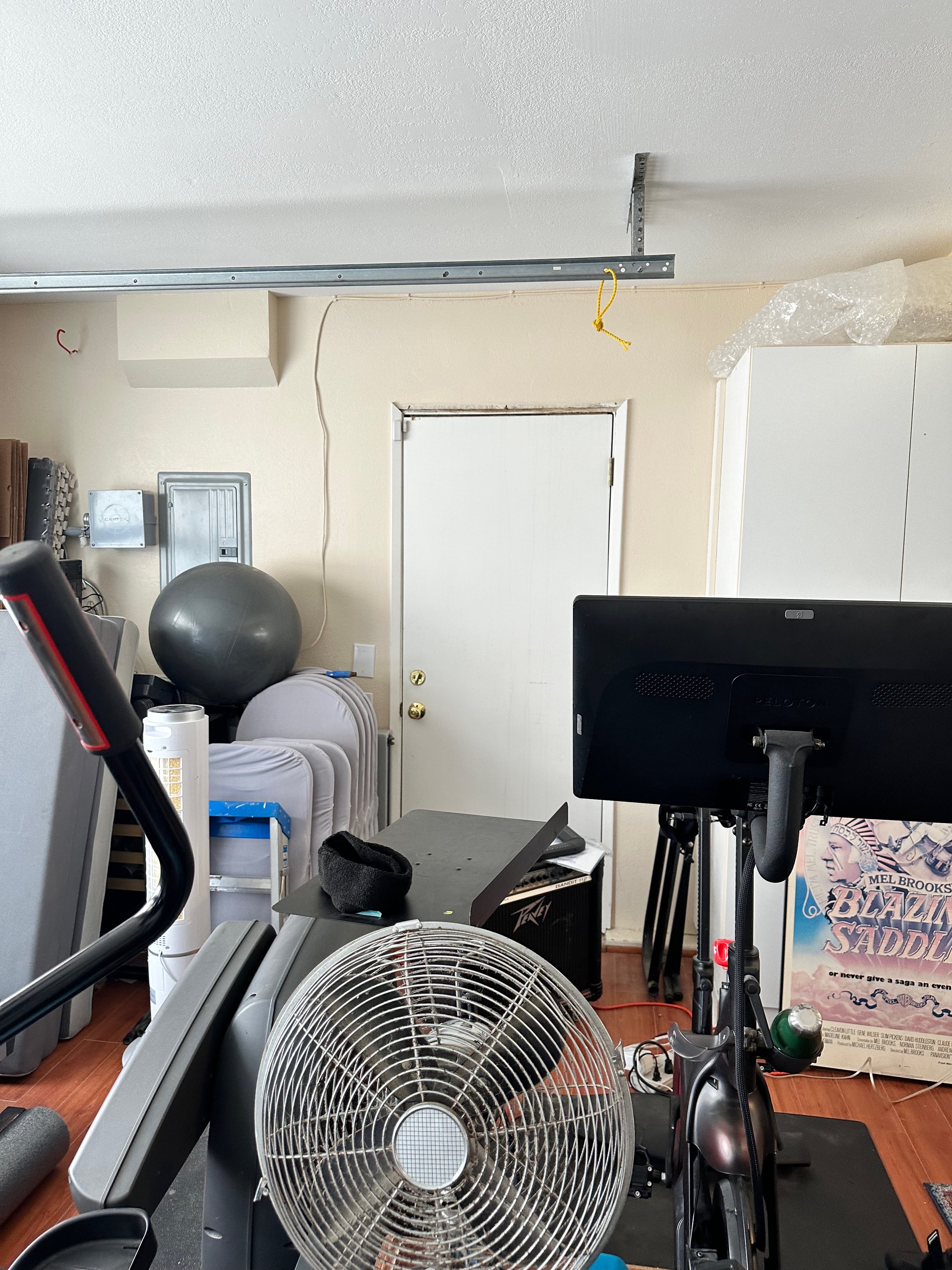
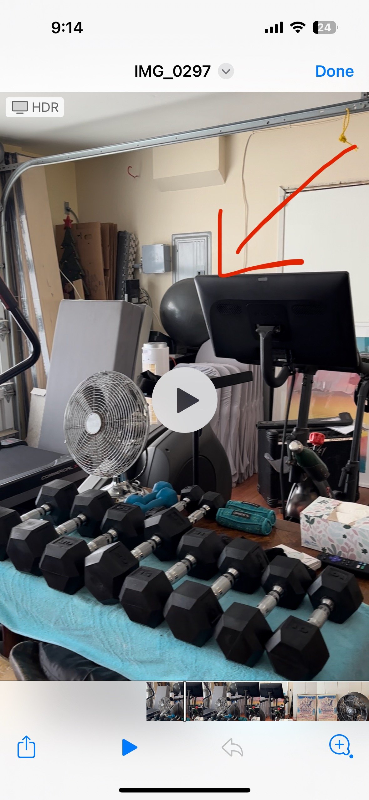
Before:

AFTER:
Photos 1-2, Credit: Melanie Thomas. Photos 3-11, Credit: Greg Frost Photography

Greetings, fellow design rebels!
My name is Melanie Thomas and I am an L.A. based interior stylist.
My work and advice has been showcased in prestigious publications such as Architectural Digest, Better Homes and Gardens, The Zoe Report, Real Homes, and Homes & Gardens, among others.
I know that I'm not everyone's cup of tea, but then again, neither are you…
LINKS TO PRODUCTS AT THE END OF THE POST!!!
I set out to treat it like a regular room that one could potentially park one’s car in and chill. Here are some things that were not in our favor…
there were/are a ton of wires that cannot be removed.
there were two different ceiling heights, so the giant exercise equipment could only be in one place.
there is a utility closet with mirrored doors that cannot be moved. Sure, if we had a $50,000 budget we could do all of these things, but we working with a comfortable but appropriate budget for a garage. In other words, make it look nice but don’t go crazy.
But there were a few things that were in my favor:
the garage had actual wood floors! Yes, wood floors in the garage. Cha-ching.
they had cabinets that were in still relatively good shape.
they have a lot of space.
And lastly, I had the biggest slam dunk I could ever ask for in a redesign: a wonderful client who I will cherish forever and ever. She wanted art and funkiness and wallpaper and even said YES to painting the ceilings black. 80% of clients are typically opposed to the idea of going dark in a room. I absolutely have no idea why since the results are ALWAYS gorgeous. It took everything for me to not gush all over her and maintain my composure while working on this project.
Whenever I wanted to give up, I thought of her enthusiasm and openness and I wanted to deliver something very very special. She was willing to go with my first designs I presented, but I knew I could do a little better so I presented this at very last and it stuck:

I had never seen any garages with wallpaper (and I googled) and I worried there must be a reason. The reason is that most garages are not as insulated as the rest of the house and it risks getting exposed to the elements. I think I asked my wallpaper installer a million times “Is this going to last more than a week????” and he said “Yes, it will” every time.
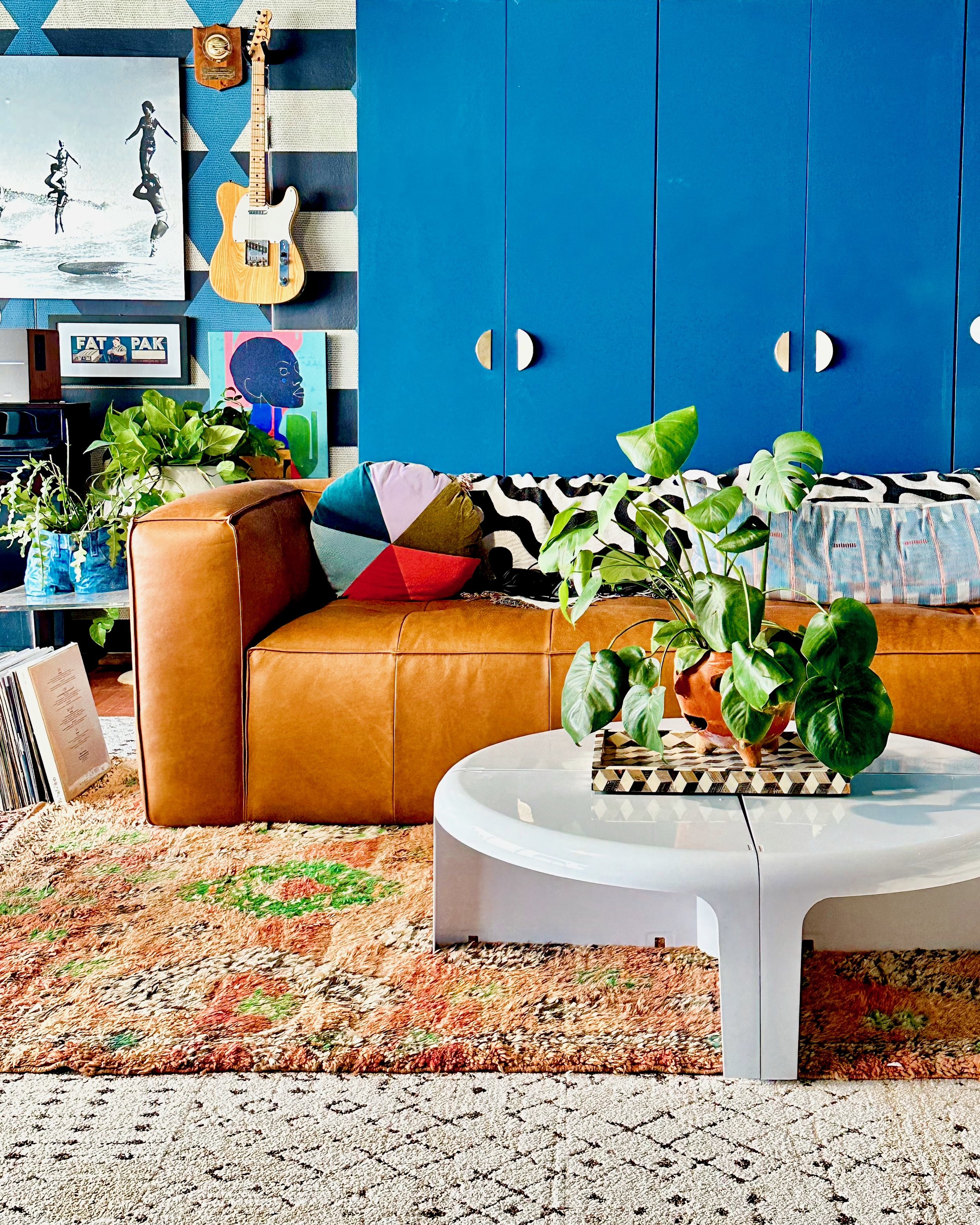
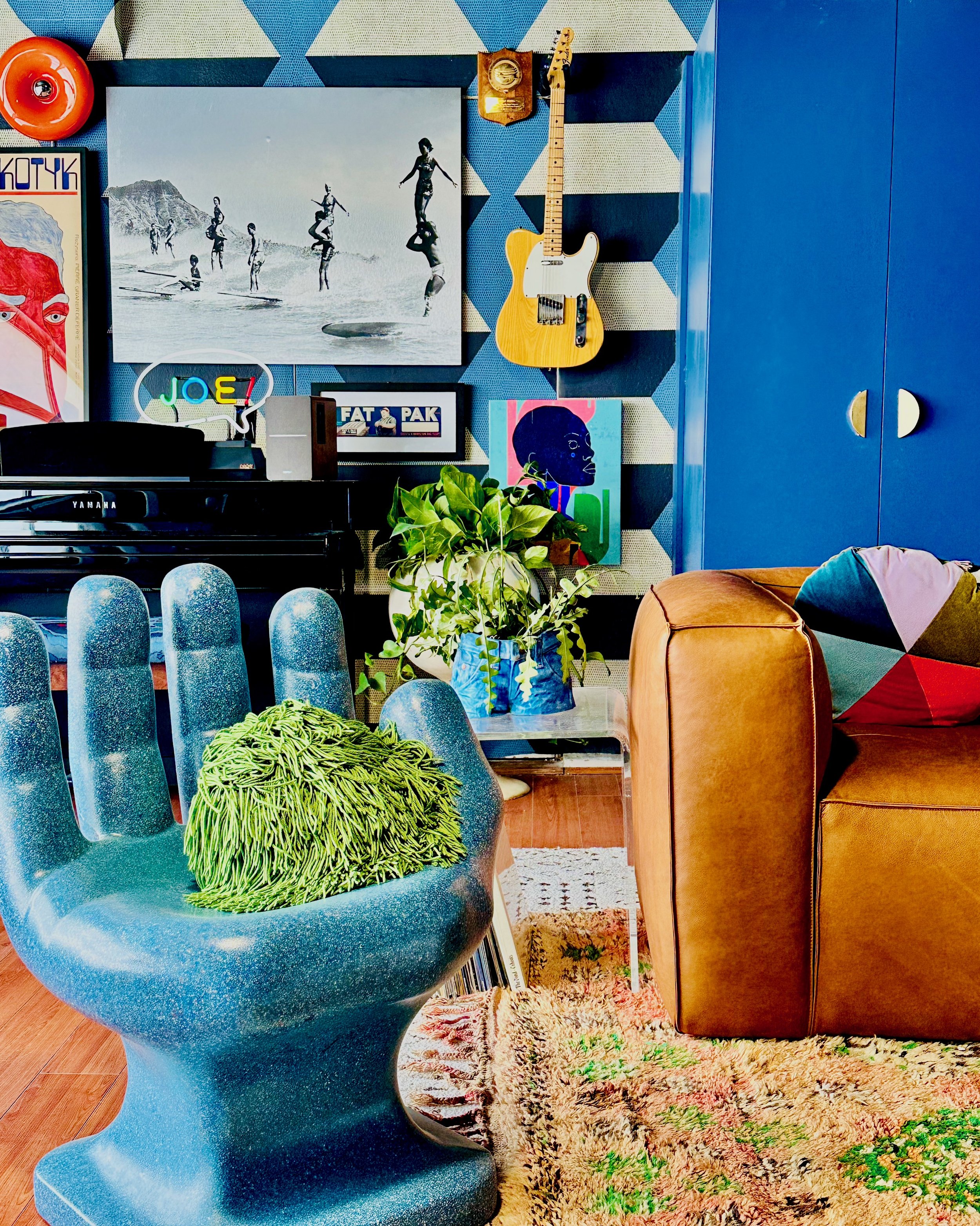
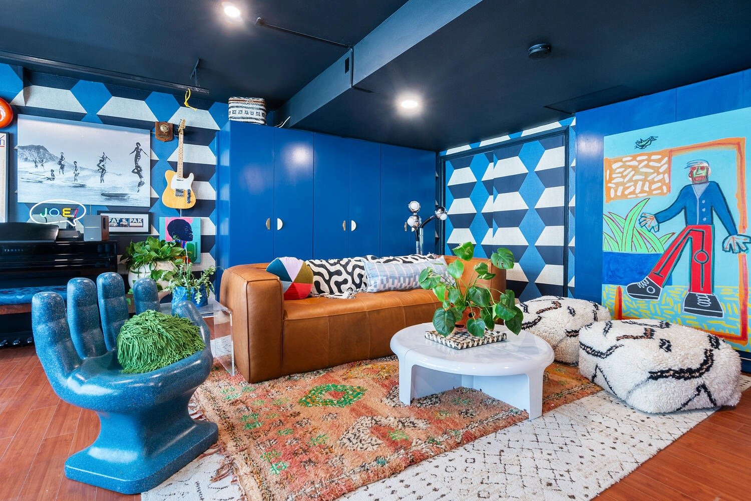
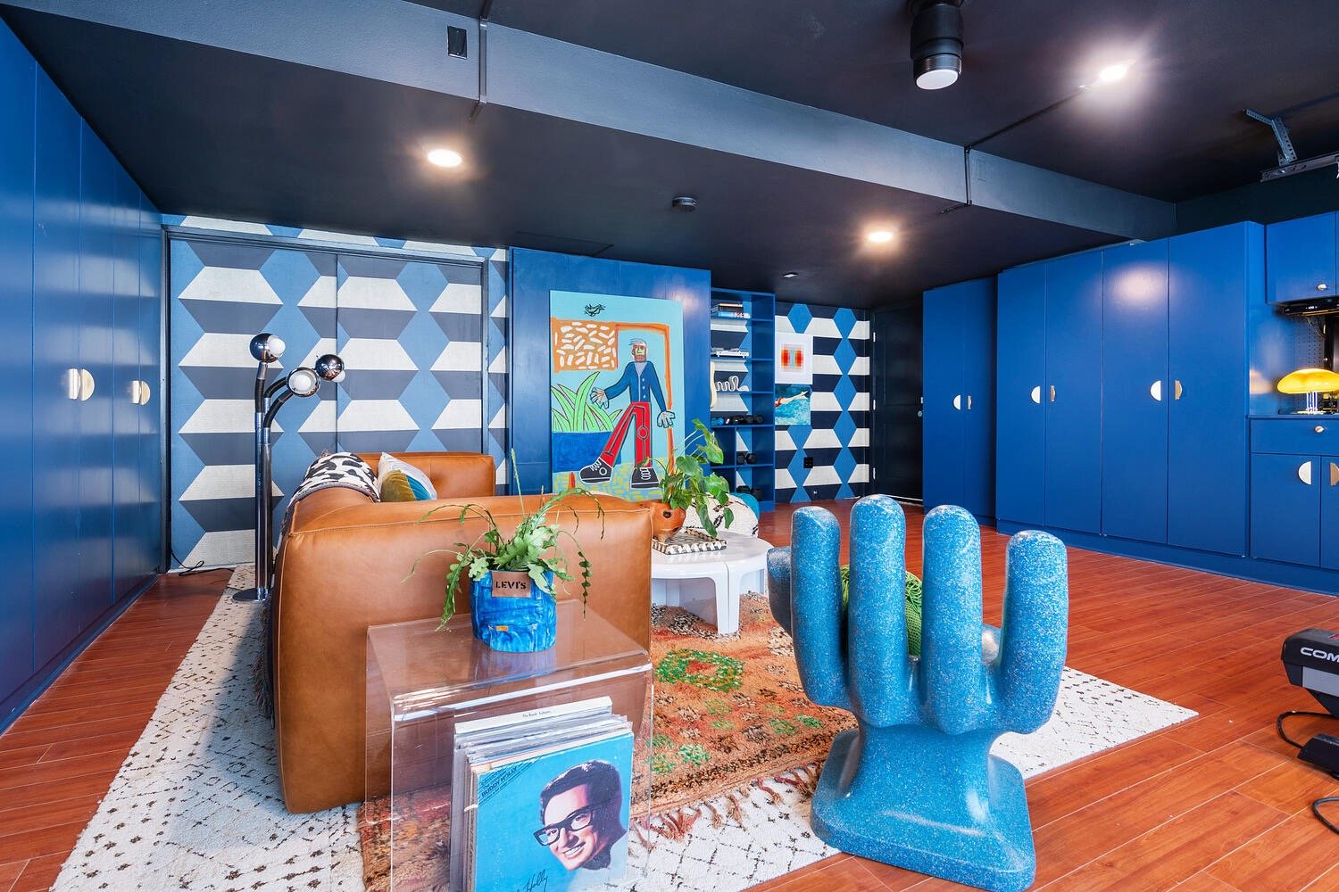
overall feel/color scheme
At the beginning, I ask potential clients what song or musician they would like the room’s vibe to feel like. She wanted: Bruce Springsteen and Kate Perry. Both sexy, but very different vibes. One is bright and happy but not stupid, and the other is weathered, blue jeans-y and soulful.
I’ve been obsessed with cobalt blue recently, but I wanted to bring it down a stop. So I thought of blueberries. I know. Yum. And somehow very American. I didn’t mind using so much blue because I didn’t want it to feel too busy.
The orange — AKA the Katy Perry-ness of it all — came from the client. In the same questionnaire, I ask “What is your favorite color combo” but I also ask “what color do you secretly love but are too afraid to try?”. Folks, I did a little jump for joy when the answer came back “burnt orange.” Orange is possibly the most underrated color so I believe it is prime for a cultural comeback, much like the millennial pink phase. I don’t know why orange has gotten such a bad wrap, but every time I ask IG to rate their faves, orange ranks very low on that list. Poor orange.
Another imperative was to STAY AWAY FROM FLORAL. It was not necessarily “no flowers at all” but definitely, nothing too feminine. At least if my memory serves me…
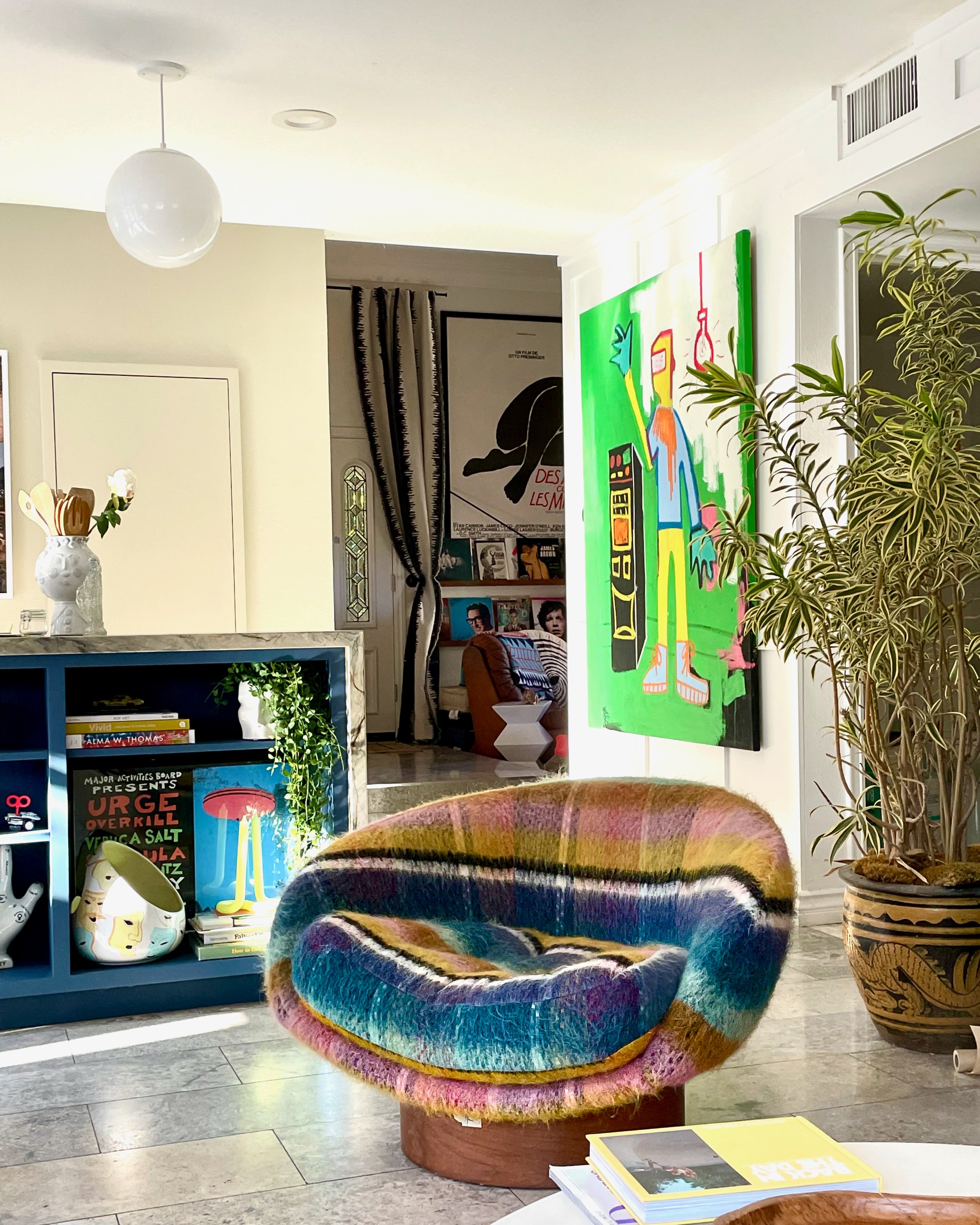
Friends, you know I love a big floral moment. It introduces shape and fluidity that can be missing from a linear/graphic pattern. I also love a challenge, so designing without one of my signature moves/crutch was exciting. How do I make mostly linear patterns fresh and interesting on different surfaces? I employed the use of a few round furniture items and interesting shapes that took the place of the floral pattern.
Layout

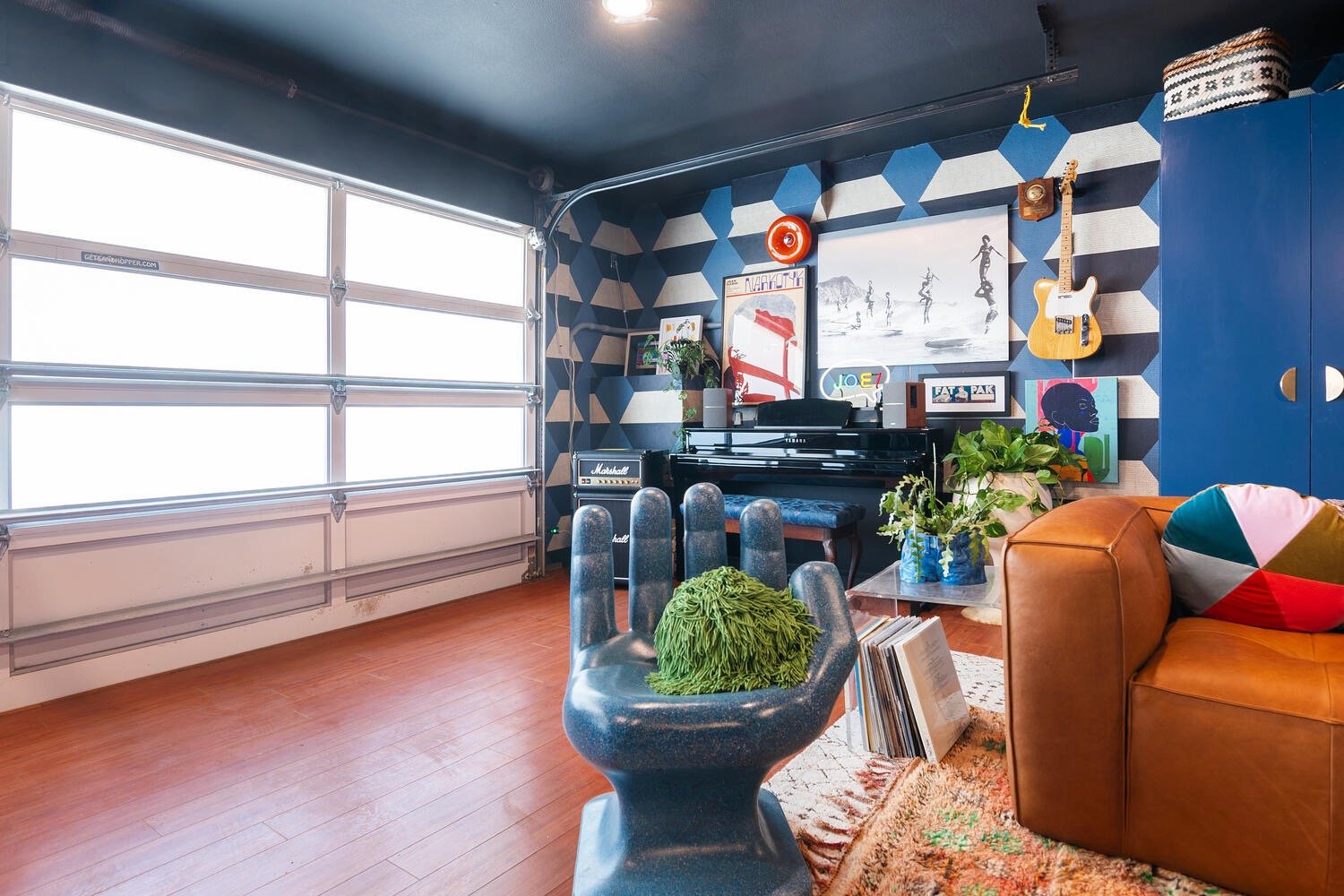
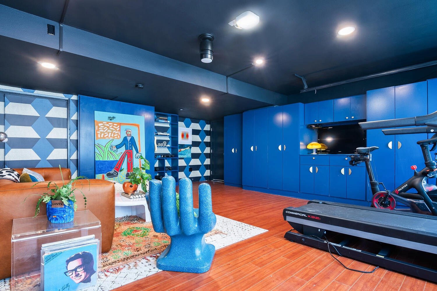
You might be wondering why put the sofa there? Why the piano there? Why is there is a big empty space on the right side of the garage?
First off, I hate entering a room and only seeing the side of a sofa if I can help it. I wanted the sofa to face the entrance so that it was more inviting. Secondly, there is also a murphy bed hidden in there:
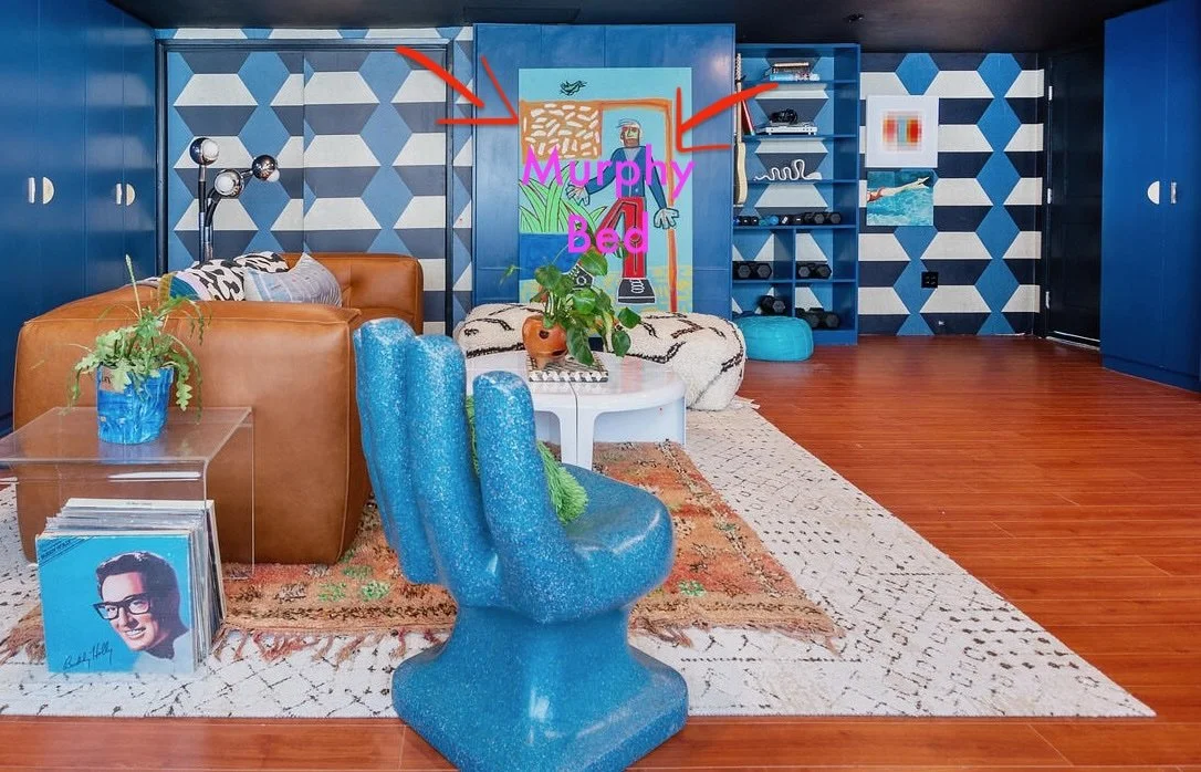
The sofa is actually incredibly heavy (which is a good sign of quality!), so I didn’t want the clients to have to hire someone to move it every time they wanted to use it. Originally we were going to get rid of the Murphy bed to make room for art, but then we decided we could have both. We were going to put the piano where the Murphy bed was located but then I decided to move it to the corner.
This also served another purpose: cover the defunct door and anchor a gallery wall so that we can disguise the electrical box and various chords and peraphenalia.
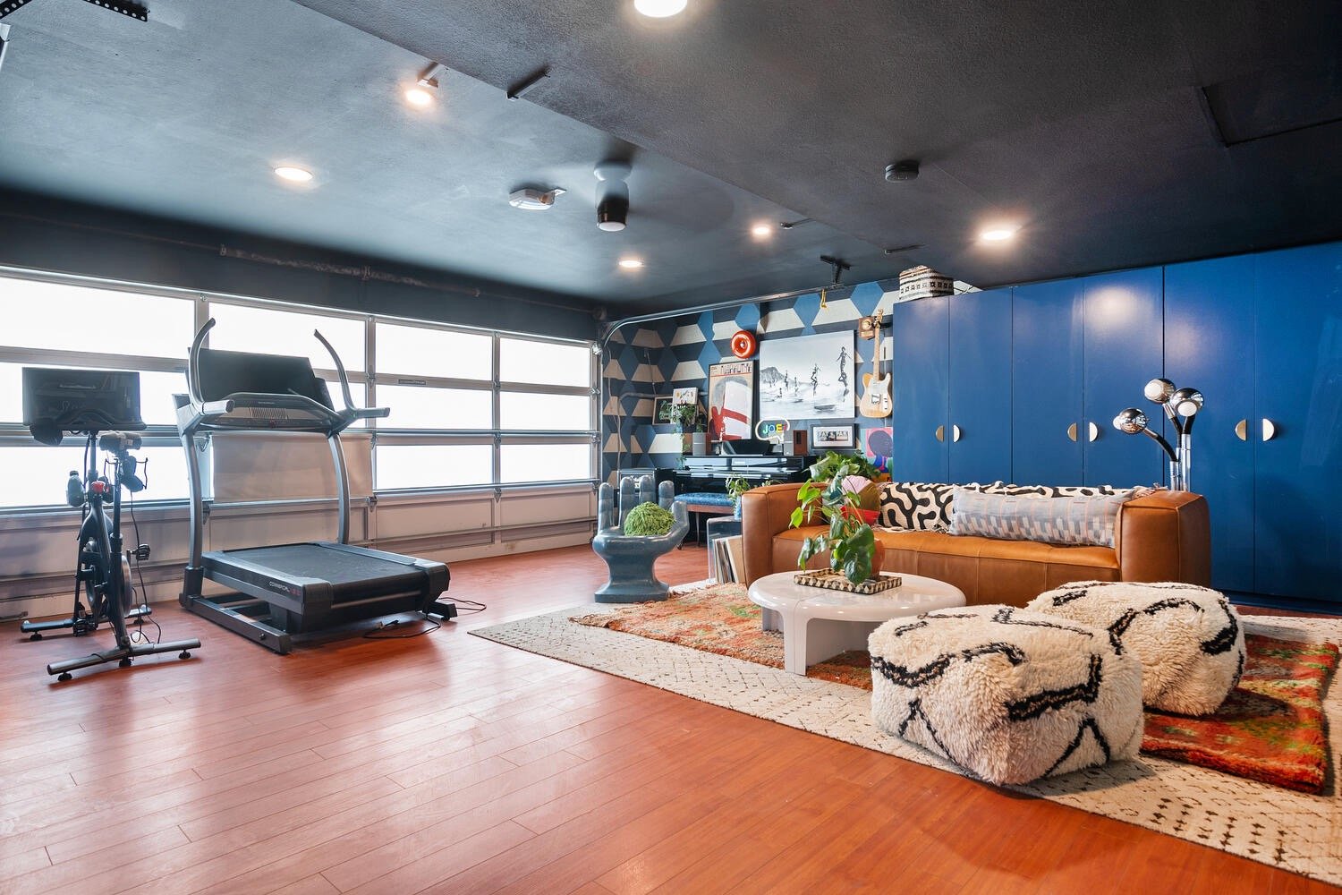
Then the treadmill is actually very tall and the ceiling above the sofa is pretty low at 7 feet. It’s just a small thing, but I didn’t want the clients to literally bop their heads, rocking out to “Born in the USA” or “Dark Horse”, trying to get their sweat on.
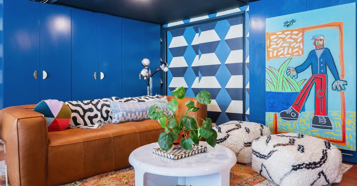
Sofa
Surprisingly enough, it was the client who really pushed for a leather sofa. Not that I mind a leather sofa. I truly truly love them because they introduce a different texture that would otherwise need to be covered somewhere else. BUT leather sofas tend to be a bit pricier than the average cloth one. I try to not have an exact formula, but it helps to have a playbook when in a tight spot. A space might just feel “meh” but then if I visit my playbook, it’ll remind me about a trick I had forgotten, like adding butter to a marinara sauce at the very last second. (Did you know you could and should do that??? Bonus content for what you thought was just an interior styling blog post!)
Reminder: the client wanted ART and WALLPAPER, so budget was about to be on the verge of “this is getting out of hand.” The client — that sounds so cold, let’s call her “The Coolest Person in the World” (and I’m not just saying that to butter her up. She might just actually be the coolest person in the world if there was ever a contest) — was up for anything. But I felt a responsibility to be the voice of reason, otherwise I would feel guilty for letting it spiral.
The task was set: find a leather sofa that didn’t break the bank but was genuine leather and very comfortable. Oh and did I mention this was a relatively quick revamp so we needed the sofa to be QUICK SHIP???
I looked in all the usual places: CB2, West Elm, Restoration Hardware, Anthropologie, Article, etc. We found some very good options, but none were hitting the mark in terms of the criteria. I’m not going to lie and say I discovered the perfect couch, because I didn’t. The Coolest Person in the World stepped in and sent me a link to Poly and Bark and before I could even say anything, visited the showroom and picked one out! Folks, it was perfect. Genuine leather, sit-able, available now and under budget.
Also, because the ceiling is so low, I wanted something without feet that sits on the floor to create that lounge effect. A garage is not a very warm and cozy place with tons of comfy spots to begin with, and I didn’t want to clutter up the space with lots of seating. In other words, I didn’t want a lot of extraneous unweildy objects to move in case they needed to shift things around. This couch really needed to do a lot of heavy design lifting and shaping.
Did I mention how much I cherish my client for finding this sofa? Brava!
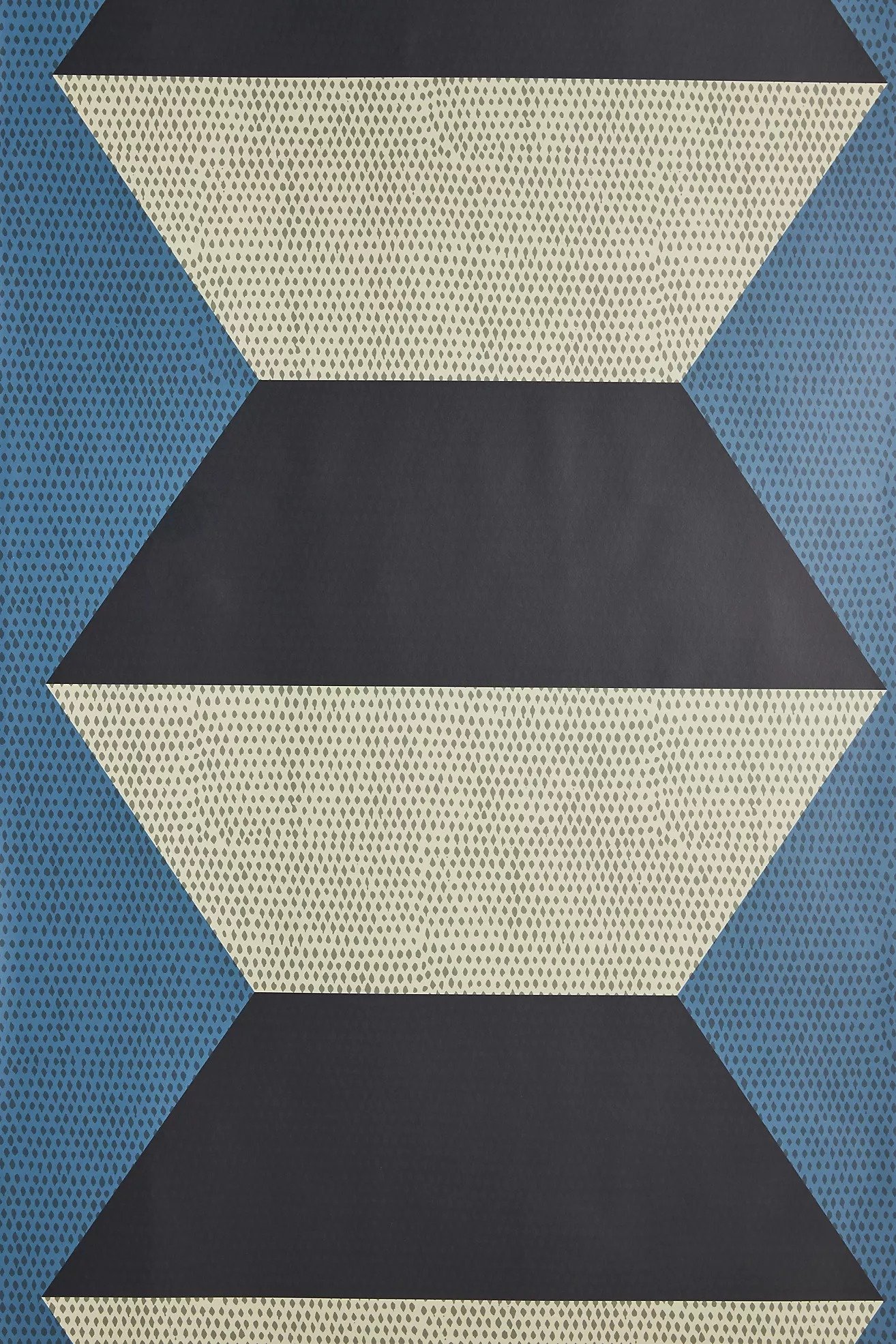
wallpaper
How about that wallpaper, huh? I went through several iterations of the design and started with a Farrow & Ball pattern:

this was an unfinished draft!
Farrow & Ball wallpapers are hand-painted and exquisite… read: very expensive. But that wasn’t the main reason why we chose to go a different way. Yes, I did want this to have a cozy, cave-like quality, the full on black wallpaper would not make the space feel more luxurious and fun. In fact it would do the opposite.
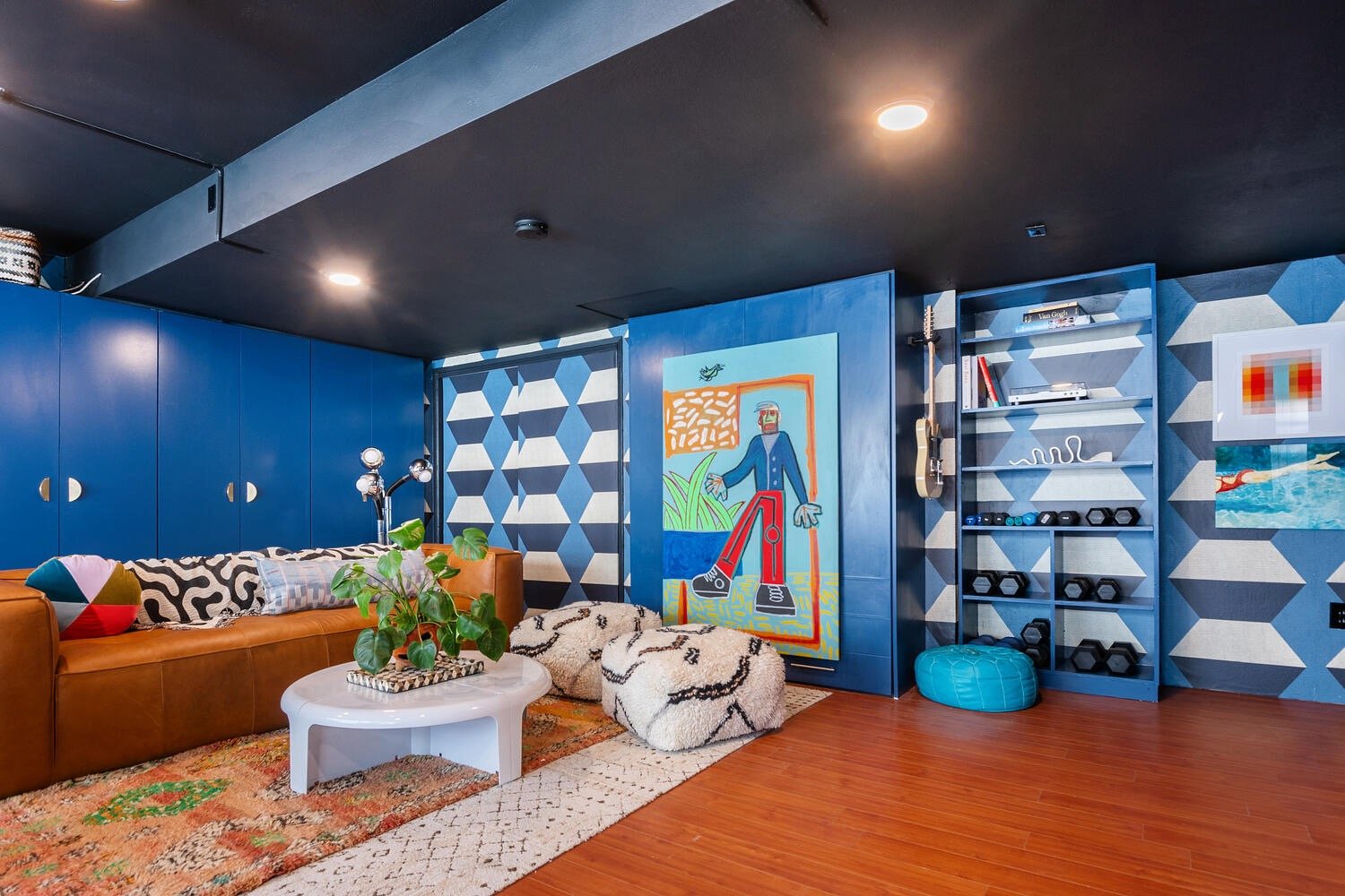
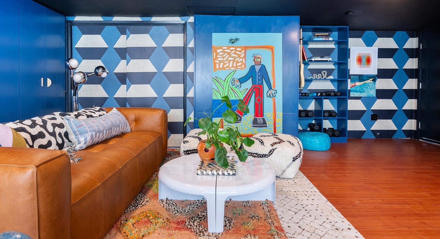
We landed on this lovely pattern from Mitchell Black:

I don’t know what it is, but I feel it’s got “Born to Run” and “Firework” DNA running through it. It’s funky, it’s impactful, it’s the right color (The Coolest Person in the World noted her favorite color combo was blue with grey or black), it’s fun, it’s all the things. Plus, Mitchell Black gives a great trade discount so relatively inexpensive.
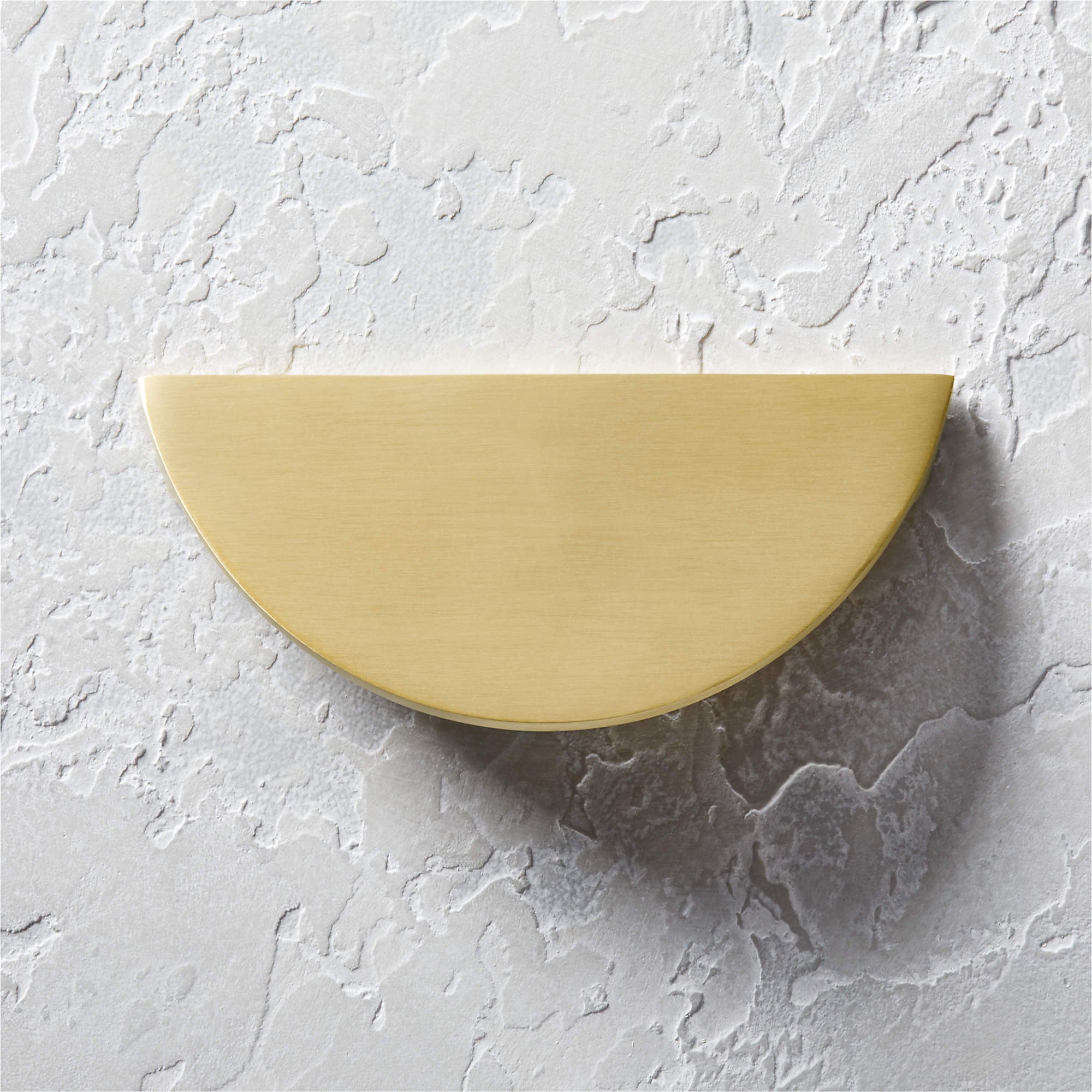
Lamp
Because the ceilings were so low over the sofa area, I knew we couldn’t use a chandelier or pendant to light the space and introduce a little bit of design. Instead the emphasis would be put on a floor lamp.
We went through a bunch of floor lamps. I wanted something that made a statement but wasn’t too tall (the ceiling here is only 7 feet vs. 8 feet). At first, I thought we would go with something tall and spiderlike but that option would just be a few inches below the ceiling and would throw off the balance.
After going through all the things I thought she and her husband would like on the surface, I realized the room was missing something a little weird. This is where I was glad that I had taken the time to get to know The Coolest Person in the World. I had come to surmise that her mother, who is a design inspiration to her, LOVED space age design. Bingo — we needed a funky-ass lamp here. I went to my favorite vintage retailer, Betsu Studio, and immediately landed on the lamp we chose.

It’s not big, but it is definitely a statement! And so so shiiiiiiiineeeeeeee….
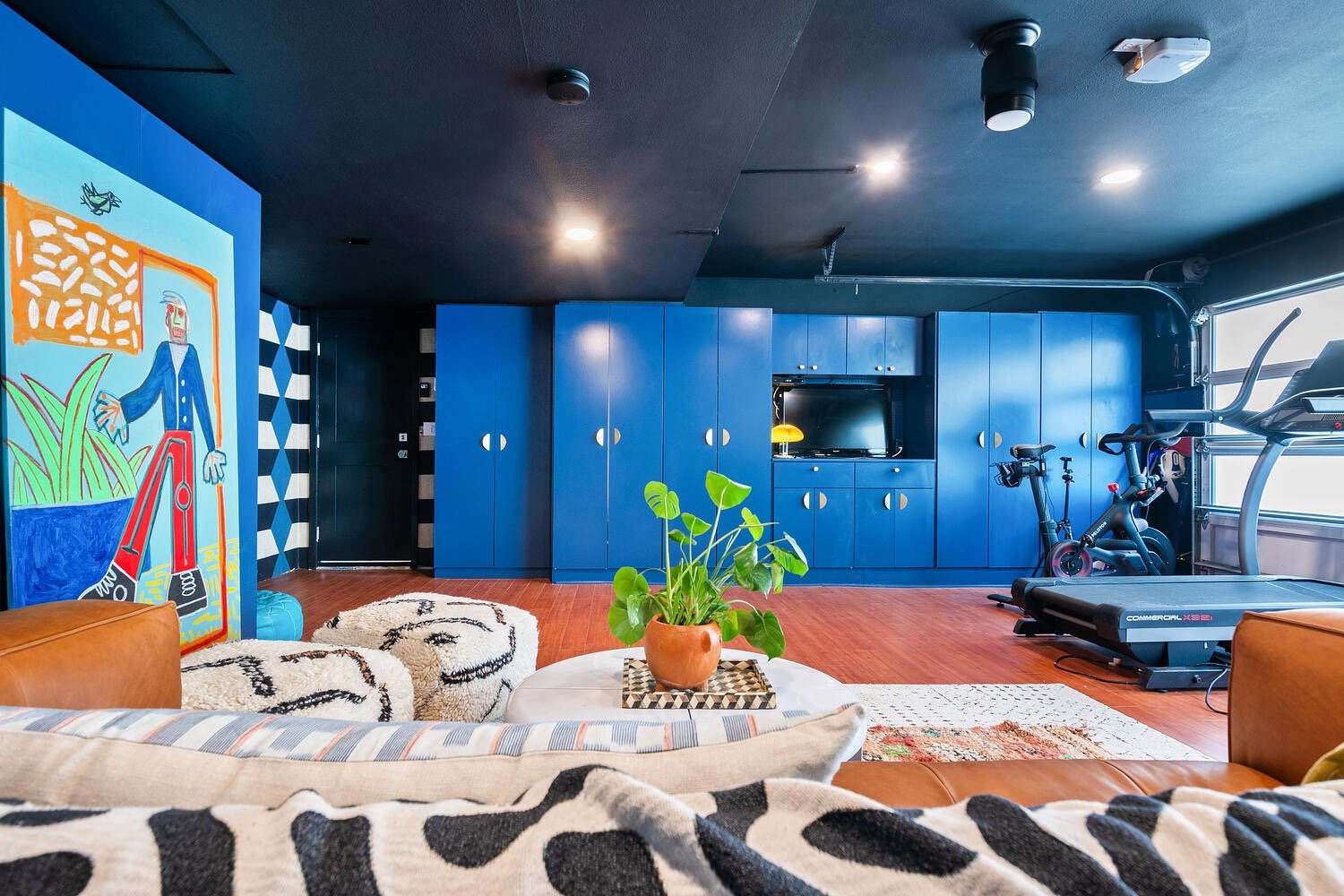
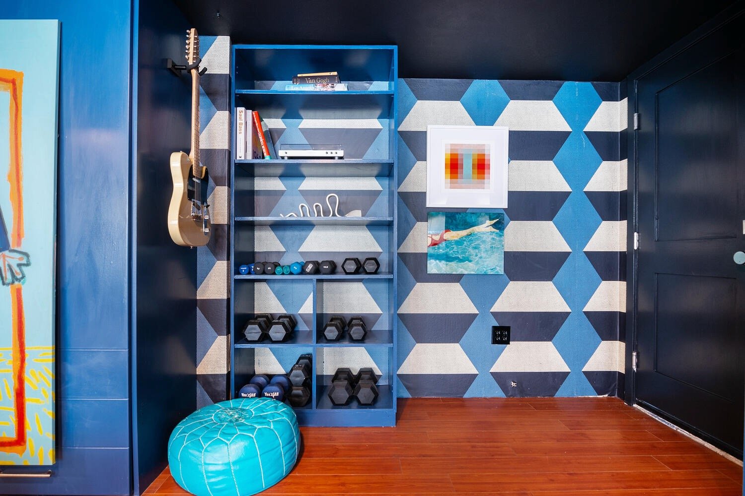
Cabinets
Another thing I worried about in a garage was the quality of the cabinets and drywall. Since we didn’t have the budget to replace all of the cabinets (that would have been all of our budget right there), we decided to paint and install new pulls. What I didn’t realize was that the CB2 pulls we chose were not uniform, so installing 26 of them became incredibly time consuming as we had to measure each individual configuration.
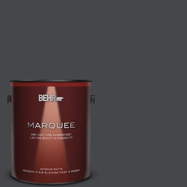
You may or may not notice that the cabinet paint color does not exactly match perfectly with the wallpaper. If I were to match perfectly, the blue would be so bright and garish, it would ruin the overall effect. Instead I matched the blue in the wallpaper and went a few stops down with Behr “Infinite Deep Sea”. It had that blueberry color I was going after but didn’t come off as “kids play area”. It was bright and striking but not annoying.
rugs
We also needed to find a versatile rug that could be washed easily and looked good in the process. We opted for a 10x12 Flor rug:
At the last minute, I decided to include a rug that had not worked for another project but had not had time to sell. Selling rugs is a bit tricky. You have to get the right setting and be able to get it all in one photo. Plus this one was pricey to begin with due to its coloration and overall quality, and if you want to make Instagram mad, you tell it the actual price of things. But nevertheless, I immediately recognized that it would be colossally important to the overall look and feel of the room, so I was glad I hadn’t sold it and that The Coolest Person in the World agreed with me.
Artwork
Next I focused on the artwork. Now normally I would focus on the artwork FIRST but this room was a little tricky. Because of the differing ceiling heights, the unsightly and unmovable AND non-functioning outside door, the mirrored closet doors, the sheer amount of cabinets, the giant exercise equipment and a little thing like the garage door, I had to get the layout right. Did I mention there is a murphy bed hidden in there somewhere? Plus I had to fit a sitting area and a piano and make the room feel inviting and room-like.
We had debated getting rid of the murphy bed up until the last second, but at very last I told her it was ok to keep it where it was. We’d just paint it. As a stylist, however, I am always thinking of the overall balance of the room. As it was, 75% of the room were to be painted this beautiful “Infinite Deep Sea” by Behr, but it was getting a little “cabinet-y”. In comes the coolest and surprisingly inexpensive Robert Langley painting:
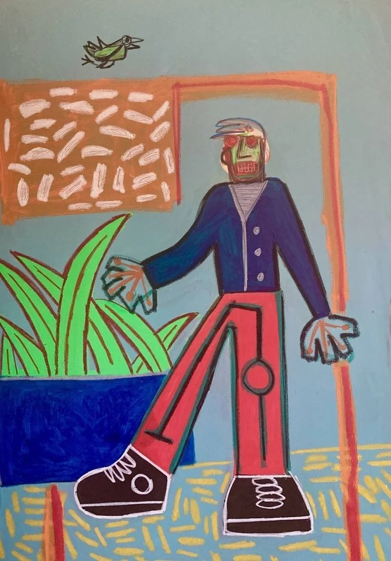
This internet photo does not do it justice. The background is actually much much brighter. He would be the centerpiece covering the murphy bed cabinet doors and break up the overwhelming blue. He was big and fun and colorful and fit so nicely over the handles. In fact, I have one in my house!
Next, I wanted to pump up the weird factor with a funny face. I found this Polish Poster of what would come to be known as “Mr. Grumpy Face”:

We opted to get him framed through Framebridge to keep down on costs (it would have been $500 if I went to the local framing store but Framebridge was around $250). It’s scary to drop a crucial design element in the mail and trust that it will get to its destination, and I was right to be afraid since UPS immediately lost it in transit. But thanks to Framebridge’s amazing customer service, they immediately took the heat for the situation and located another poster of equal value, bought it and framed it ASAP in time for installation. I know that things happen, but what’s important is that large companies recognize error and try to fix it when small independent contractors hire them for their clientele. There are several companies that are currently on my shit list simply because they left me in the lurch and forced me to pay for their mistakes. So kudos to Framebridge!
Sliding mirrored doors
Another sticking point (you’ll see why this phrasing is funny in a minute) was the mirrored doors. Here’s the thing when you work with wallpaper and handymen that want to make me happy and do the work: sometimes they don’t tell you the whole truth or alert of you of any possible hiccups. That’s not their fault, we all live and learn and want to work, but I don’t like getting surprises on the 11th hour when I’ve got a photographer on the way. Instead of replacing the mirrored doors, which was my preference, I was told we could cover them with melamine and then wallpaper them. I was anxious to see this done since I had never done it, but every time I visited the site, the doors were on the side, waiting to be covered. Finally on installation day, they were finished and all we had to do was put them back on the track.
I can laugh about this now, but, folks, I was almost near tears when we tried to jam them back on and they simply would not fit because of the melamine. I wanted to fold and throw in the towel since I cared about this project so very much. The scenario was grim… we would have to buy new doors and then cover THOSE with fresh wallpaper, which would take another couple of weeks to deliver. I took a breath, gathered myself, and realized there was a small little plastic tag preventing our success. It wasn’t that much of a difference, but even so we were able to nudge the doors in and cover what could have been an unsightly view:
Ugly stuff
Need I say it? Garages are probably the least loved room in the house (if they are attached). And they earn that title, since this is usually the place where are the ugly guts of the house are allowed to hang out.
First off, we had to decide if we would seal up that door or paint it. I didn’t want to get rid of it just in case there was some building code it would violate or in case she actually wanted to use it later if she ever wanted to rent out the room. That’s a stretch I know, but I just thought an extra door to the outside would be useful in the unknown future.
So we decided to wallpaper it. Boy, did I underestimate the problems that would cause. We removed the trim and even then we didn’t realize the door was completely water damaged on the outside. So we wallpapered and THEN we noticed it was unfit. For this photo shoot we kept the door, but we quickly got a new door and are waiting to wallpaper once it is delivered.
As for the wires…. well, I just covered them up with art! Useful and beautiful, like a very shiny red stapler.
Summary
Do you ever do this? Blame it on Instagram, but I think of famous of quotes from movies when describing a design and I just keep repeating it over and over in my head. For this particular design, this is what kept replaying in my internal conversation with myself:
Now that’s a garage.
Even though I just described a bunch of things that went wrong, don’t get me wrong. Styling this room was the joy of my life. I’ve styled rooms and houses before (I started flipping houses in 2013), but this was my first garage that I worked on in my style with my personal taste. It had a very high likelihood of disaster. Normally I would just slap on some paint and call it day. It wasn’t going to be a walk in the park, especially if my goal was to make it live up to my high standards.
At every step of the way, I felt loved and appreciated and able to face difficult situations because I had the support of my client and those around me. But more importantly, I had the love and support of myself. After 40 years of living, I have finally learned to trust my own voice and to live in the moment. Installation day was kind of like my wedding day —is that weird to say? — in that I wanted to appreciate all the hard work I had done and not let any of the fun pass by without celebrating it.
What was at first an insurmountable task in my own mind, turned into another project I could be proud to share with the world. Moreover, I was grateful that I have found yet another person who was on my side. Thank you, Coolest Person in the World! I’m sad this project has ended but I will forever cherish it.
Shopping
Vintage/one-of-a-kind pieces purchased via the following vendors:
White fiberglass planter - Big Daddy Antiques
Chrome Space Age lamp - Betsu Studio
Blue hand chair, orange rug, black and white squiggle blanket - Rosebowl Flea Market
Robert Langley “Tim 4” painting - Saatchi
Narkotyk polish poster - Polish Poster Gallery
Levi’s planter - Lackluster
Terracotta face planter - NFS
Acrylic side table, Joe neon sign, Fat Pak print, guitars - provided by client
Purchasable products:
Here is the full list of resources (click on each photo for a link):