unravel the mystery of “flow”
Ahhh Enya. I miss her. I bet you’re thinking “Great. Now that silver-voiced Irish songstress will be in my head all week long.” Speaking of…
All I keep hearing about is “flow”. What is this flow that I speak of? Why is it important? How does one create it? I like talking about flow because barely anyone ever mentions how to create it on IG reels. In some instances, many refer to flow when speaking about furniture placement. But to me, flow is so much more than that. It is probably the most important element to design. It is the raison d’etre, the organizational principle behind all the chaos. It provides structure and balance to what could be a free-for-all.
On this next leg of our interior design journey, let me be your flow master (I say flow MASTAAAAA in my own head but I don’t want to scare you off before I get to the good stuff). I have studied the ways of flow and know its secrets, O Grasshopper.
If you’re renovating/restyling your entire home or even stuck on one room, you really really need to read this. This article might just unjam those logs in your brain about what direction to go with your space(s). If anything, my method to planning flow gives you a roadmap for making choices. And I always say “Don’t strive for perfection. Strive for thought provoking choices.”
Let’s get into it, shall we?
so, What the F*CK is FLOW?
Many times, interior designers refer to flow when they want to talk about furniture placement. “Make sure there is a path from entrance to exit”… “Don’t put a chair in front of a fireplace”… “Don’t block any foot traffic”… etc.
But I’m not an interior designer and I actually don’t really care too much about that stuff. Well, I do and I don’t. It’s pretty unimaginative to fuss about where chairs go IMHO. Most people just have too much furniture, so if you find yourself stumbling over chairs in order to get to stuff, perhaps its time to find a different place to put them.
For these purposes, I see Flow in terms of interior styling and how inviting your home can be. It describes the unspoken draw one might feel to go from room-to-room. Have you ever entered a home and immediately felt welcomed into its embrace? Each room building and deepening your enjoyment, until you felt little by little that you were in a home and not just a collection of stuff? I always felt that the true meaning of hospitality was to not just be gracious and smile a lot and offer something to drink but to surround yourself with comfortable and fun things that allowed visitors to just let their guard down and relax. It’s not about showing off — it’s about showing them it’s ok to be loose here.
That’s flow.
From the second one enters my home, I want them to be wordlessly pulled in. And it’s not just a matter of having a lot of cool stuff on my walls. It’s about creating a visual story map of how to experience the home.
Let there be light… then dark… then light again!
A very famous brain neuropathologist once said:
“The human eye and consequent brain synapses like to go from light to dark and dark to light.”
Ok it was a couple on Magnolia Network renovating their vacation cabin and that isn’t the exact quote — you might have noticed the very dubious source “famous brain neuropathologist” — but I couldn’t help but agree.(And might I mention that I love Magnolia Network? I mean if I’m going to watch corporate sponsored home renovation, and I can put aside my dislike for the occasional pretty but by-the-numbers designed interiors, then Magnolia Network does the trick. Love the cooking and gardening shows, Handcrafted Hotels and even Storefront Stories. They have some amazing stories). The brain REALLY does love to go from dark to light, and light to dark! I know because I have one. A brain that is.
This concept is a lifesaver when it comes to entrances. My rule of thumb is that large, open and airy entrances should remain large open and airy. If a giant, vaulted ceiling living room is the first thing you and your guests experience, keep it light.
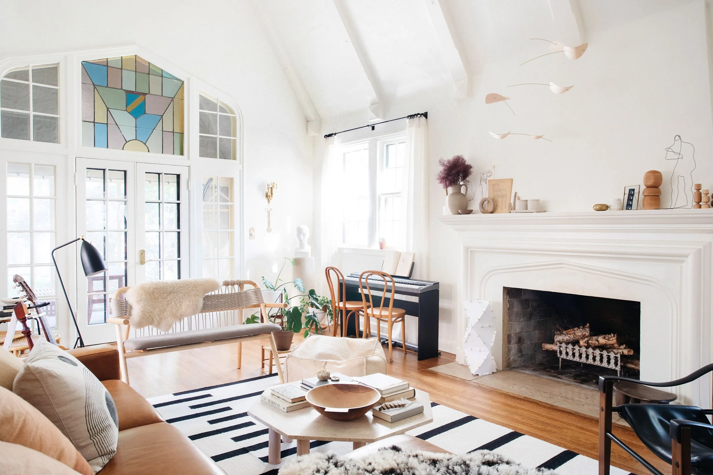
I find it best to lean into the architecture of the space as much as possible. But that doesn’t mean a vaulted room cannot be dark either.
Christopher Patrick Interiors
Choices choices! For my own sanity though, if I’m designing a home from top to bottom, I start with the architecture and then the light source. If a room gets lots of Southern light, take advantage of that and lean into a lighter palette. If it is a Northern facing room, I lean into the darker and/or warmer palettes. Believe me, you do not want to fight with the Northern gray light when it comes to color. So far, with my own battles, it is 6-0 North facing room and my desire to paint it some fun color like neon yellow.
So what do you do if you have a very small/enclosed entrance? Why paint it some dark delicious color, of course! Remember this mantra: “dark, light, dark, light, dark.” Think of the feeling you get when you’ve been out walking outside and you suddenly find yourself in the shade of some colossal tree. It is the most wonderful sensation to go from feeling overexposed and then suddenly very, very safe and hidden. It is chance for your brain to relax and transition. The same goes with your home. If you are blessed with a cozy entrance, go with it. Your guests and your brain — and most importantly, yourself — will think it’s rad.

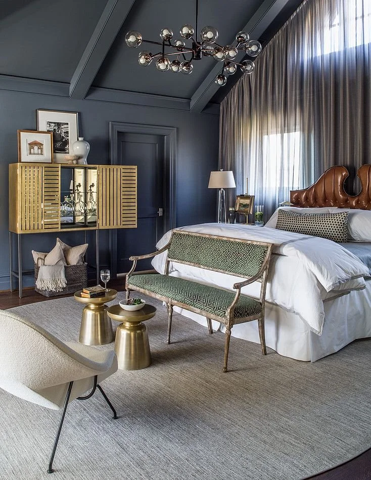
Domino Magazine - Kim Johnson
Now that we have the entrance nailed down, what about the adjoining rooms? Repeat the mantra, O Grasshopper: “Light, dark, light, dark.” See example above!
In my own home, I go from this:
To this:
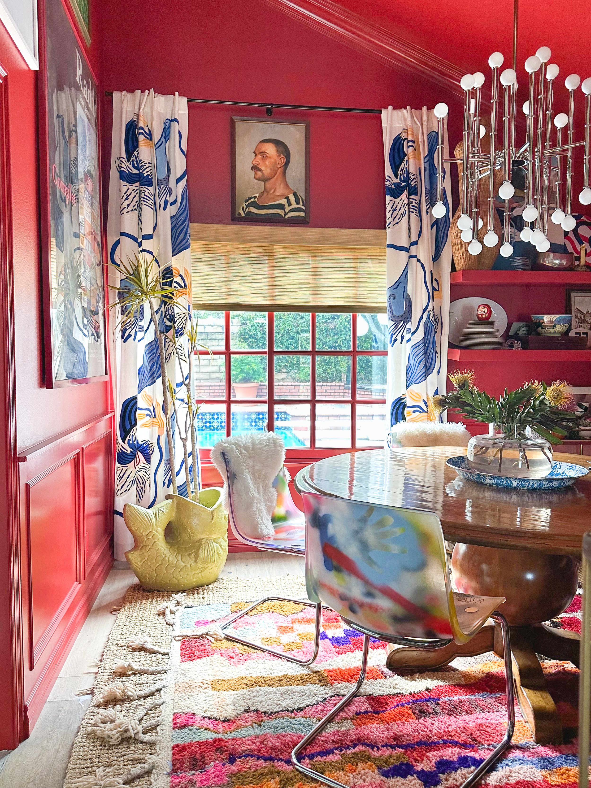
While not exactly dark per se… it certainly is extremely warm and cozy in the Red Red Wine Dining Room. When one enters this room, shoulders drop. It tells the visitor that this room is special and different from the other rooms. It tells you what to do, which is sit down and relax and conversate.
Flow is about breaking up spaces and defining them just as much as creating cohesion. Think of a fun house. You’re always excited to see the next setup filled with surprises. If it were all just one room still filled with the same contraptions, there would be no “fun.” It’s about setting mood.
Peanut Butter Jelly Time
I did that for you — now Enya has some ear worm competition.
But that brings me to the next method to my madness. And a really stupid acronym.
P = Pattern
Butter = Bold Color
Jelly = Just White
I know. It’s stupid. But you will remember it. What does it all mean? Let’s take a look at Kim Johnson’s home again:
Do you see it? No? Let’s try it again:

When I figured this out, it was like all the little numbers in the matrix started to form sentences and say “Happy Birthday, you beautiful genius!” It was epic.
Sure there have been blogs and posts about creating flow with color, but nothing and no one really broke it down to me in a simple yet EXTREMELY flexible method. Even if your style is way more subdued than mine, you can still use this method. Sure I love all wallpaper all the time, but for me again I will reiterate: I don’t just want cool stuff on my walls. I want to create an inviting space.
In my own home, this is how the acronym plays out:

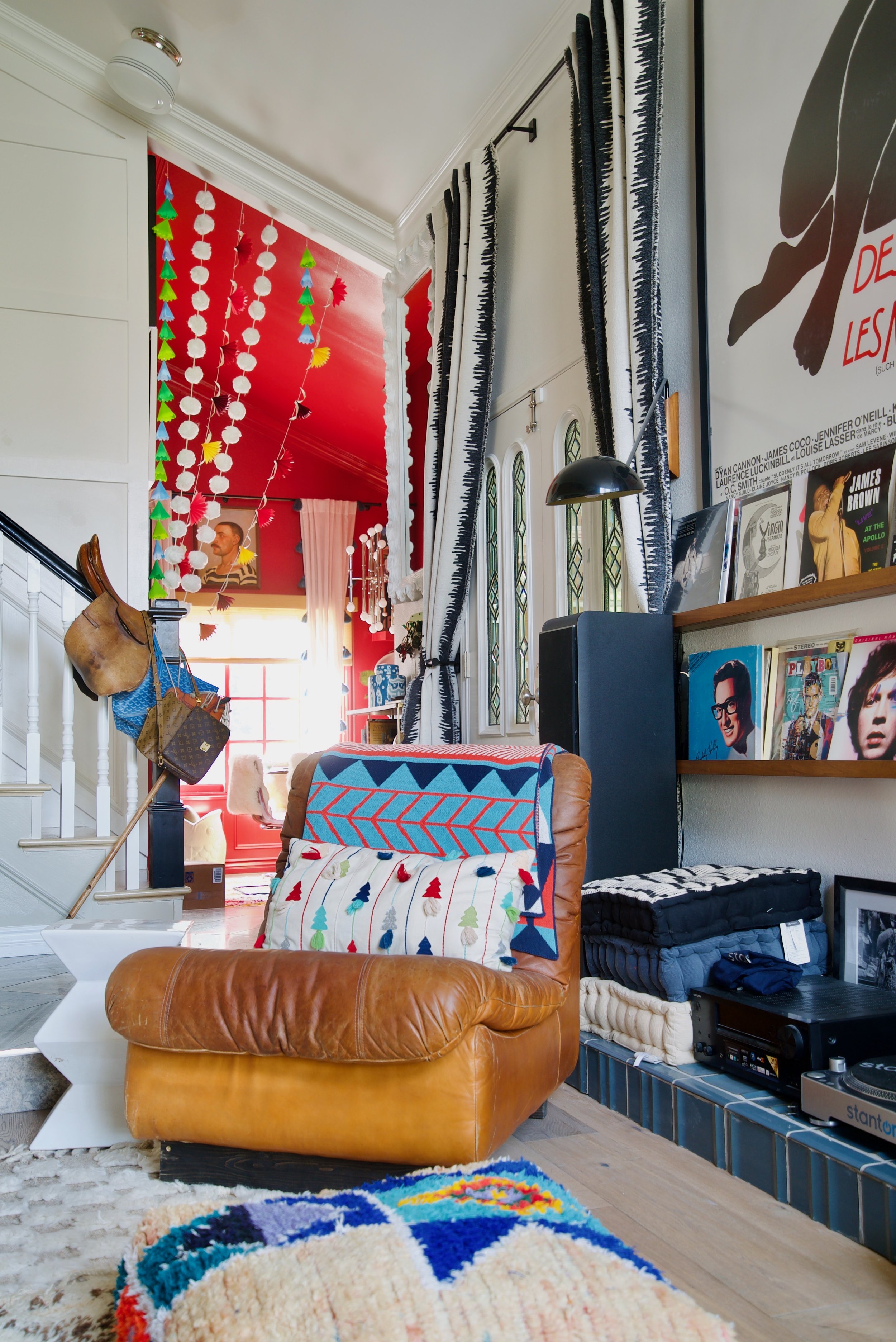
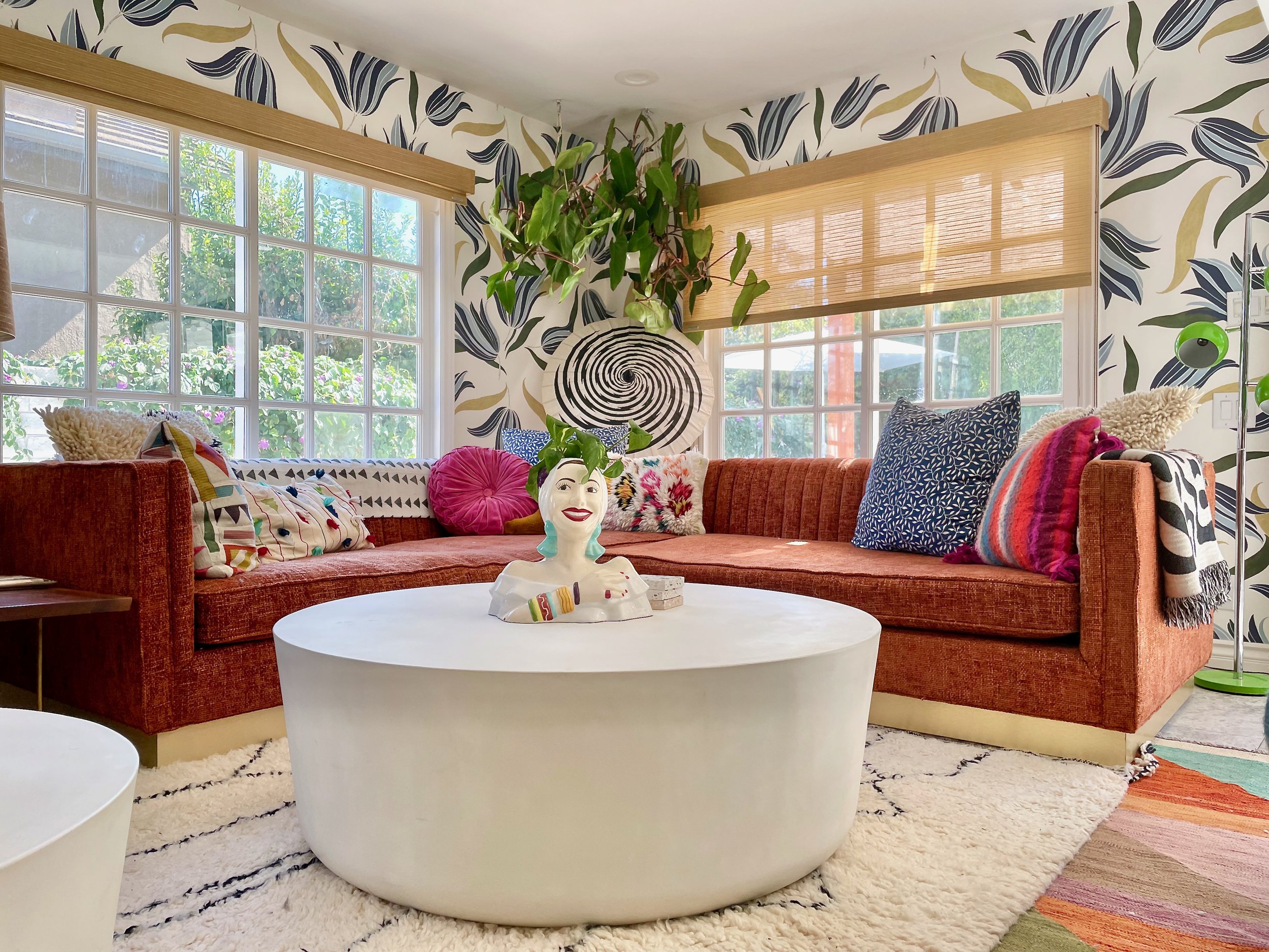
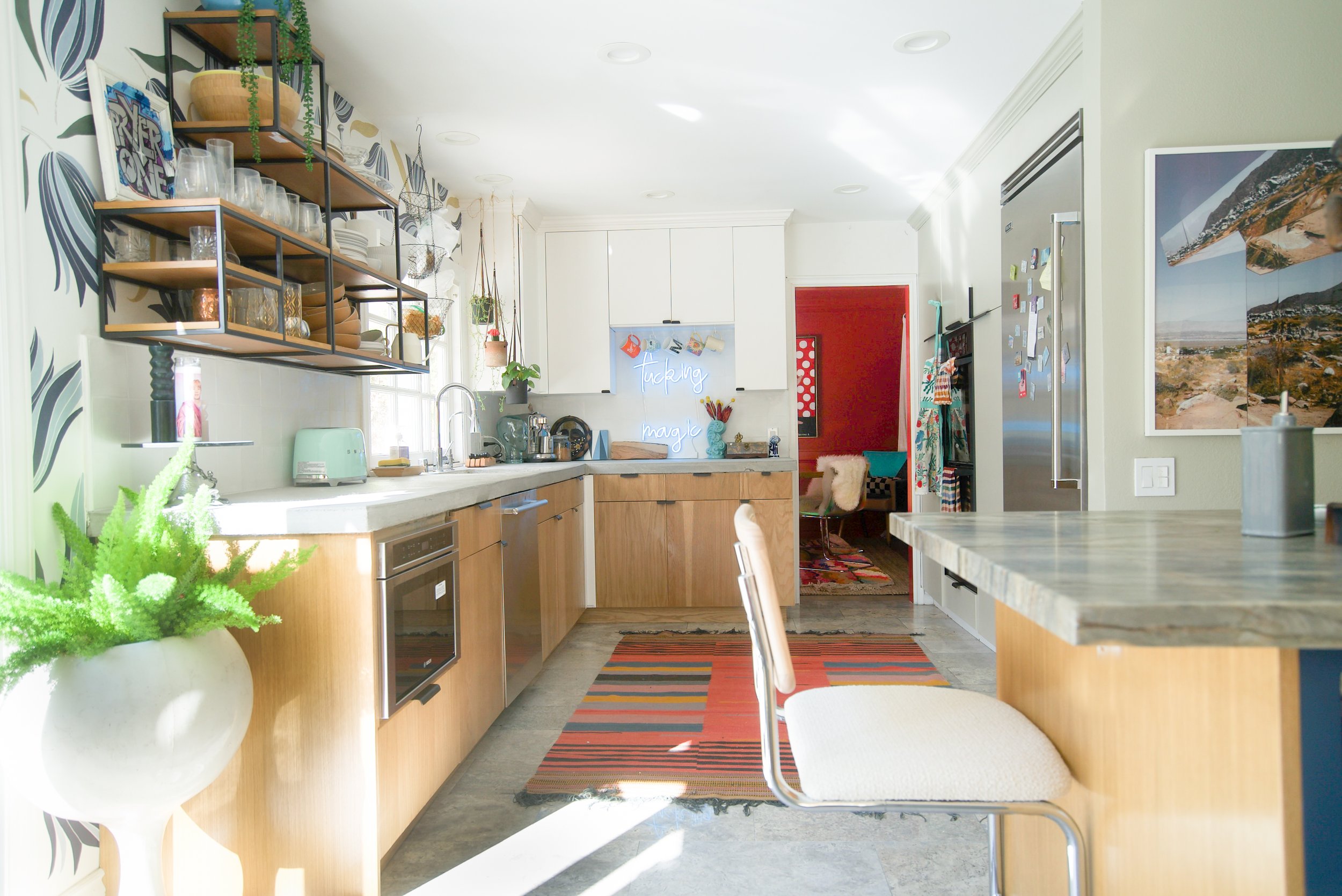

It’s like a little “choose your own adventure”. First I start off with my JUST WHITE vaulted living room. From there you can either choose to go into the Red Red Wine Dining Room OR the Patterned Abnormals Anonymous wallpaper TV room/Kitchen. From the patterned kitchen, you enter into the Bold Color dining room. Sure you can have two Just Whites or two Patterns next to each other, but then they will be treated as one room. You can even have two bold colors next to each other, like royal purple and chartreuse if you really really want. However, from personal experience, I know that I like to give the eye a little bit of a break in between.
Now that you have the knowledge, go on other home tours. See which ones employ this trick. It’s like the matrix, I swear. Once you know, the whole world changes. You will know kung fu.
But wait there’s more…
If you’re a color lover (or even if you just like grey and white and beige), this next step is ABSOLUTELY CRUCIAL to creating flow: make sure you repeat colors in each room, especially if they are connected or can be seen.
Let’s go back to my favorite outside example:
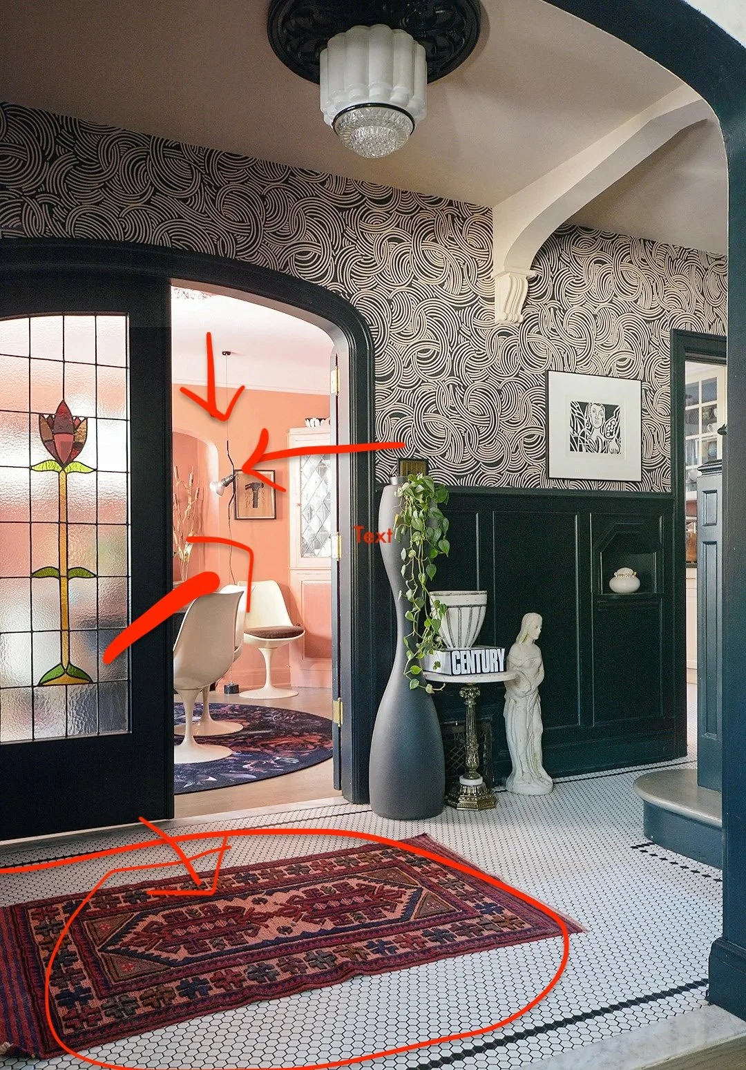
Or even my own house:
You need that little bit of bold color, whichever you choose, in the rug. And what would be even cooler is if the rug also incorporated the colors from the room it’s currently in. This can be done with anything — rugs, art, books, planters, ANYTHING — so if you feel like one room doesn’t speak to the other, then throw a colorful rug in there with the same colors and voila! Instant cohesion.
And now for your listening enjoyment… DJ Melly Mel and the new Peanut Butter Enya drop. It’s possibly the worst song I’ve ever heard but it kind of grows on you.

Hi! I’m Melanie Thomas, a reformed house flipper-turned-maximalist interior artist…
Search my posts!
my latest ig post