failure is an option
To err is human. To err in interior design is expensive. Chances are, if you're a home design pioneer and like to take chances, you have made a ton of mistakes. There are the obvious mistakes like not measuring and not testing paint colors in the actual room, but there are the other mistakes. The "What was I thinking?" and "Did I take it too far?" mistakes that make you second guess your bold choices and go back to square one.
I have made a ton of these. Any creative endeavor is fraught full of doubt... the anxious running back and forth between rooms, pictures, moodboards and shoving those things in my husband's face, demanding his opinion and then promptly disagreeing with him. (I love you, honey!). It's exhilarating to have a vision, but vision comes with years of gut-churning, eye-wateringly intense decision making. It's ok to make mistakes, because that is what leads you to the unexpected. But here are a few mistakes you definitely want to AVOID and how to deal with them.
i am rebranding mistakes as lessons, by the way. So this is my '“year of lessons”.
re-contextualize old items
Okay, so it isn't SO bad. Even now, I'm debating if this was a bad decision at all. And lucky me, I can easily take this rug and put it somewhere else. I never much cared for this rug before, either, since I typically did not decorate with those colors. Red? Never! Green? Maybe. Why then did I buy it? Besides being a serial online shopper and kilim rugs being trendy at the time, I literally bought it because it has pink in it.
When I first bought this house, I had a very clear idea of what I wanted to do. I was going to keep it simple and classy, black and white and textures and I was going to use sisal predominantly throughout the house. This rug did not fit into the "vision", and I definitely felt it was a bit like a winter wearing burnt orange. YUCK.
But after a few months of living with it in my space, I have come to appreciate it's "ugly" charms, much like the titular character of Anne of Green Gables (I have shamelessly binged three seasons of Anne with an "E" on Netflix and highly recommend for those trying to get some innocence back in their lives). And now I have even gone one step further: it stands as the inspiration for the rest of my house. I love the cold, colorless floors set against its earthy tones. It's a juxtaposition I have come to seek out: "earthiness mixed with classic refinement." Now I wouldn't replace it for the world! And at least it's not boring.
Lesson learned: there's a reason why you bought something in the first place. Live with it in the space before you toss. You might learn to appreciate it!
too bold, too quickly
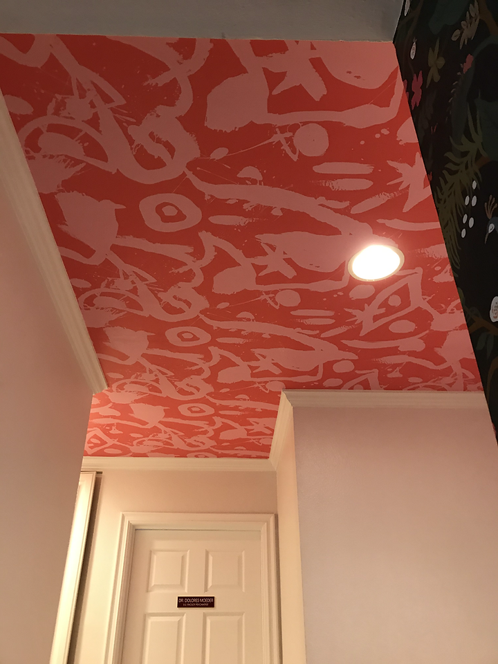
First let me address the wallpaper:
"Lovely persimmon-hued wallpaper, I love you and will never regret having you. I will defend you until my dying day."
Now that I have that out of the way, I can admit I fell in love too quickly with this paper and could not get it out of my mind. I just had one vision and I wanted it up on my ceiling RIGHT NOW. However, it was definitely a limiting decision and an early one at that.
With the wallpaper in place, it dictates the direction of the surrounding rooms and the colors I will use there. This will force me to give up on some additional design choices that I would have made had I not gone so loud here. The guest bedroom, in particular, will now be harder to figure out.
It also means I cannot do anything else loud in the hallway or subsequent rooms since I don't want anything competing for the title of Biggest Moment in my house. That is not to say there will not be other "moments". And what if I come across another wallpaper or color that I love even more? What then? To the scrapheap?
However, there was no way I was not going to use the wallpaper in the hallway. And as for trying to design the adjacent bedrooms, that was always part of the challenge. It actually eliminates some of my choices, and I will be forced to get creative while also excite my own personal artistic endeavors.
Lesson learned: If something feels right, go with it even if you paint yourself into a corner. Your creativity will lead you to solutions to get out of it and you will feel greater sense of accomplishment than if you played it "safe".
playing it safe
What's an even bigger mistake than going too bold, then? Playing it safe, in my opinion.
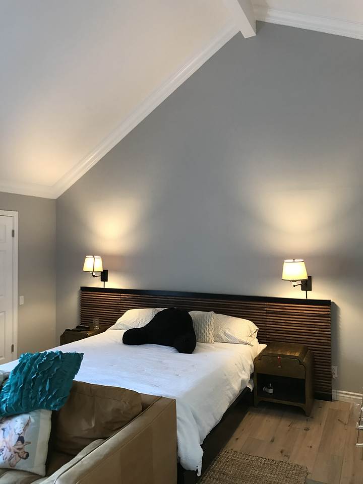
The photo here represents my bedroom in its current state. And there is nothing wrong with it. I chose a color that I like before from my old house and it's a very pretty soft grey. BOOOOOORING.
While I want my bedroom to be a serene place of rest, the designer in me yearns for something more romantic. Something intentional and artistic and mesmerizing. Grey aint gonna cut it. And even though I am disappointed in the result right now, I can't bring myself to paint it.
So then I must resort to sexy-ing up this dull hue. How can I make this gray sing so that it is no longer just some paint on a wall, but work cohesively with the scheme I've worked out in my head? Indeed, it will take some brain power and some hero Pinterest posts to coax out the vision. But I definitely have some tricks up my sleeve.
Lesson learned: Safe choices can often be the backdrop for creative discoveries. After all, all paintings start out as blank canvases.
RELYING TOO MUCH ON RULES
As you can tell already, I'm kinda making this stuff up as I go along. At least, it may appear so. But I didn't get here by happenstance. I read a great many blogs and books and took coarses and basically spend every waking moment looking at Pinterest. And I have designed many spaces, some with great success and some deleted and forgotten forever on on old laptop somewhere. I can tell you there are definitely rules out there and I do my best to abide by them. Design mistakes are costly and time consuming. Yes I might say, "it's just paint", but who wants to spend weekend upon weekend repainting a room? It is tedious work and aren't we meant to enjoy our homes? And not constantly changing and upgrading them?
That being said, my favorite thing in the world is to break rules and make things work despite it. As I mentioned earlier, because of my bold persimmon wallpaper, I will now have to resort to painting my teeny-tiny guest bedroom a color EVERY DESIGNER UNDER THE SUN HAS BANNED FROM SMALL BEDROOMS. Or I just keep it white. But where's the fun in that?
In other words, stay tuned for my GUEST BEDROOM REVEAL. I hope hope hope I can pull it off and set the design world ABLAZE with excitement!
Lesson learned: know the rules so you can break them.


