How to pick art: part 2
Hello! I've been putting off my blogging duties this weekend - I've been experiencing major migraines and just couldn't look at another screen. Plus, my keyboard is not working so typing has become even more difficult! But duties call and I can't leave you hanging on my next installment on how to pick art for your home. ICYMI, here is my first lesson:
https://www.melaniethomasdesign.com/post/how-to-pick-art-the-basics
My next lesson is in
SIZE
The first way to narrow down the choices is to select the desired size of the piece you're looking to source. I often break down what type of art and what size based on each room. There are a few go-to configurations you can use to vary up the scale and vibe of each wall so that it doesn't appear too cluttered or monotonous.
Below is an example of the ideal combination of art placement to create a harmonious, balanced room:
Photographed by Anna-Alexia Basile for Lonny.
In the example above, the room works because the interior designers, Lara Apponyi & Michael Woodcock, used a combination of tapestry, large pieces and a clever gallery wall to play with the space. Your eye is drawn to first to the yellow daybed, then the red tapestry, then along the line of square mysterious shapes, then the solid lilac painting in the corner. Each piece might be a little boring on its own, but together, they amplify and echo each other so that the room tells a story. A beautiful story.
ONE BIG ART PIECE
For this type of piece, you will need something almost as big as the wall it will go on. You will also want something that is generally the same shape. So, if you have a vertical wall, you will want a vertical art piece and so on.
This type also tends to be very expensive, so I recommend finding art that is already framed, or does not need a frame.
GALLERY WALL
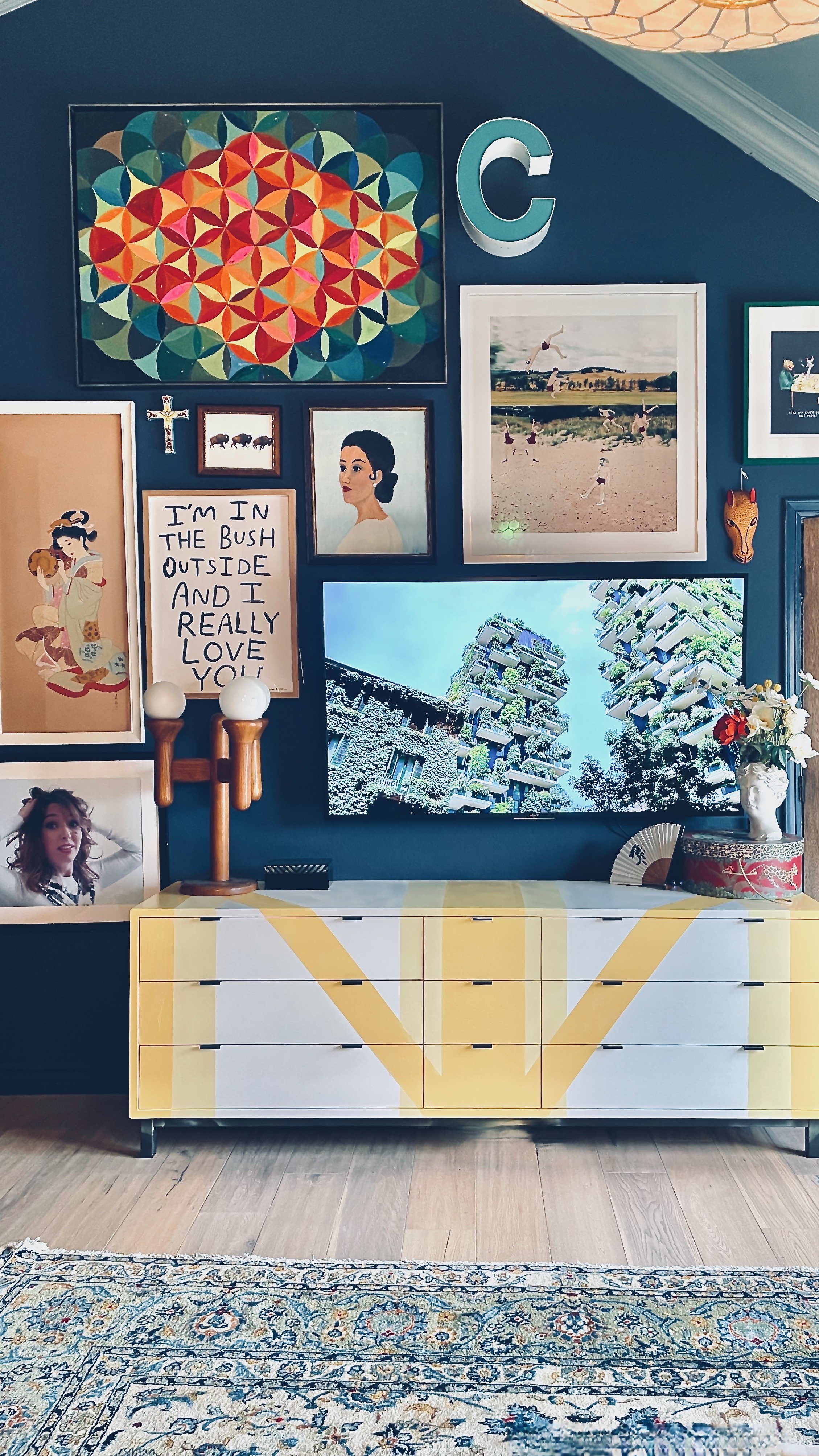
Ah, the gallery wall... For a gallery wall, you will need art of varying sizes, orientations and shapes. Pay special close attention to unusually shaped art and collectibles to achieve the ultimate gallery wall. See so many examples on the internet, but here is my own:
Let's break it down! The hero piece below is the chromatic painting. Then I separated that piece from the next larger piece with an oblong brown portrait and a mask. I brought the red back with the red frame around the fun cartoonish print, and chose and equally bright blue photograph. Notice how I used the couch and the two lamps as the structure below. I love using structural elements to design around.
My rule of thumb for a gallery wall is to start with a medium-sized piece as the hero. Then I vary the size, shape and orientation along with color and layer in each piece. I like a mixture of wall sculptures/masks, photography, prints, paintings, and text. The idea is to draw the eye in with the big piece, then let it wander along the rest of the gallery wall.
There are no rules when it comes to a gallery wall but I can tell you that some consistency is important. That can mean selecting art the same size, the same colors, the same frames, etc. As always, balance is key.
DIPTYCHS AND TRIPTYCHS
Diptychs and triptychs are a great way to create a large piece out of smaller framed art and is often cheaper.
Source: Natural Curiosities
TAPESTRIES & RUGS
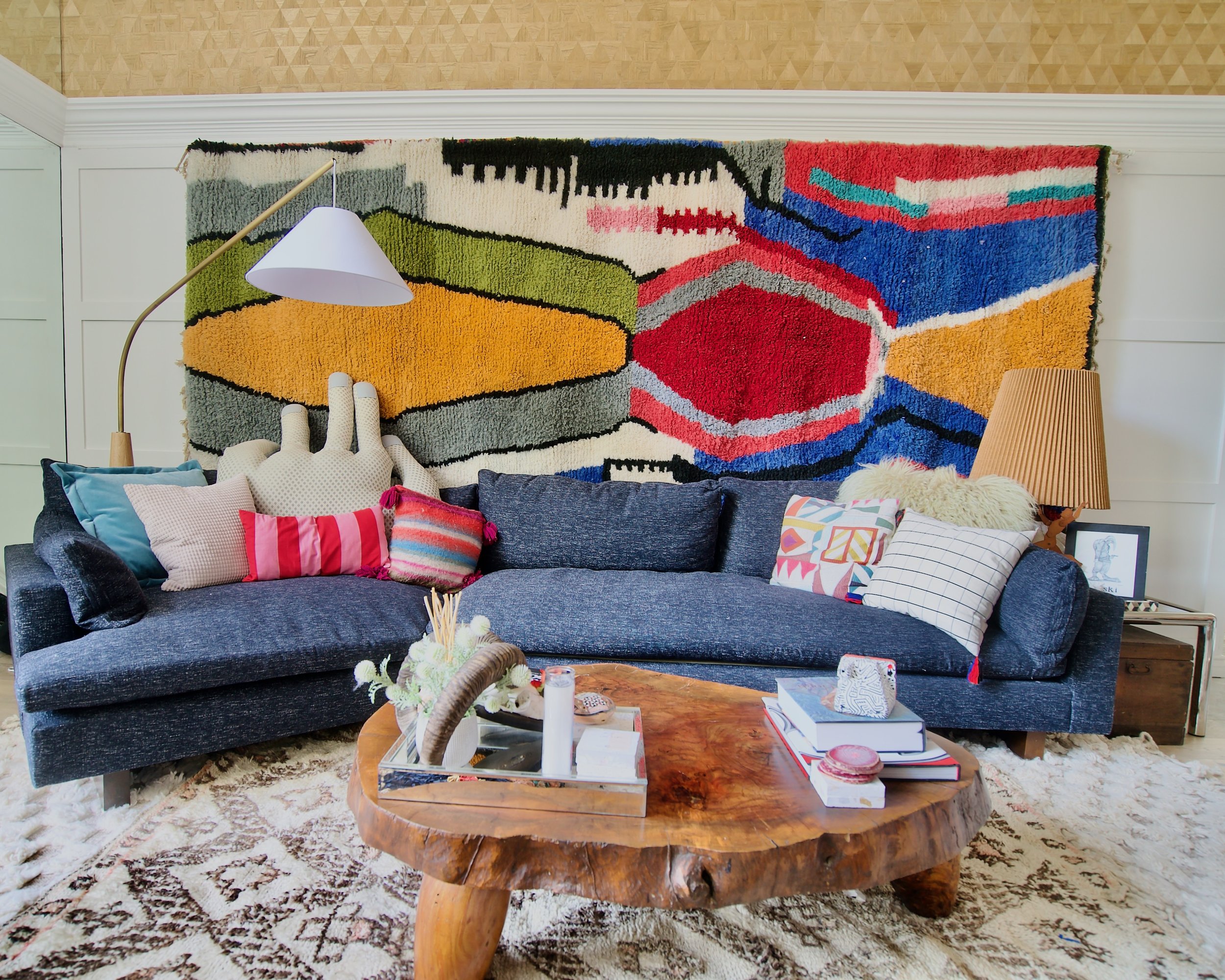
Tapestries have definitely had a resurgence in the last few years. Even medieval tapestries are getting in on the game! Tapestries are a great way to introduce texture and material and can count toward being a big piece of art.
TINY ART
I'm just getting hip to the tiny art movement, but I'm on board already! The great news is that tiny art can go anywhere, even on a huge wall. Tiny art lets one play with scale and expectation. For best impact, I would place a small piece of art above a door, under a window or even at the end of a hall. Sorry I can't find any images of the phenomenon, but try it out in your own home and share with me and I will update this post with your credit!
So there you have it! Now that you have a size in mind for your art piece, plug in the numbers and head over to your favorite resource to start searching!


