
Color Rebellion: Break Free from the 60-30-10 Rule in Interior Design
Hey there, fellow color rebels!
Feeling a bit boxed in by the conventional wisdom of the 60-30-10 color rule in interior design? Well, you're not alone. I’m a little bit tired of seeing this everywhere in every single blog, post, etc. I get it — you want simple rules that help keep your home from looking like a dumpster fire. But this is my hot take — by obsessively following this color rule, you might actually make your home look bad and boring, and that I just can’t abide.
It's time to break free from the shackles of tradition and infuse your spaces with some much-needed vibrancy and personality.
So, what's the deal with this 60-30-10 rule anyway? It's a guideline suggesting that you allocate 60% of a room's color to a dominant hue, 30% to a secondary hue, and 10% to an accent color.

:(
Sure, it can create a harmonious color scheme, but where's the fun in that? It has a tendency to be matchy-matchy and that’s the opposite of cool and vibrant.
Let's shake things up a bit, shall we?
examples of how to ditch the 60-30-10 rule
Go Monochromatic Madness
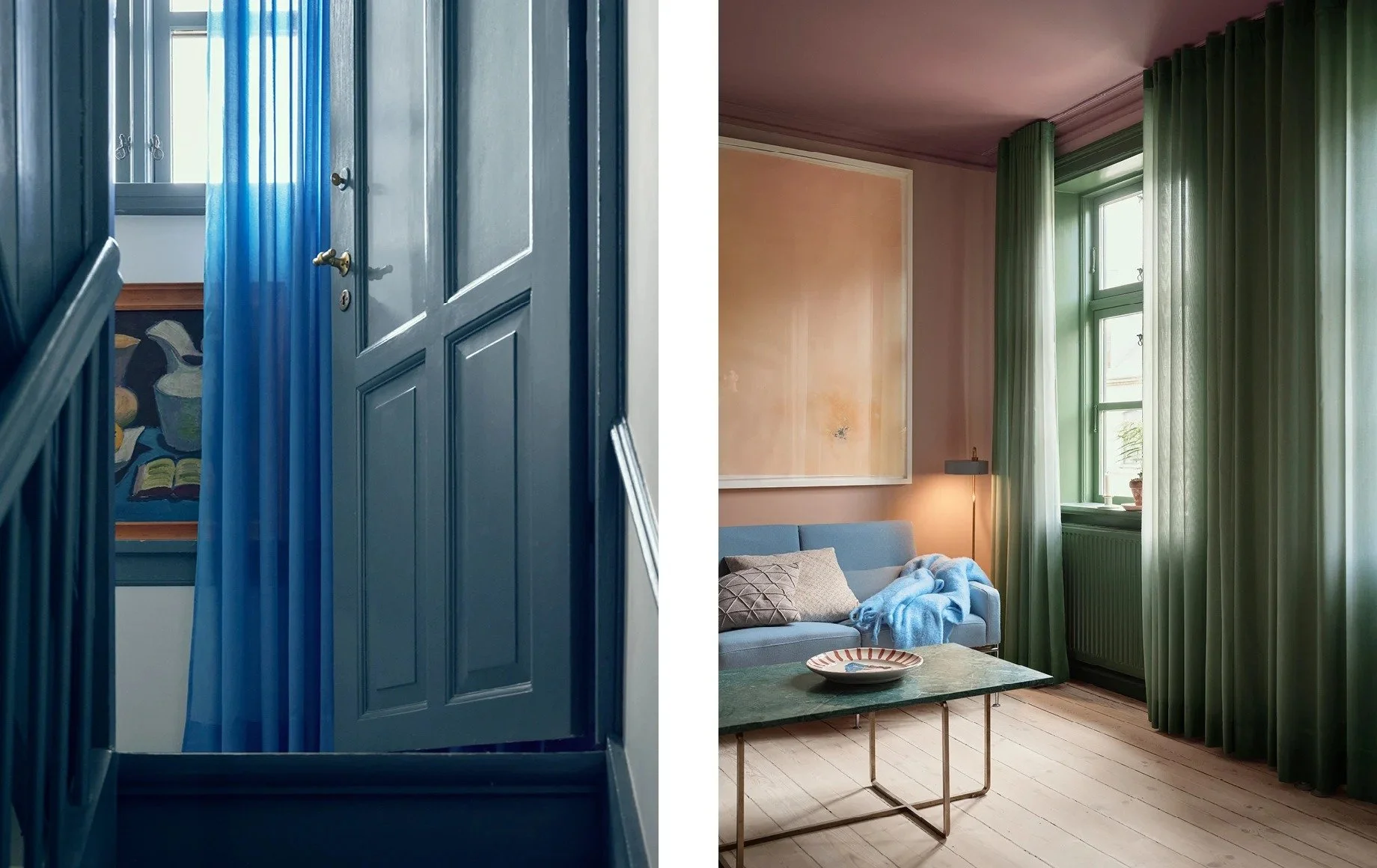
Who says you need three distinct colors? Embrace the beauty of monochromatic schemes by using varying shades, tints, and tones of a single color. Picture a living room adorned in different shades of blue – from deep navy to serene sky blue – creating a soothing and cohesive ambiance without the need for additional hues.

Dare to be Dramatic with Dominance
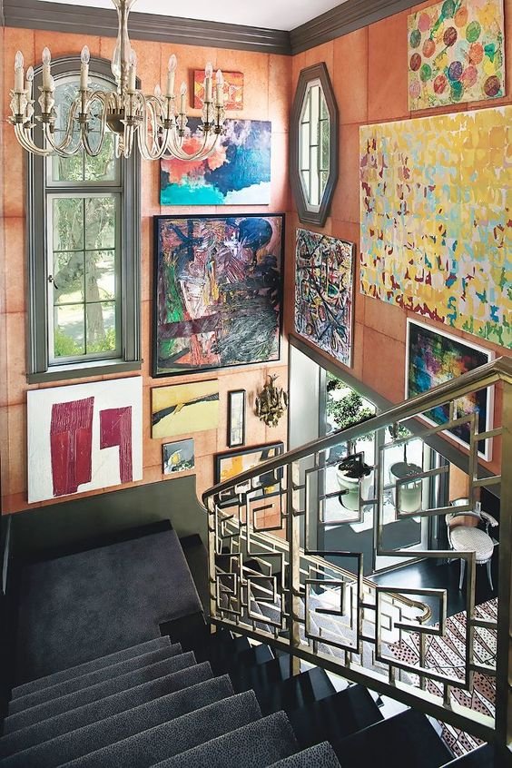
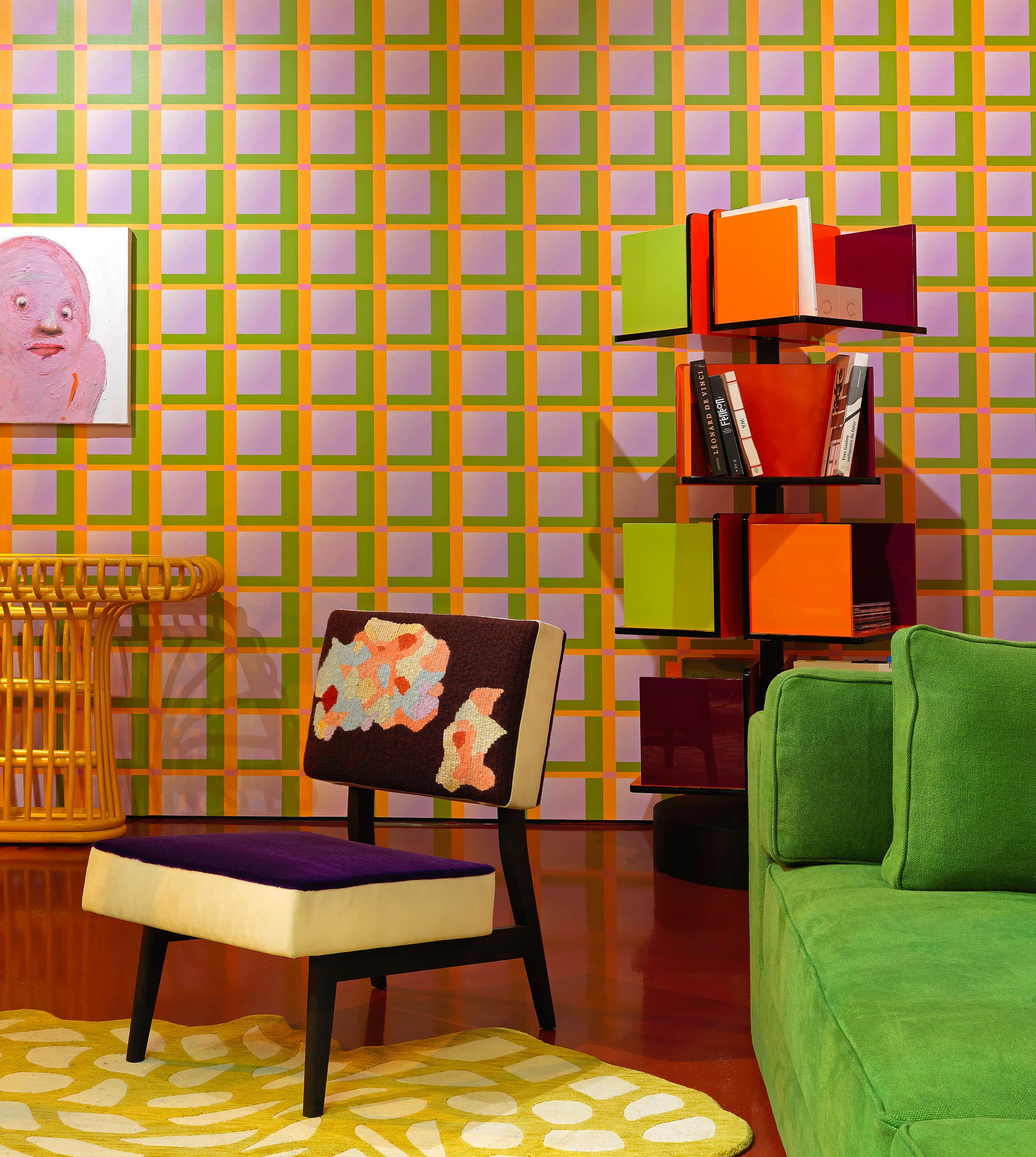
Instead of relegating one color to a mere 60% dominance, why not let multiple colors share the spotlight equally? Experiment with bold patterns, eclectic furnishings, and contrasting textures to create a visually stimulating environment where no single color takes center stage.

The Power of the 10% Accent
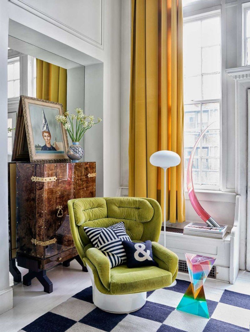
Who says accents have to be subtle? Break the mold by incorporating a splash of color that demands attention. Whether it's a vibrant piece of furniture, an eye-catching piece of artwork, or an unexpected pop of color in unexpected places like door frames or ceilings, let your accent color steal the show and defy expectations.

Go Bold with Patterns and Prints
Why limit yourself to solid colors when you can mix and match patterns with reckless abandon? Break out the florals, stripes, polka dots, and geometrics, and let your eclectic spirit shine. By layering different prints in unexpected ways, you can achieve a dynamic and visually stimulating look that defies traditional color ratios.
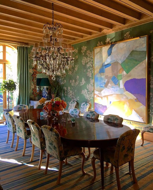
Example: Picture a dining room adorned with a riot of vibrant patterns – a striped rug, floral wallpaper, and geometric upholstered chairs. Despite the lack of a strict color scheme, the space feels cohesive and inviting thanks to the playful interplay of textures and motifs.

Experiment with Color Blocking
Who says you have to confine each color to its designated percentage? Color blocking allows you to divide your space into bold, graphic sections, creating visual interest and drama. Mix and match contrasting hues to make a bold statement that's anything but ordinary.
Example: Visualize a bedroom with a daring color-blocked wall – one half painted a rich burgundy, the other a deep navy blue. The two colors intersect at a diagonal, creating a striking focal point that instantly elevates the room's design.Several interior designers are known for their bold and innovative approach to color, often deviating from traditional rules like the 60-30-10 guideline
stand on the shoulders of giants
Here are a few designers who are celebrated for their daring use of color and willingness to break the mold:
Kelly Wearstler: Renowned for her fearless approach to design, Kelly Wearstler is not one to shy away from vibrant hues and unexpected color combinations. Her interiors often feature bold patterns, eclectic furnishings, and a rich mix of textures, resulting in spaces that are undeniably daring and visually striking.
Jonathan Adler: With a penchant for playful sophistication, Jonathan Adler infuses his interiors with a sense of whimsy and joy. His use of color is anything but conventional, often incorporating bold pops of citrusy hues, graphic patterns, and unexpected color pairings that defy traditional norms.
Miles Redd: Known for his glamorous and theatrical interiors, Miles Redd is a master of color and pattern. His spaces are characterized by rich jewel tones, sumptuous fabrics, and a sense of opulence that transcends the ordinary. Redd isn't afraid to mix and match colors in unconventional ways, creating rooms that are as bold as they are beautiful.
India Mahdavi: Renowned for her playful and vibrant designs, India Mahdavi is celebrated for her fearless use of color. From candy-colored pastels to bold primaries, Mahdavi's interiors are a celebration of chromatic exuberance. She effortlessly blends hues from across the spectrum, resulting in spaces that are both joyful and sophisticated.
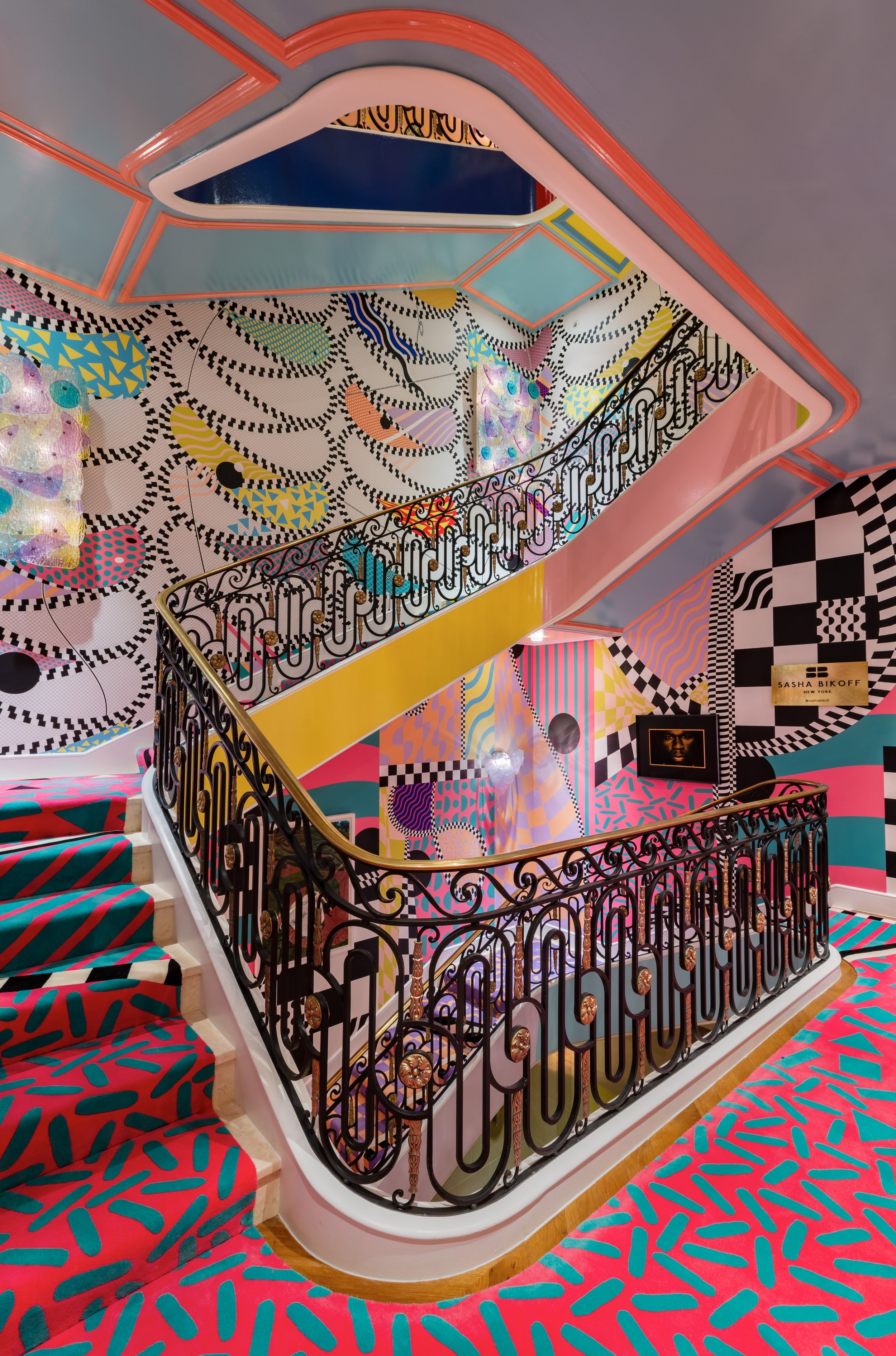
Sasha Bikoff: Sasha Bikoff is known for her eclectic and whimsical interiors that defy convention. Her designs often feature bold color combinations, unexpected juxtapositions, and a sense of irreverence that sets her apart. Bikoff's use of color is daring and imaginative, infusing her spaces with personality and panache.
These designers are just a few examples of those who embrace color fearlessly and aren't afraid to break the rules to create truly memorable interiors.
In conclusion, my fellow rule-breakers, don't be afraid to defy convention and inject your spaces with boldness, personality, and a healthy dose of color rebellion. Whether you opt for monochromatic madness, dramatic dominance, or accentuated accents, the key is to embrace your unique vision and let your creativity run wild.
So go ahead, experiment fearlessly, and remember – in the world of interior styling, there are no rules, only endless possibilities!
Stay colorful,

- The Rule-Breaking Interior Stylist

If you’re like me, you’ve had it up to here with those snooze-inducing showrooms that are more "museum" than "home". I'm flipping the script on home styling, and let me tell you, there won't be any rulebooks or tedious style history lessons involved. Just pure creativity.
Why do I rebel against the ordinary? For seven years, I meticulously crafted and refurbished homes solely for their resale value. I dwelled in a universe of beige, grey, black, and white. But in 2020, I reached my limit and gleefully abandoned all that for a fantastical realm of vibrant colors and delightful oddities. Dive deeper into my journey right here. 🌈🤹♂️🏡
My work and advice has been showcased in prestigious publications such as Architectural Digest, Better Homes and Gardens, The Zoe Report, Real Homes, and Homes & Gardens, among others.
I know that I'm not everyone's cup of tea, but then again, neither are you…