
The Pitfalls of Accent Walls
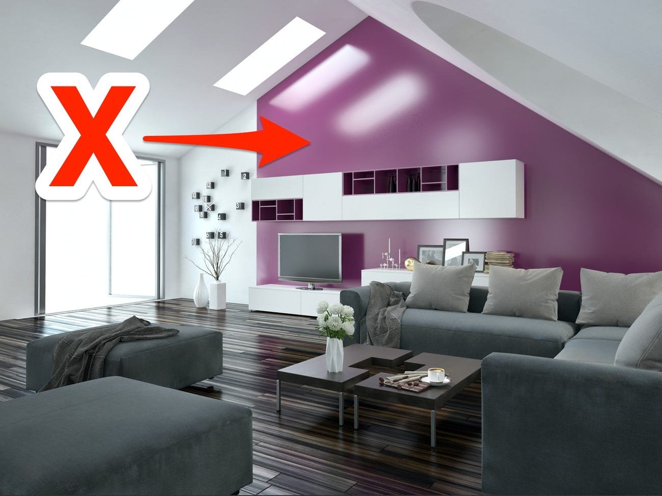
Hey there, fellow color-loving maximalist interior stylists! Today, I'm thrilled to dive deep into a topic that resonates with our vibrant souls – the art of committing to a specific color palette or striking wallpaper in our design projects, while bidding adieu to the overused accent wall trend.
After helping hundreds of people (hint: I do One Hour Design Chat Consultations that can help you with this issue), I can safely say the most common problem is commitment to color and/or pattern. People say to me: “Help! I can’t figure out why my home feels so choppy and disjointed” and behind them on the Google Meet conference call, I see a big beautiful accent wall in some wallpaper or color.
And I can imagine why: You're standing in the heart of your latest design endeavor, surrounded by an array of paint swatches and wallpaper samples, pondering which wall to infuse with your signature flair. It’s tough to commit to ONE choice, but commitment is what makes all the difference between having a home that is beautiful but choppy and a home that is spectacular and also cohesive. And committing to a color or wallpaper doesn’t mean it needs to be loud and obnoxious. It just means that your eye doesn’t have to jump all over the place to make sense of the space.
I also stress that cohesion, in my opinion, has nothing to do with matching colors and patterns, etc. In fact just the opposite. It is about bringing it all together so that it gels, but is not matchy-matchy (which is another cardinal sin IMHO).
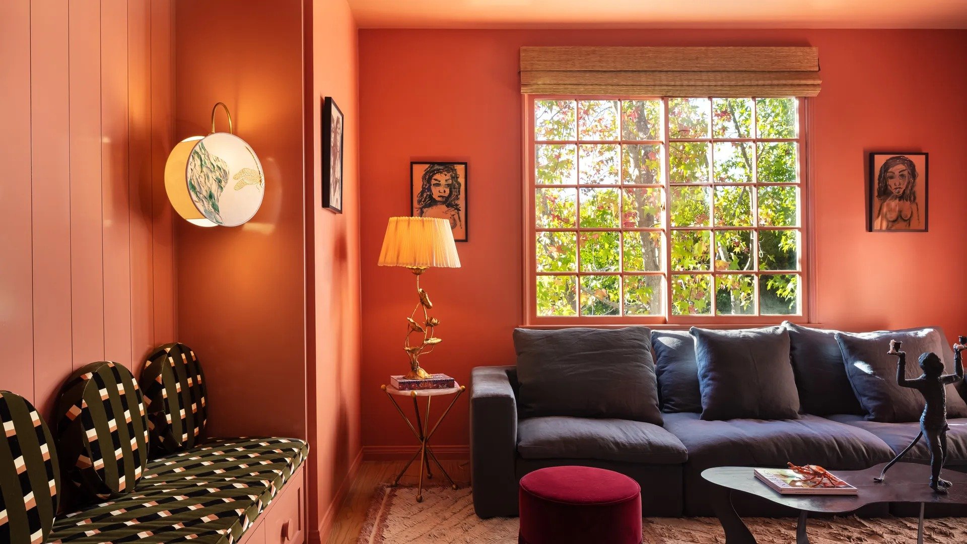
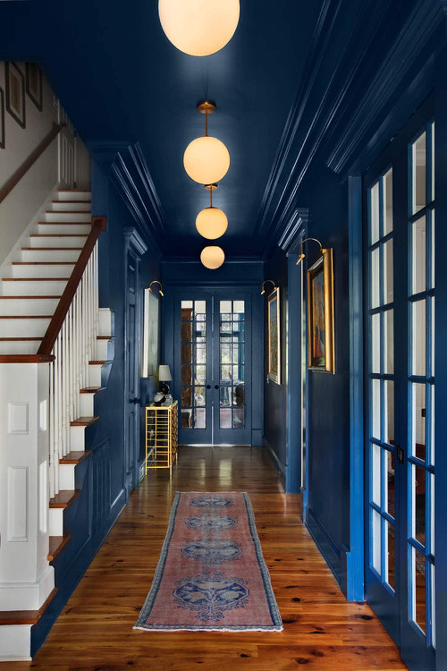
The temptation to opt for an accent wall is strong, but let me present an alternative vision: What if we commit to a cohesive explosion of color or a statement-making wallpaper that envelops the room in unison?
And, yes, I totally mean painting and/or wallpapering the ceiling, too. You want bold, right? Well, why not do it the right way?
Here's why it's an absolute game-changer:
Unifies Your Design Vision: By committing to a specific color scheme or captivating wallpaper, we lay the foundation for a harmonious visual narrative that truly speaks to our maximalist sensibilities. Each element in the space becomes a part of a cohesive story, weaving together hues and patterns in a symphony of style.
Enhances the Flow of Energy: Accent walls, while popular, can sometimes disrupt the energetic flow of a space, leaving it feeling disjointed. By extending our chosen color or wallpaper across all walls, we create a seamless flow that invites movement and exploration, amplifying the dynamic energy of the room.
Invites Depth and Dimension: While accent walls may offer a quick burst of visual interest, they often fall short in terms of creating depth and dimension. In contrast, a carefully curated color palette or captivating wallpaper can add layers of texture and intrigue to every corner of the room, inviting the eye to wander and discover.
Celebrates Versatility: Embracing a bold color scheme or striking wallpaper doesn't mean we're confined to a single look for eternity. Instead, it serves as a versatile canvas upon which we can unleash our creativity, allowing for effortless transformations and seasonal updates without the need to contend with conflicting accent walls.
So, how do we go about selecting the perfect color palette or wallpaper for our projects? Let's start by tapping into our passion for vibrant hues and bold patterns. Consider the emotions and atmosphere you wish to evoke – perhaps you're drawn to the fiery warmth of sunset tones or the whimsical charm of botanical prints. Let your instincts guide you as you infuse your space with the essence of your unique style.
Once you've found your muse, don't hold back – dive in headfirst and immerse yourself in the brilliance of your chosen colors or patterns. Embrace every inch of the room, from floor to ceiling, and revel in the transformation as your vision comes to life in a riot of color and texture.
But it's not just about visual impact – there are practical benefits to consider as well. Painting or wallpapering walls and ceilings in the same style can help disguise architectural imperfections and create a seamless backdrop for your furnishings and decor. Plus, it simplifies the design process, making it easier to choose complementary colors and patterns that enhance the overall aesthetic of your space.
But I really want an accent wall!
Instead of sticking to the safe bet of stark white walls, why not go for a lighter shade that complements your chosen hue? Picture it: that vibrant turquoise or sizzling hot pink popping against a soft, neutral backdrop. It's like giving your favorite color the spotlight it deserves while keeping things balanced and inviting.
But hey, if you're feeling extra daring, why not go all out? Imagine a room swathed in a bold black background wallpaper, with that standout color taking center stage. It's a dramatic yet undeniably stylish choice that'll make a statement like no other.
And here's a wild idea for you: turn it into a fun art moment! Get creative with patterns, textures, and unexpected color combinations. Mix and match different hues, experiment with geometric shapes, or even unleash your inner artist and paint a mural that reflects your unique style and personality.

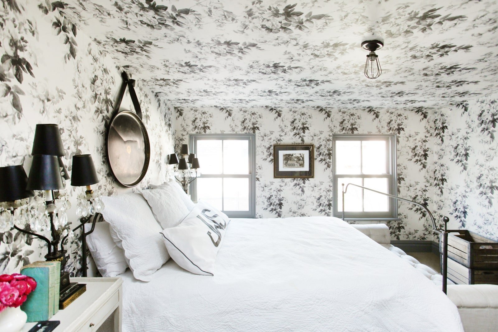
Ceiling Accent Wall
But here's the thing – rules are made to be broken, especially when it comes to creative expression.
So, why am I singling out the ceiling as the exception to the rule? Well, for starters, it's one of the largest uninterrupted surfaces in any room, offering a prime opportunity to make a statement without overwhelming the space. Plus, when done right, an accent ceiling can draw the eye upward, creating the illusion of height and adding a sense of depth to even the most compact rooms.
Now, you might be wondering: how exactly does one go about accentuating a ceiling? Fear not, my fellow design rebels, for I have two words for you: paint and wallpaper. Whether you opt for a bold hue or a striking pattern, the key is to choose something that complements the overall aesthetic of your space while adding an unexpected twist.
Let's start with paint. A fresh coat of color can instantly transform a dull ceiling into a focal point worth swooning over. Feeling adventurous? Go for a rich jewel tone like emerald green or sapphire blue to inject a dose of drama into your space. Prefer something more subdued? Opt for a soft blush pink or a calming sky blue for a subtle yet sophisticated touch.
Of course, I prefer the not-so subtle hues and can’t resist:

Design: Natalie Papier
If paint isn't your jam, fear not – wallpaper has got you covered. From geometric prints to botanical motifs, the options are endless when it comes to adorning your ceiling with patterned paper. Just imagine lounging beneath a canopy of tropical leaves or gazing up at a constellation of stars as you drift off to sleep – talk about a dreamy escape from the everyday!

photo by tessa neustadt | design by amber interiors
Of course, no design decision is without its considerations, and accent ceilings are no exception. Before taking the plunge, be sure to consider the scale of your space, the height of your ceilings, and the overall vibe you're trying to achieve. Additionally, keep in mind that while accent ceilings can add visual interest, they should complement rather than compete with the other elements in your room.
In the end, design is all about self-expression and pushing the boundaries of what's considered conventional. So, why not shake things up and give your ceiling the attention it deserves? Whether you opt for a daring paint color or a whimsical wallpaper pattern, one thing's for sure – your fifth wall will never look the same again.
So go ahead, break the rules, and let your creativity soar – after all, the sky's the limit when it comes to accent ceilings!
Happy decorating,


If you’re like me, you’ve had it up to here with those snooze-inducing showrooms that are more "museum" than "home". I'm flipping the script on home styling, and let me tell you, there won't be any rulebooks or tedious style history lessons involved. Just pure creativity.
Why do I rebel against the ordinary? For seven years, I meticulously crafted and refurbished homes solely for their resale value. I dwelled in a universe of beige, grey, black, and white. But in 2020, I reached my limit and gleefully abandoned all that for a fantastical realm of vibrant colors and delightful oddities. Dive deeper into my journey right here. 🌈🤹♂️🏡
My work and advice has been showcased in prestigious publications such as Architectural Digest, Better Homes and Gardens, The Zoe Report, Real Homes, and Homes & Gardens, among others.
I know that I'm not everyone's cup of tea, but then again, neither are you…