
art filled spaces I’m pinning right now (and how to get the look for a little less)
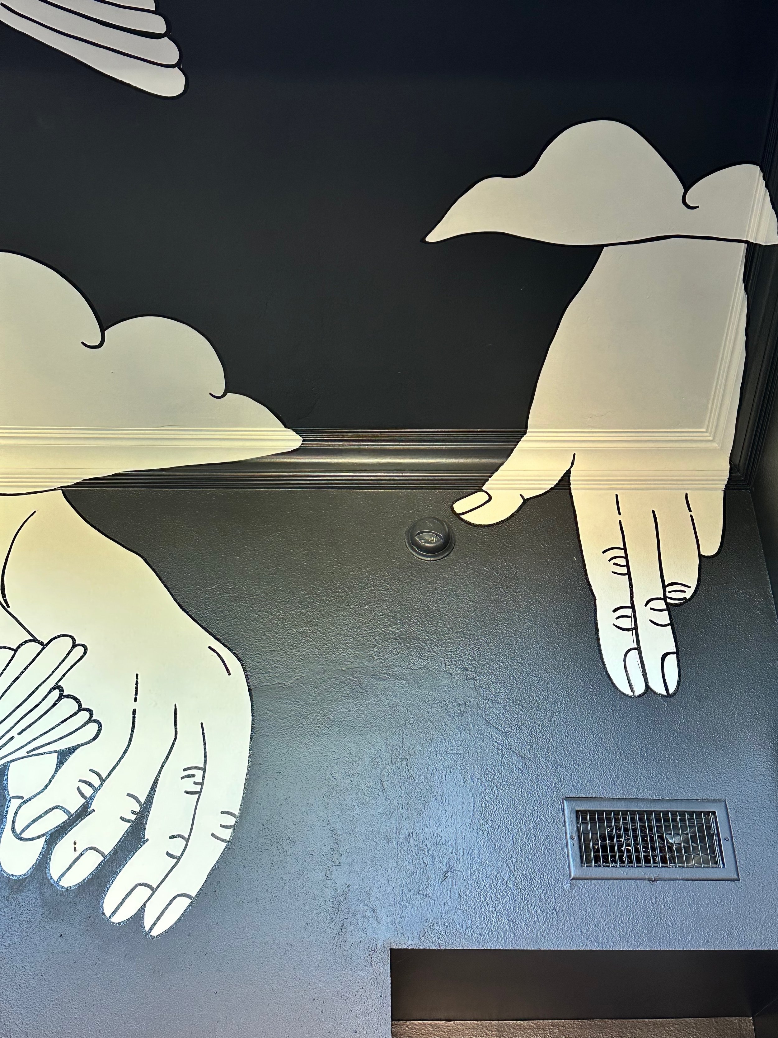
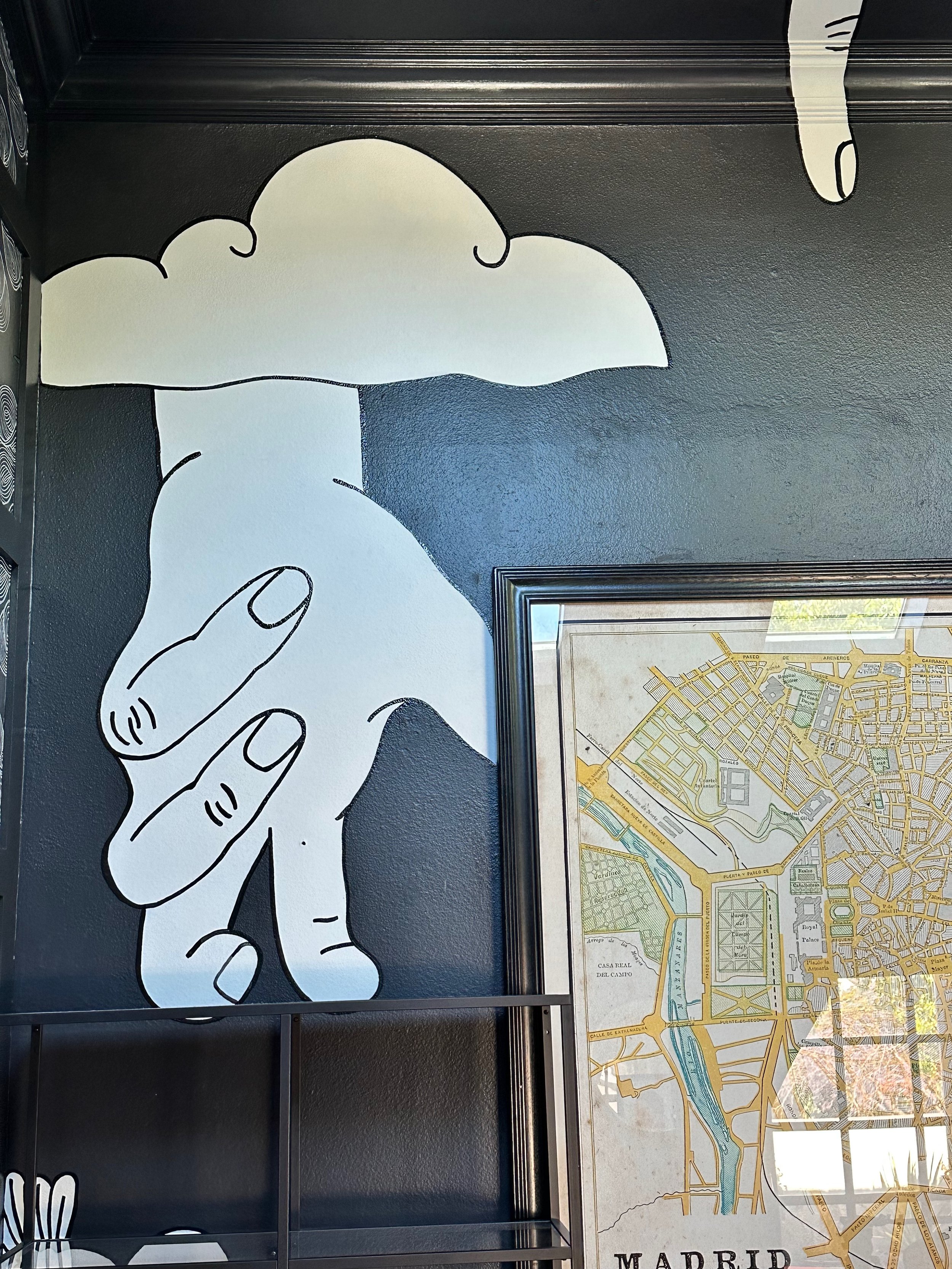
Guess what?! I’m redoing my bedroom once again. Like many who take chances and try new stuff on their home, I liked what I did in the beginning but felt it was lacking a little. You can check out my original posts here: One Room Challenge. My heart was in the right place but ultimately the black was too overwhelming in a north facing room. So… I contacted Kailee Collar and got to work on a mural vs. painting the entire room a different color:
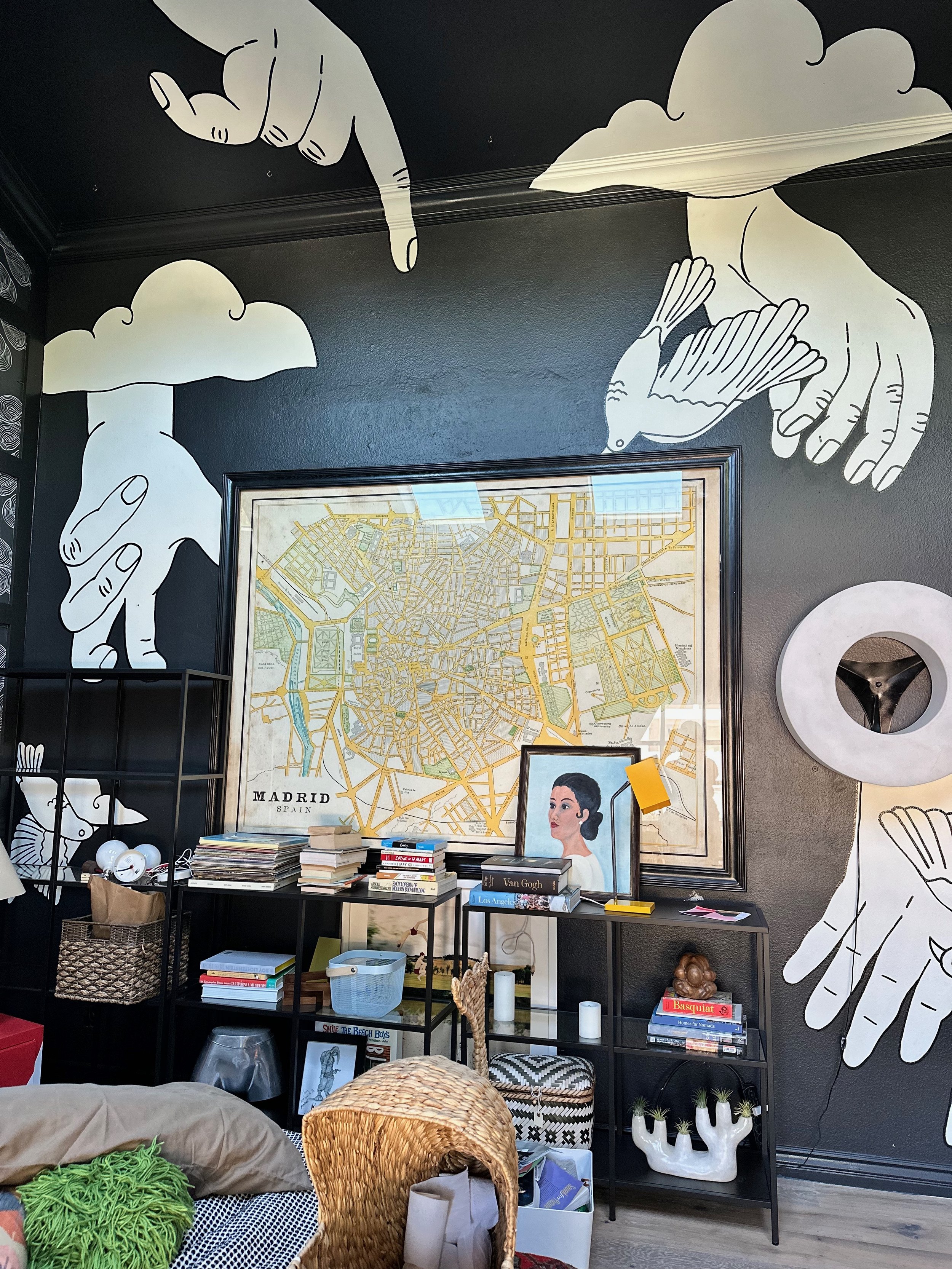
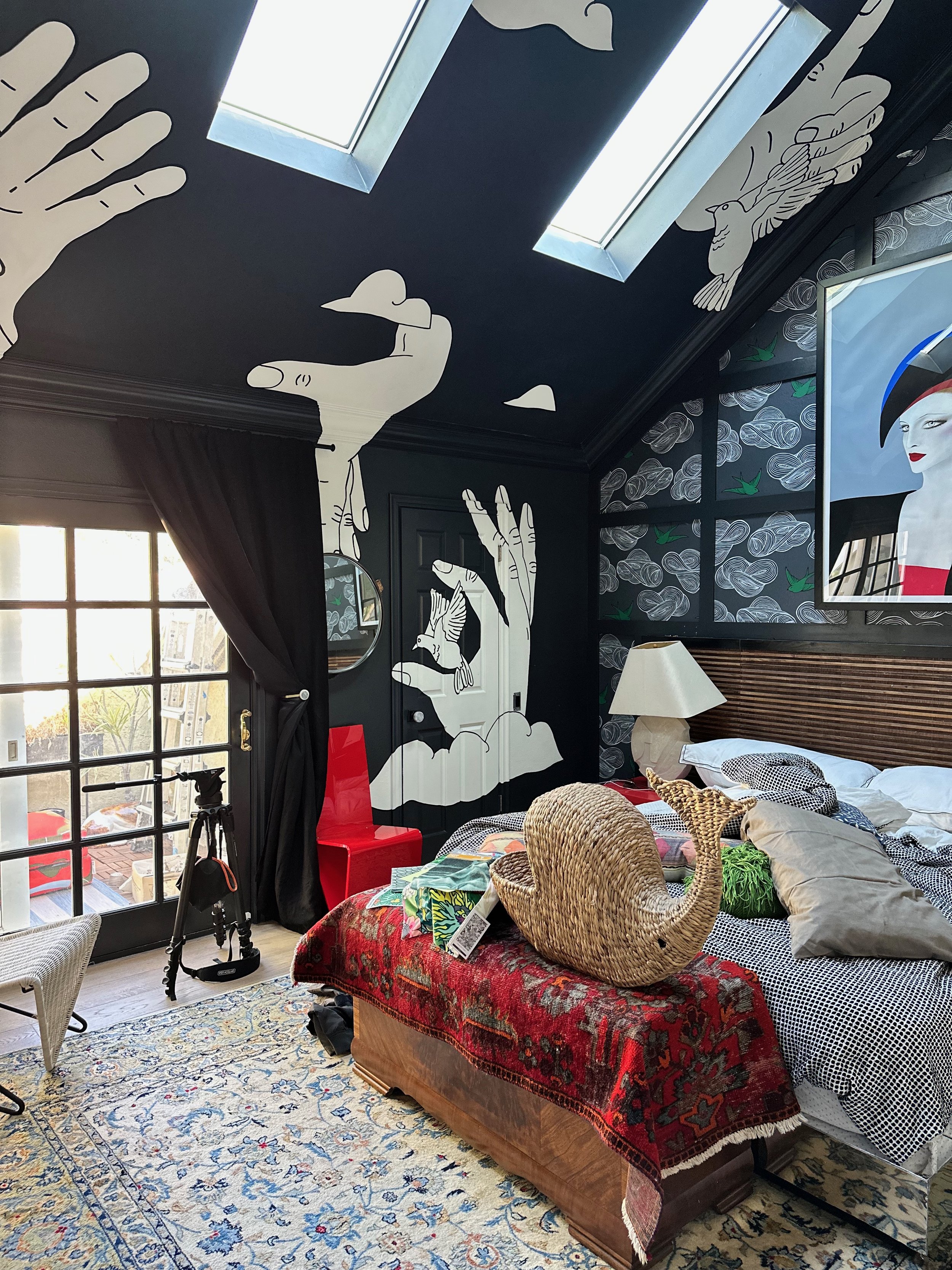
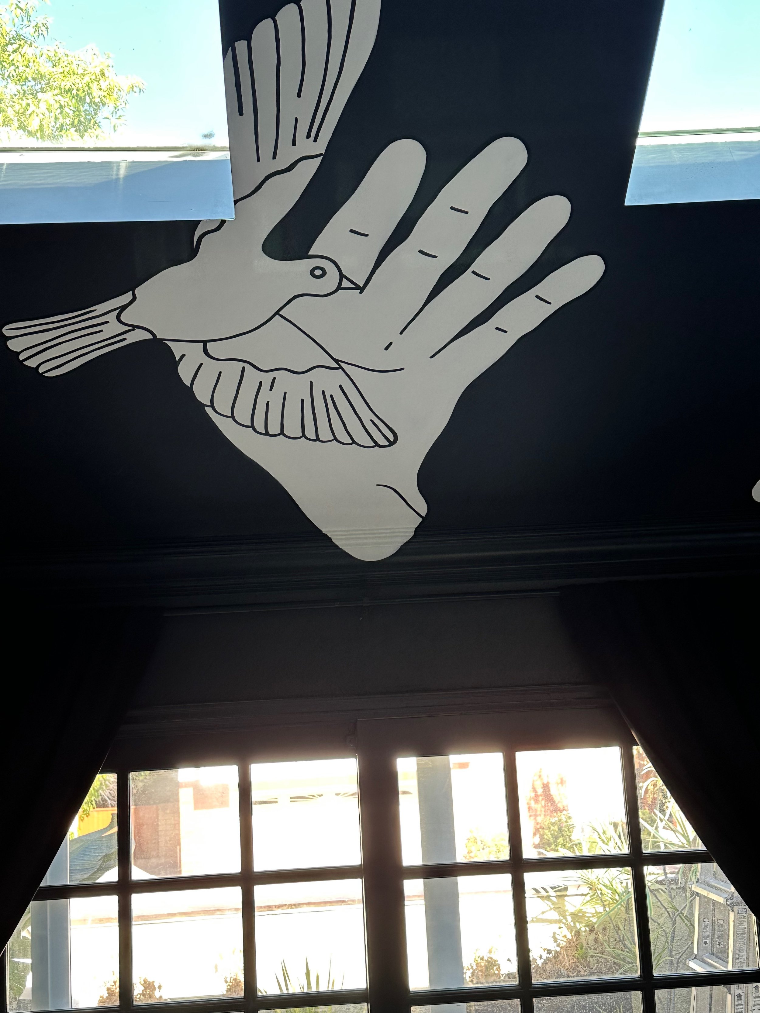
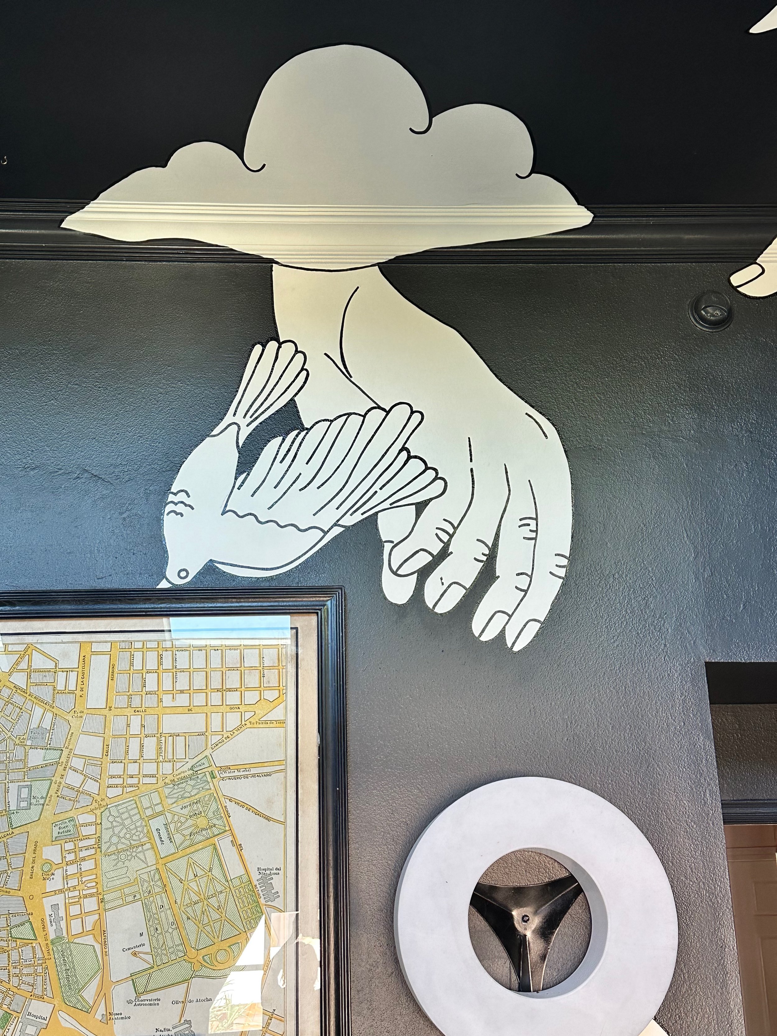
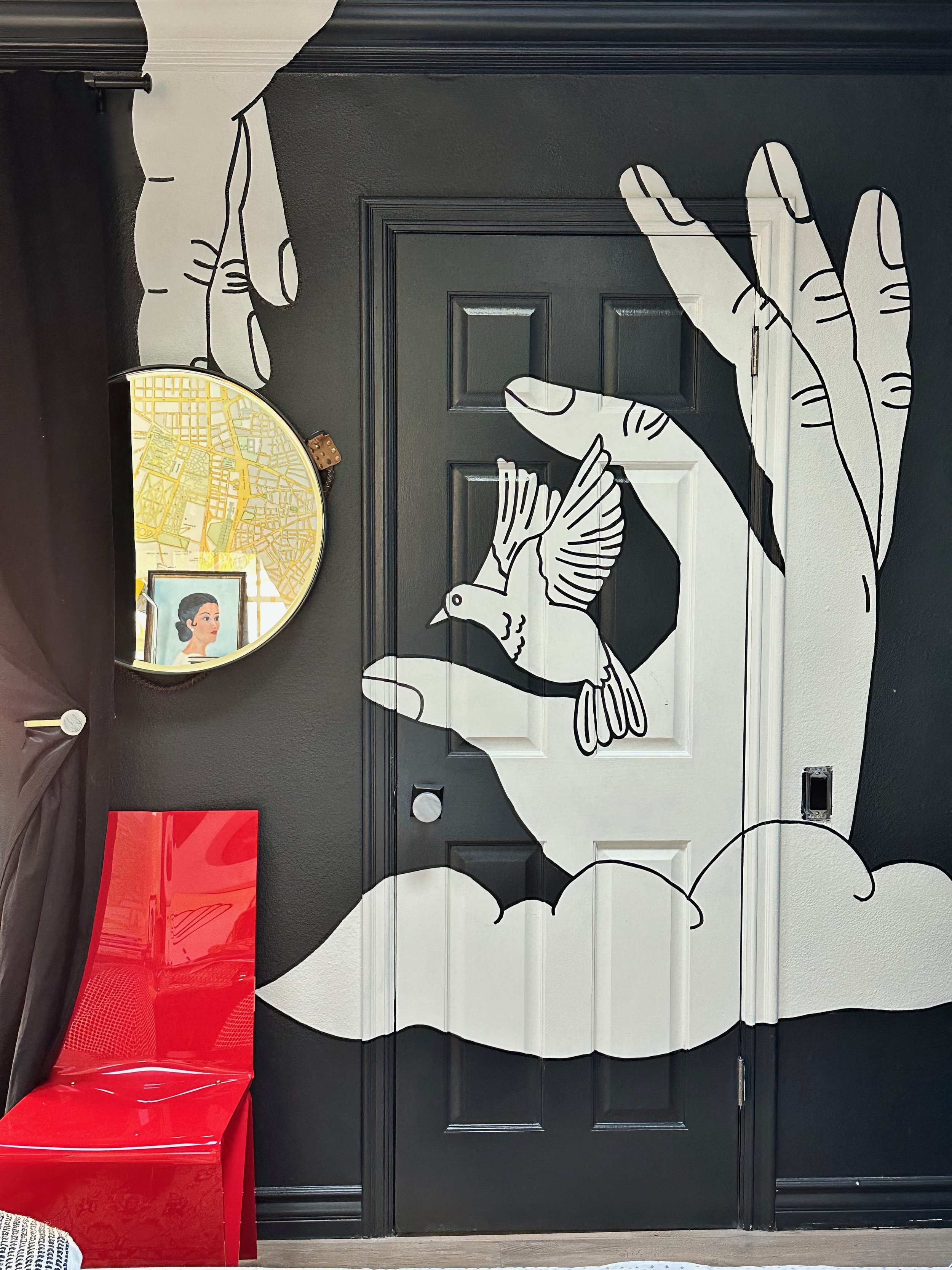
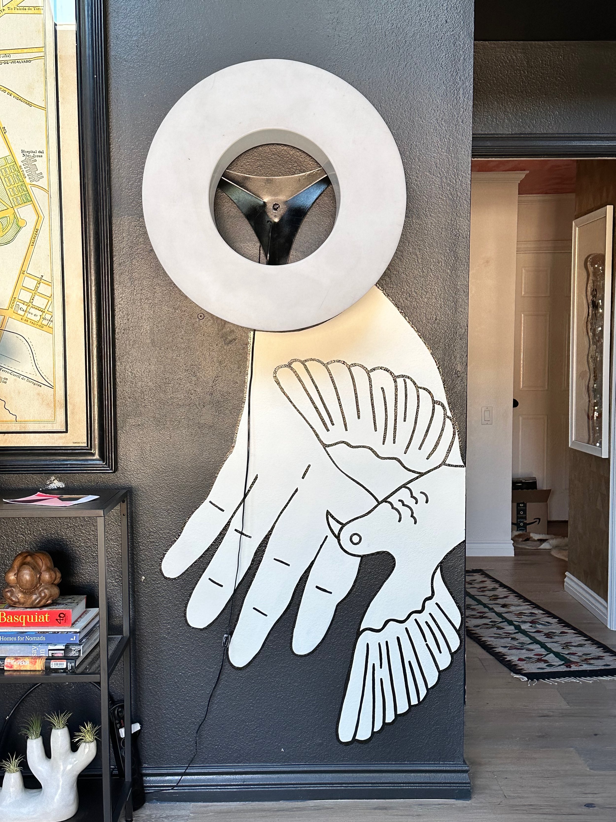
But that didn’t fix my problem… The problem was warmth. So I took a page out of my own book and added a shitload of walnut veneer to the walls:
Plus, my recent trip to DTLA majorly influenced some other new choices I have yet to reveal but I’ll give you a few guesses!


Big big plans over here!
Get the High End Look for a Fraction of the Price
I don’t know about you, but I’m a serial pinner. My favorite thing to do is scour the internet for inspiration, but then again I am constantly wanting to add to my repertoire. I think having an open mind when it comes to your own home and receiving information is the key to creating a vibrant environment.
But then I’m faced with a bigger problem: my bank account. When I pin images of homes with extremely high end furnishings/art/decor I balk at the actual price of things. Yes, me, who is famously indiscriminate when it comes to prices of things according to Instagram, gets spooked. So I wanted to make a post about how to get the high end look of some incredible spaces for less.
Let me tell you a secret, too. I google image searched each item in the photos and put together my best roundup of items based on price, quality and overall uniqueness. So really you can do this, too, if you find a space that you really like. All it takes is a little bit of effort and voila! But I caution you against copying directly. The point here is not to copy the rooms but just find a way to put together a really cool space that is artistic and fun and does not necessarily drain your wallet.
So here we go!!!!!
Heather Nette King Living Room
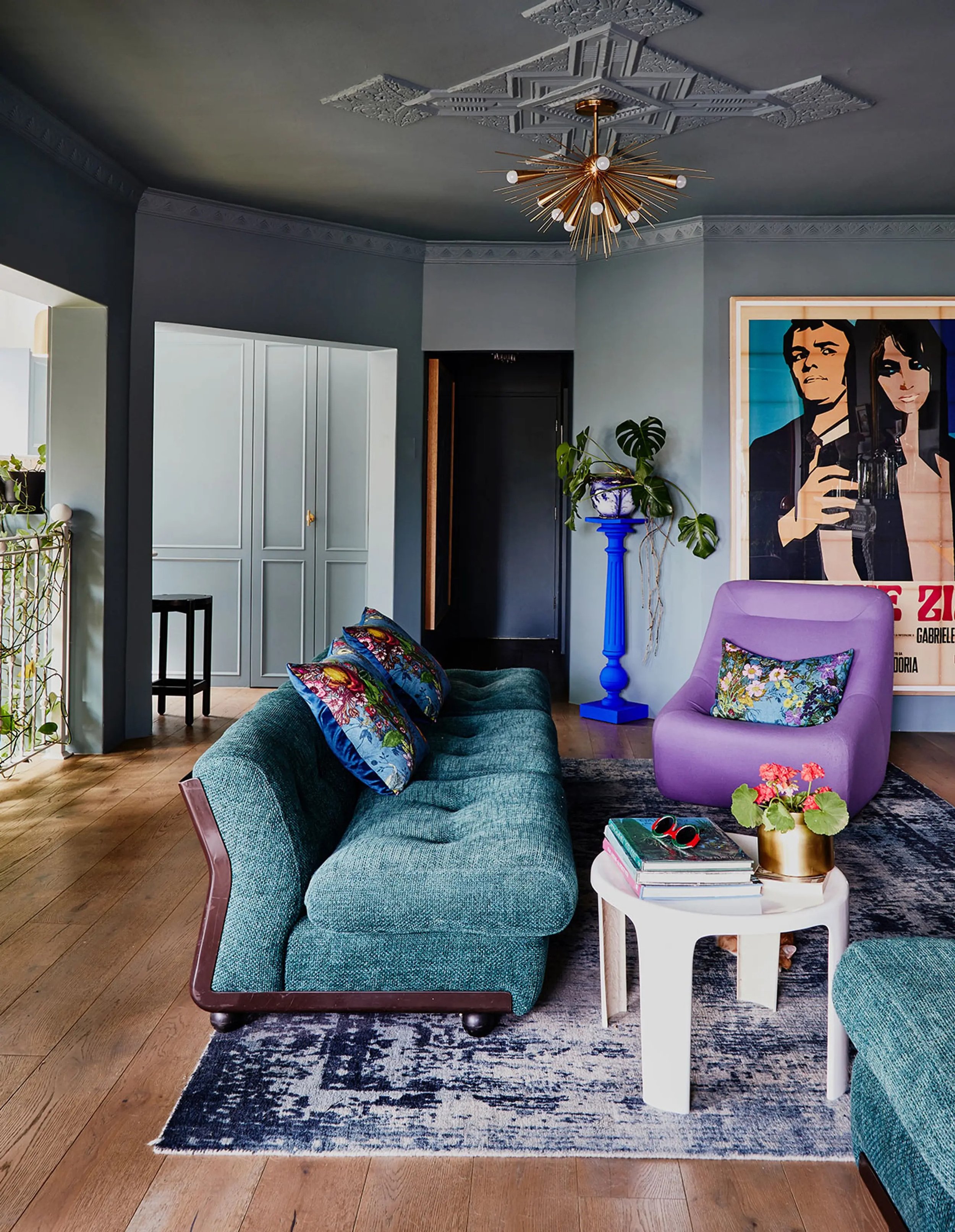

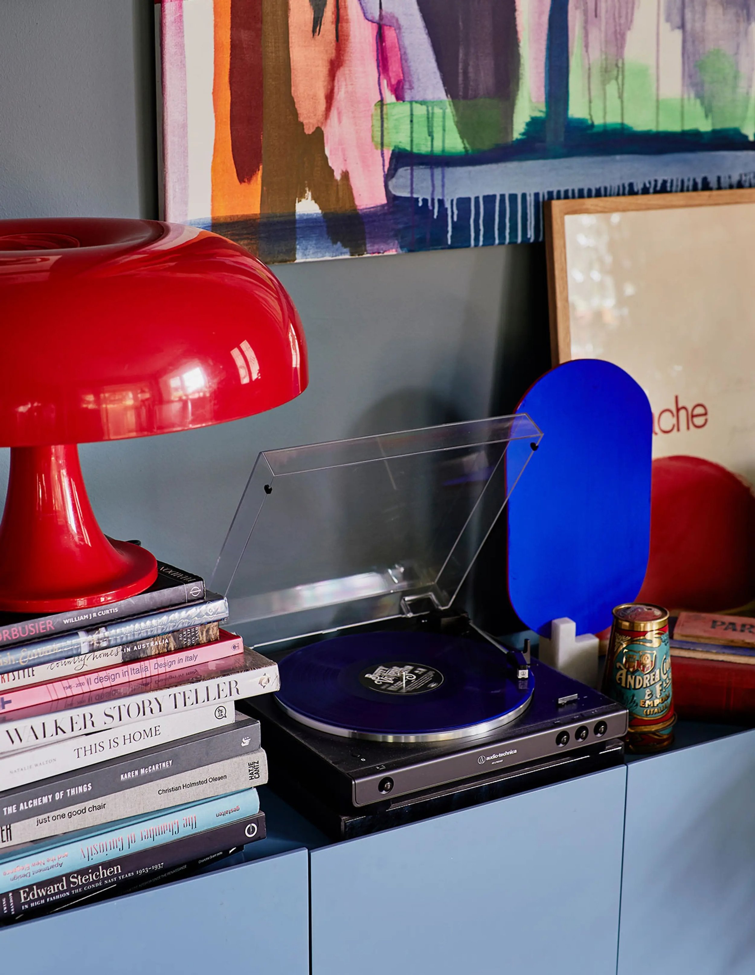
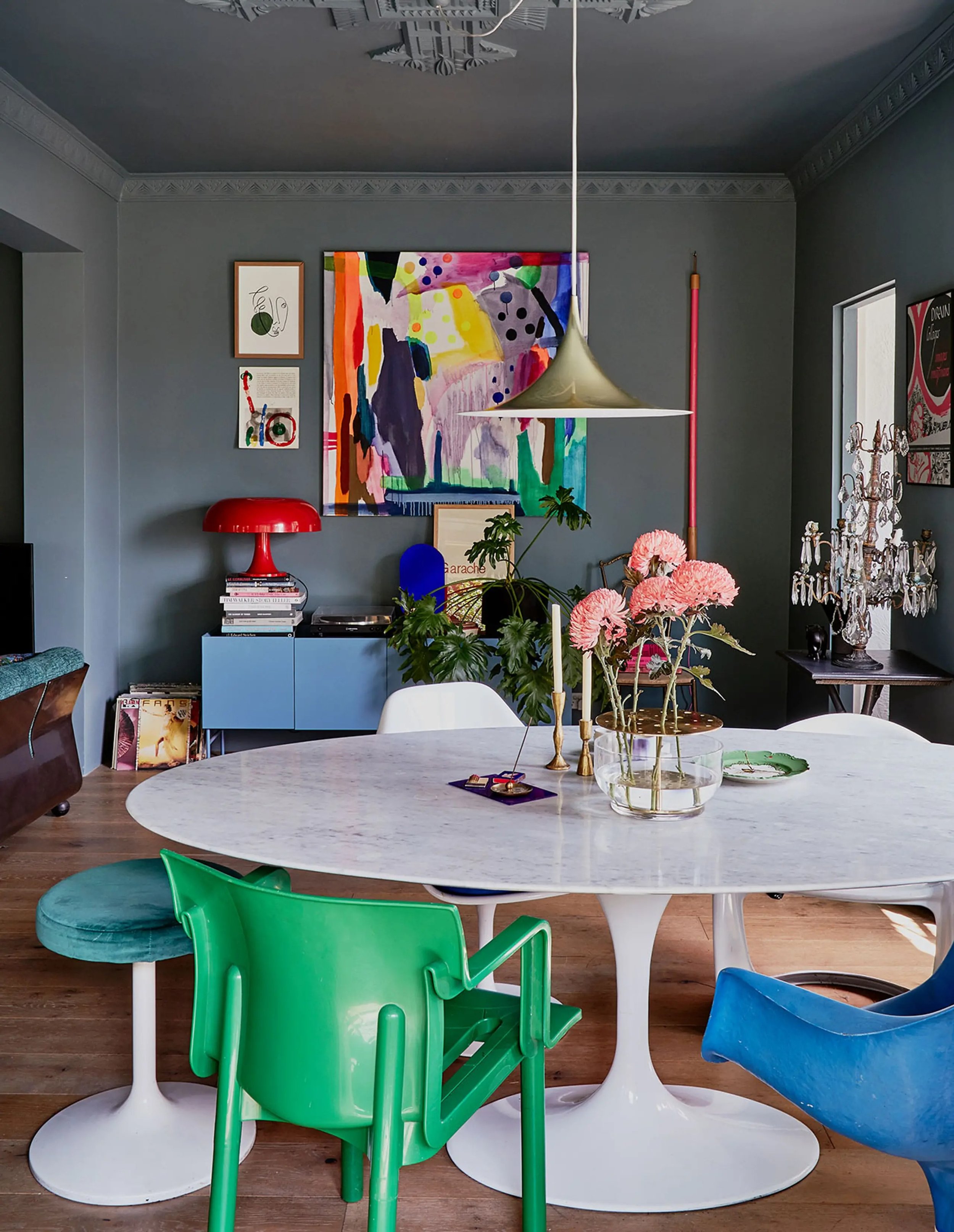
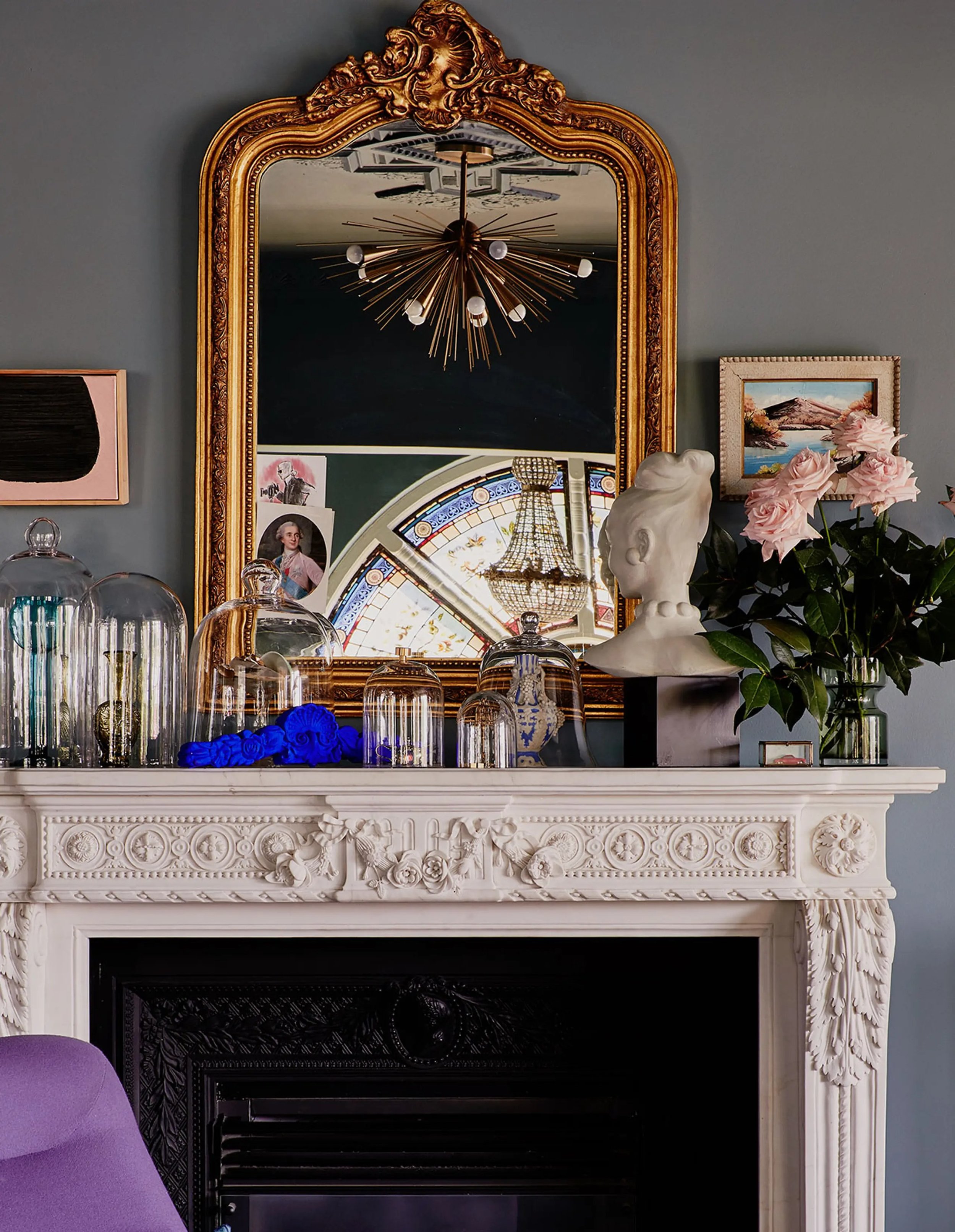
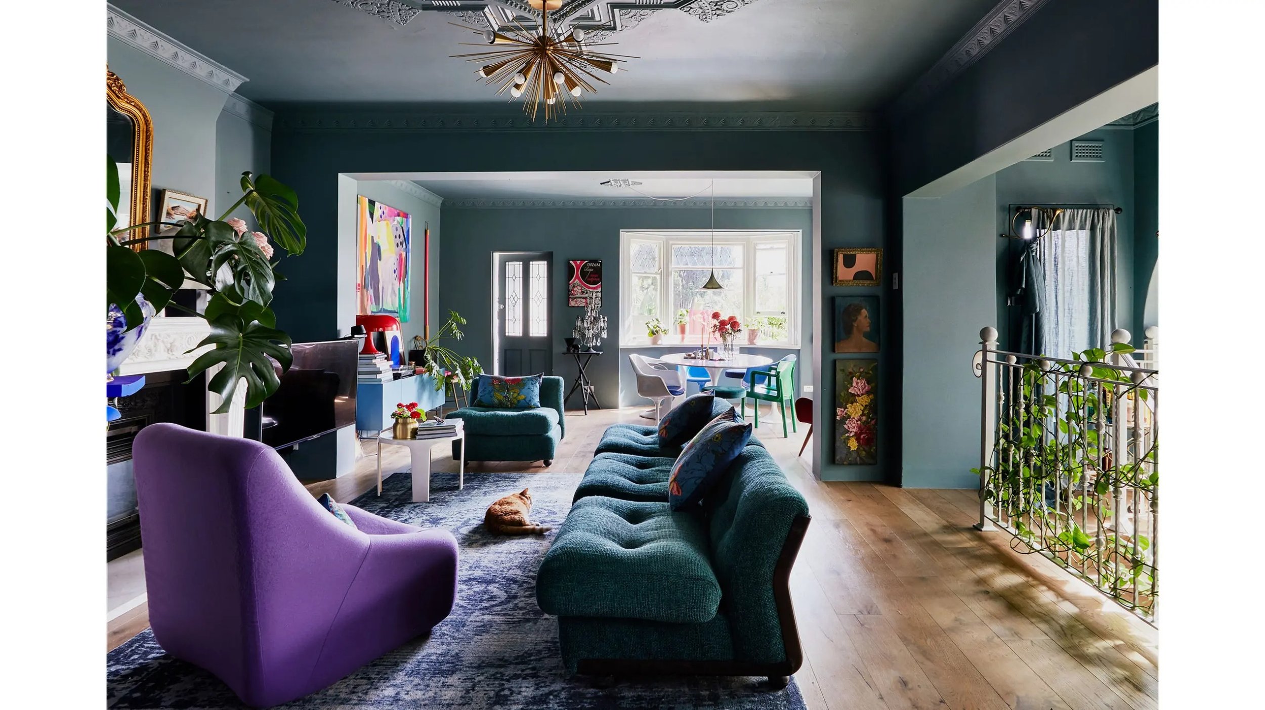
One of my favorite design publications is actually Australia’s Design Files. I am constantly inspired and breathless whenever I come across one of their featured homes. What is it about Australian artists and stylists that is so freakin’ cool??? Take this home for example styled by Heather Nette King.
Here’s what I love about it: it’s vibrant but also subdued. Romantic yet modern. Practical yet somehow extremely chic. I also love the fact that there are MULTIPLE COLORS in this room but it doesn’t feel busy or overwhelming. Just goes to show that the 60-30-10 rule is completely unnecessary. I mean wowza, right?

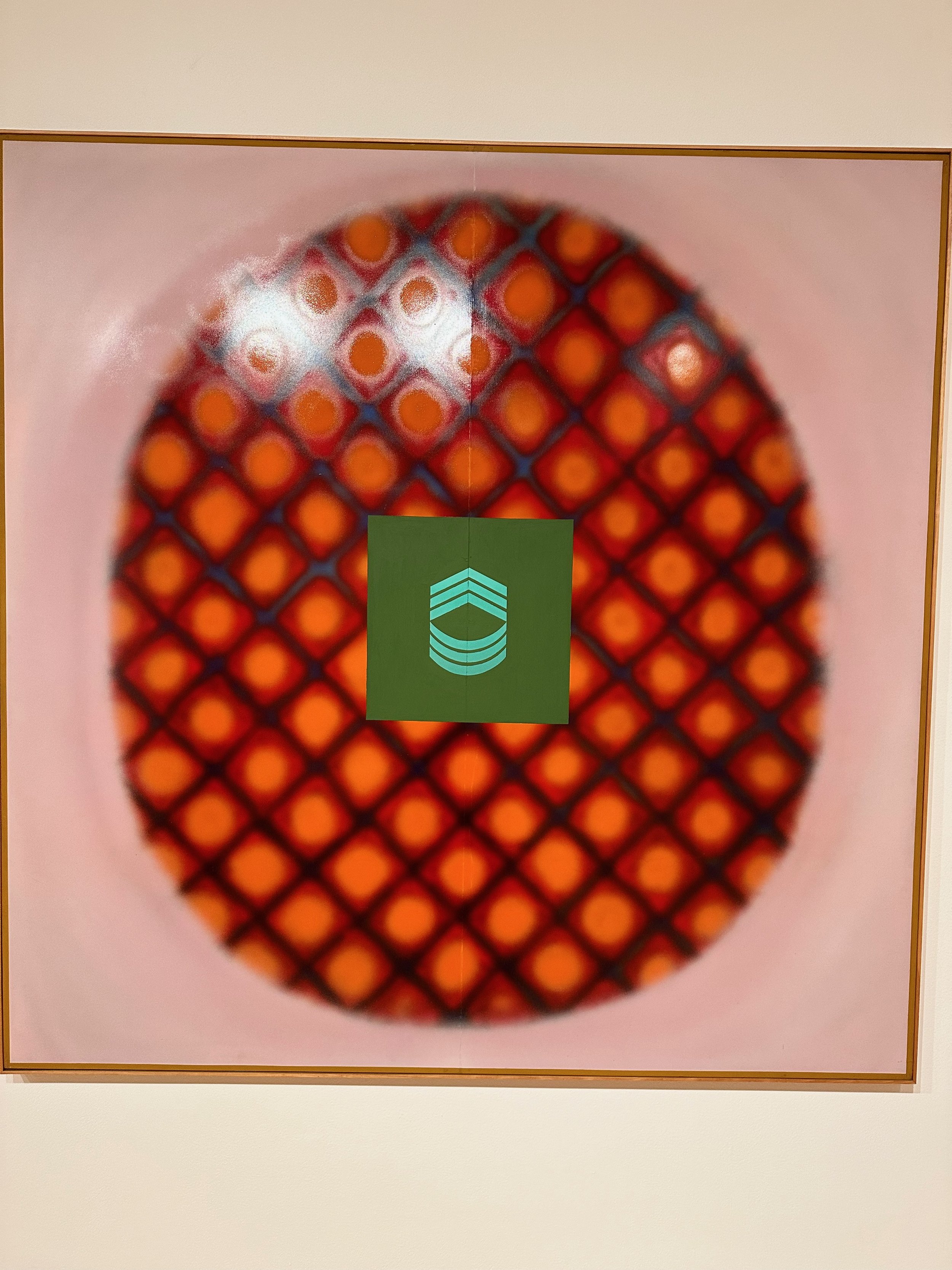
1. D Shop Semi Pendant 2. Saatchi Modernist Primary Tones Painting 3. Nesso Table Lamp 4. Antique Mirror 5. Vico Magistretti Chair 6. Tulip Dining Table 7. Glenwillow Credenza 8. Relax-R Accent Chair 9. Velvet English Garden Cushion 10. Bust 11. Curvy Amphoras Vase 12. Andy Stool 13. Blue Rug 14. Seletti Fluorescent Light 15. Country Landscape
Frances Merrill Dining Room
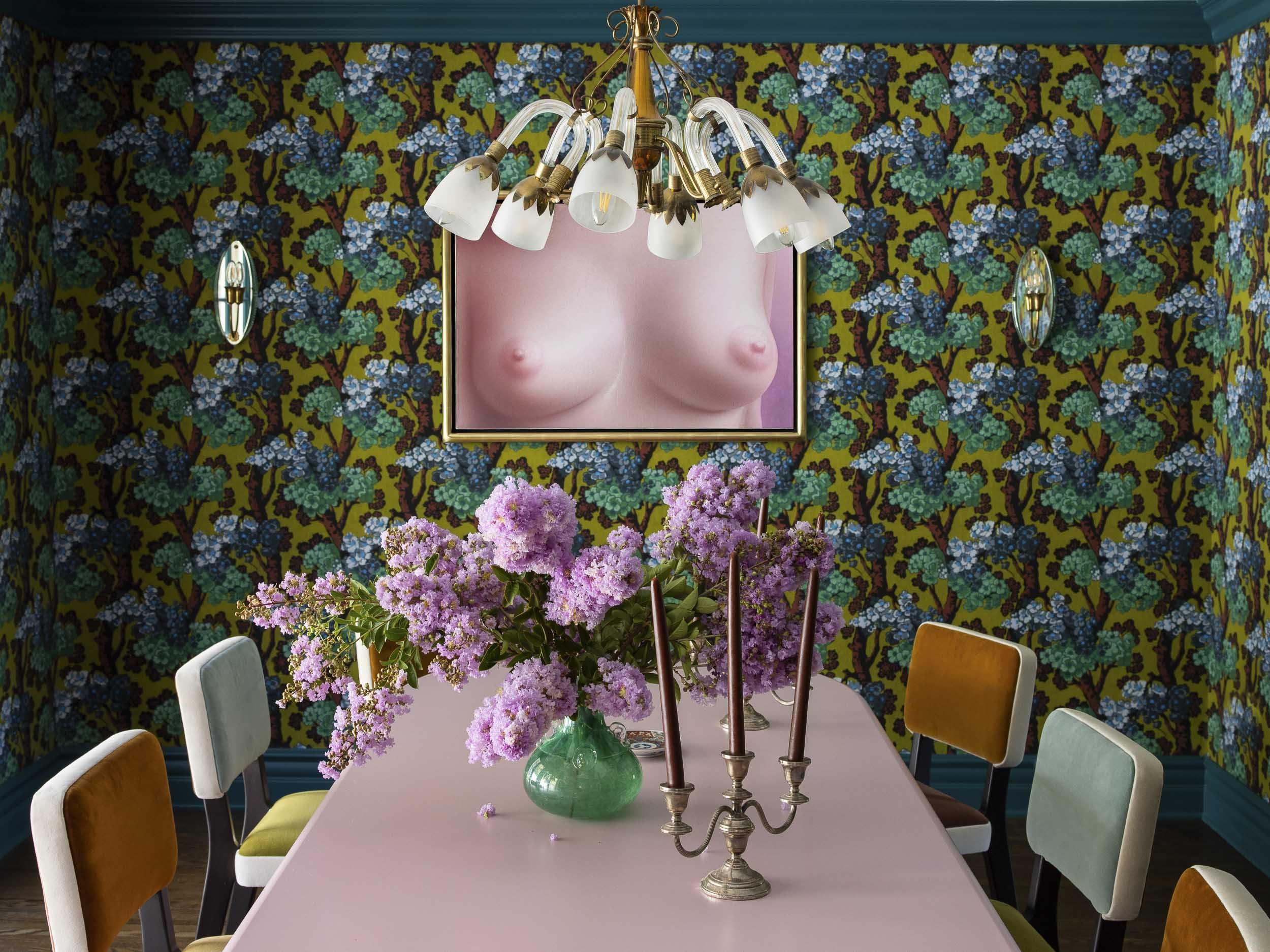
Here we are. Face to face. A couple of silver spooooooons. I don’t know why I think of that song when I see this dining room designed by the lovely and talented Frances Merrill of Reath Design. Could you ever imagine a better dining room in your wildest dreams? I personally feel like dining rooms should be a place for grown ups so I don’t mind a little naughtiness and intrigue. Dining rooms, in my estimation, should be the place of real conversation, a bantering of intellect and secrets and deep down hidden wishes to be shared with friends and partners while sharing delicious food.
When you break it down, Ms. Merrill’s design is super simple, but extremely elegant and packs a punch:

Celine Hallas Bedroom

Mmmm now isn’t that good? And yes, that is an IKEA Malm bed painted pink. If you’re afraid of color… then why you here??? But seriously, if you have any problems with color, you’ve got to check out photographer Celine Hallas’ Copenhagen home. My god it’s beautiful and effortless. Celine gets the concept of cool chic, of mixing in high end with low end and then some. I wrote about it in my blog, No Fail Steps to Make Your House Look Cool, and I bet Celine read it too. I’ll give myself all the credit (I’m obviously kidding, but I would love to inspire the next Celine Hallas with my inspiring words).
For years, I believed the rhetoric about matching colors and 70-20-10 and all of that poppycock. Yes, there is cohesion here with the oranges and the orange curtains, etc., but there is inspired little bits of brilliance that make it o-so-chic. Isn’t it so freeing to forgot all of that and just do what you want?

Well there you have it! Of course, like I mentioned, I pin a lot of stuff so feel free to pop over there: https://www.pinterest.com/MelanieThomasInteriorDesign/
And now I’m really curious! Which one was your favorite??? Let me know below. I can’t decide. They’re all my favorite. I wish I had a million houses that I could decorate like each one of these designers and just live in a new one each day of the year for the rest of my natural born life.