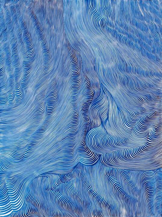
unexpected clashing color theory
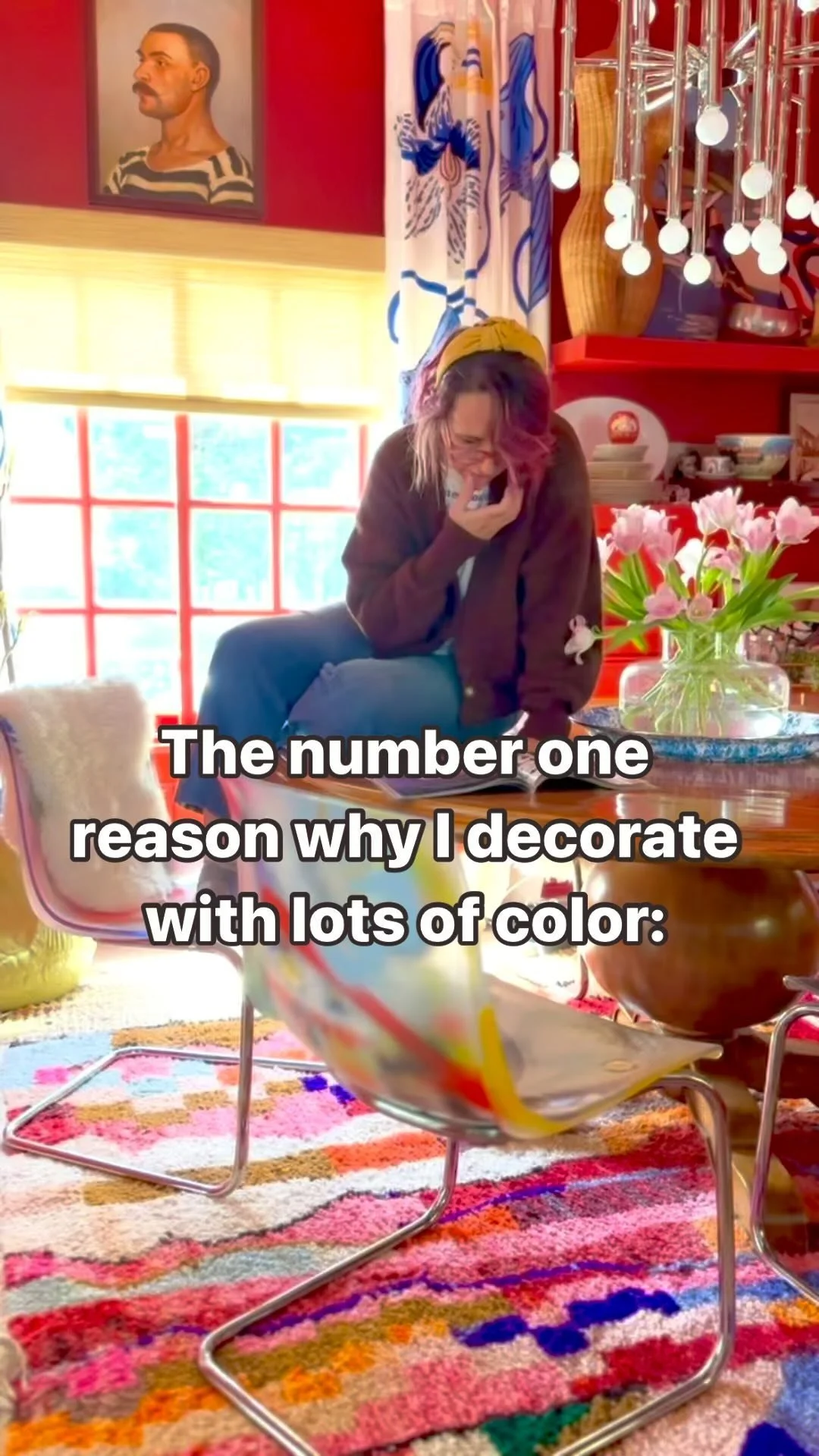
You’ve heard of the “Unexpected Red Theory” by now, right? No. Well, you’re in for a treat today. It’s a well-known principle in design that any room that has no red whatsoever will instantly be elevated to “chic” status by simply introducing some random redness.
User Taylor Simon recently (@intayriors) shared a video detailing the unexpected red theory, which she defines as “adding anything that’s red, big or small, to a room where it doesn’t match at all — and it automatically looks better.”
To read more about this particular theory, you can check out this Apartment Therapy article. The great thing about this practice is that you don’t have to commit to an entire room if you happen to be a tad more conservative.

Yes yes, Red. Red is extremely controversial, but somehow once one gets past whatever hang ups one might have, it dominates the soul. So let’s do a little experiment here: next time you decorate a room, keep red out of it. Then at the last minute introduce at least one red item and see how it feels.
There are some rules here, however. It tends to be the most successful when paired with cool or complementary (opposite) colors. In other words, red works best with greens, yellows, warm or tinted purples, and blues. I like to get creative with my red placement and try it with mints, cool pastels, beige, olive green, etc.
The whole point of this exercise is to bust out of the rule that ALL colors should be grounded by some artwork or rug or whatever in order to work. It often confines us to the world of "matchy matchy" decor. Personally, I'm feeling a bit miffed that I adhered to this theory for such a long time. I spent a great deal of my life thinking “The professionals always have a piece of art or rug or pattern that anchors all the colors in the room. This is the way.” So often I have sat at my 2D rendering program, trying to figure out if there is too much yellow or green in a room only to feel trapped by it all.
But I’m not about that anymore. At this point, the rule seems so restricting and archaic. Sometimes I feel like the entire industry creates these “rules” on how to decorate in hopes that they can somehow teach people how to avoid “mistakes”.
I’m here to tell you (and also you give you permission) — you should never follow ANY rule blindly when it comes to expressing yourself. And that’s what I want to encourage those who are brave enough to follow me on my design journey and discover for myself. Sure there are guidelines, but just like Lil Nas X has shown the world, F*ck that country noise. It’s time to rethink those rules and be a little dangerous. It’s time to be authentic and wild. It’s time to get weird with color. At the very least, it will make your home a little more interesting.
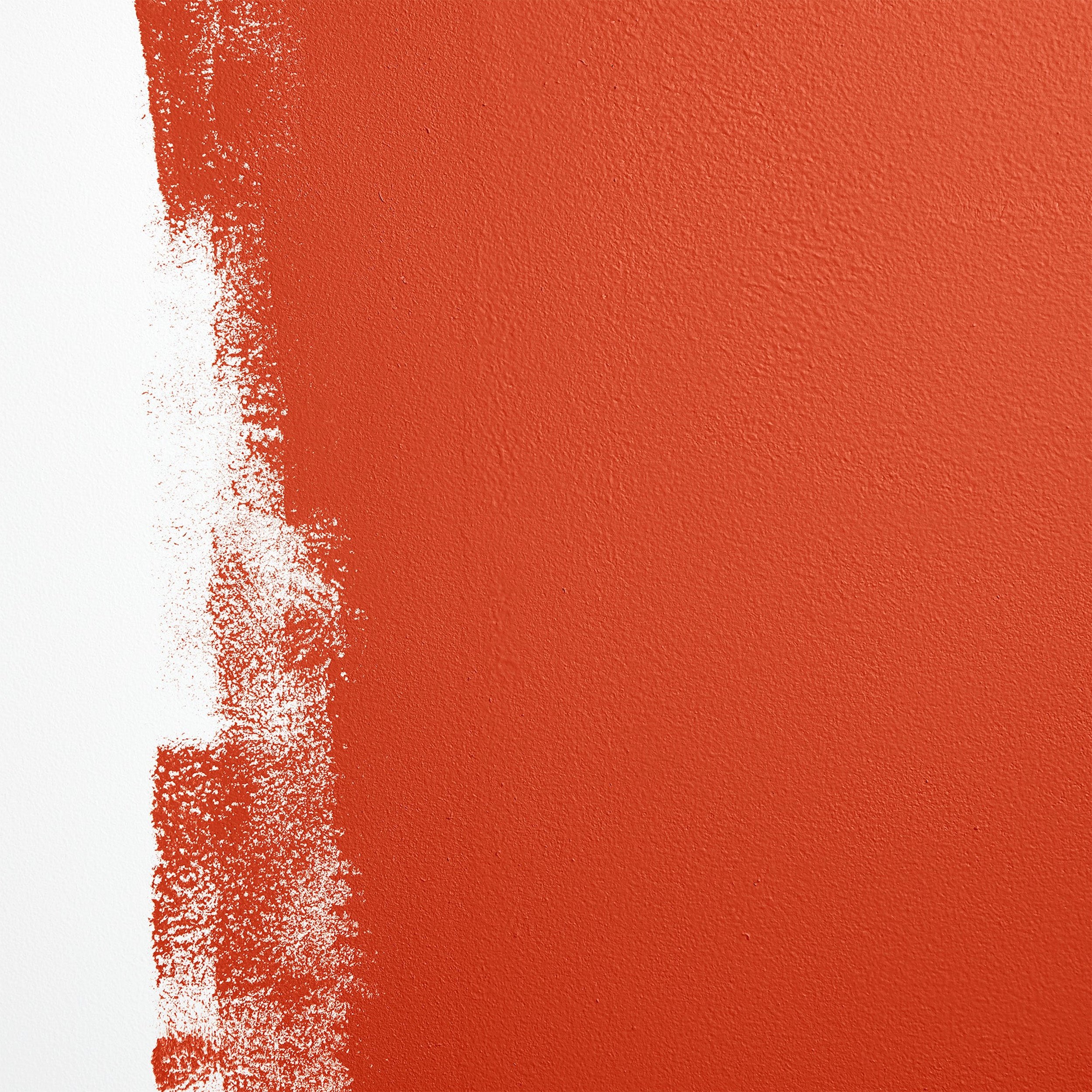
The unexpected clashing color theory jumps off with red and says that ANY big, bold color that doesn’t match the room will make it more chic and interesting, not just red. There is the clashing color trend that supports this idea, but even then the requisite “clashing color” is often rooted in an anchor like a rug, artwork or wallpaper. This other theory posits that the “clashing color” have absolutely ZERO anchor. In other words, pick a dominant color that matches the decor item in question, but then add something completely different.
It gives you permission to be free with your design and think of color not just as something to make your home look cool, but actually as a pass to another free-er self, uninhibited by conventions that no longer work for you.
I know once I started thinking outside of the matchy-matchy box, suddenly life and design got a million times more fun. It’s like I gave myself permission to be free. And that’s what I want for you!
And on a more philosophical level, I believe conformity in general is what kills the human spirit. Conformity does not guarantee happiness, success, or safety. It is a false narrative that lulls us into accepting status quo.
On a design level, it lulls us into buying matching sets and coordinate everything for fear that if we do not match or fit in with other’s expectations of what a home should look like, we have somehow failed. Challenge those expectations. Be free! Fail often. Stop trying to be perfect. In the imperfection, there is life and inspiration.
Yeah, but does it look crazy?
I’m sure you’re asking “But Melanie, won’t it look chaotic?”. Here’s the balance you need to strike. I love chaos as much as the next person (well, some people really like chaos and I’m actually not that great with it), but yeah this look can veer crazy town real quick.
The trick is to keep it pretty sedate throughout most of the room and then BAM, crazy unexpected clashing color.
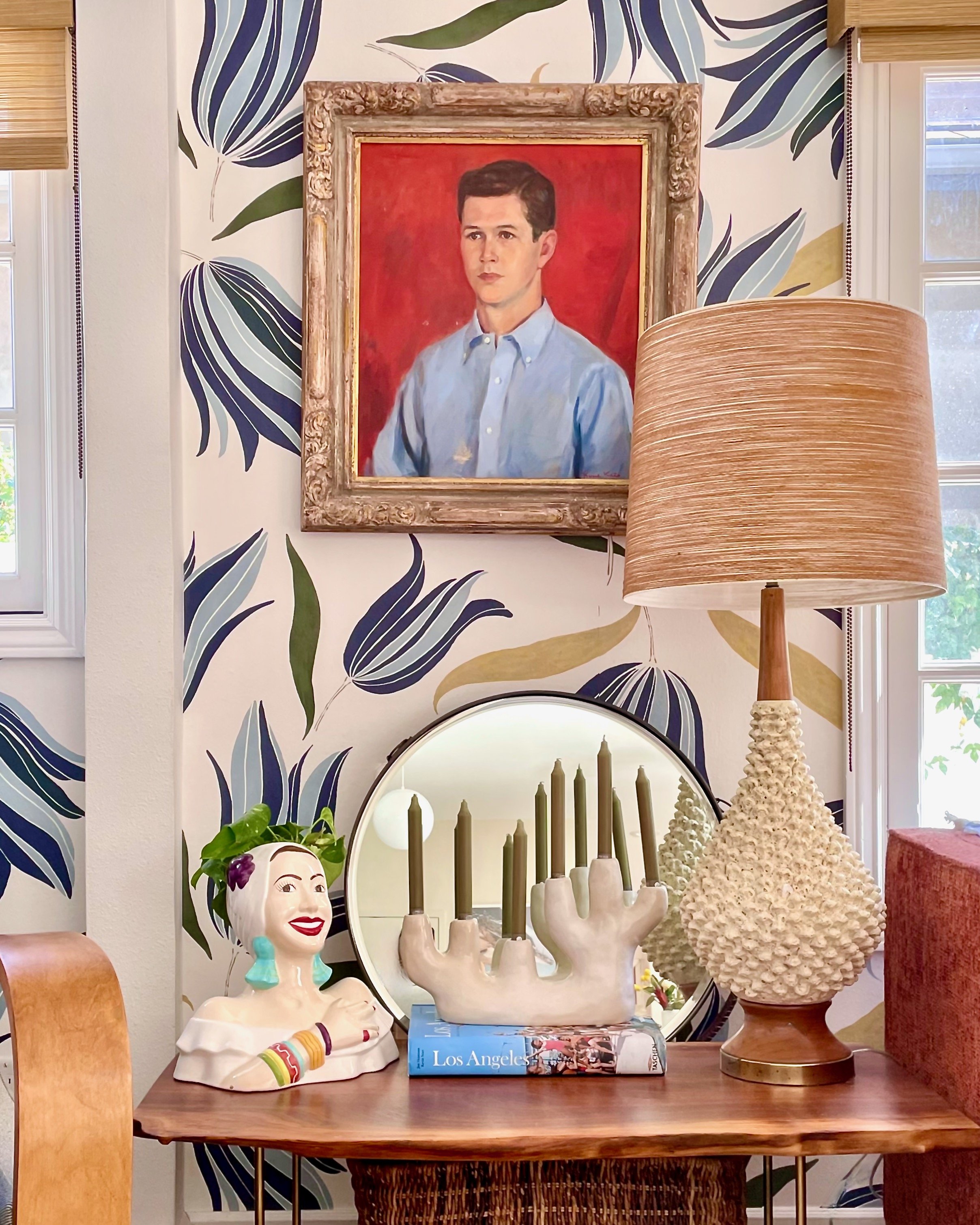
Here’s a great example:

I love this because nothing else in the room is blue. The sofa, the rug, the flowers, the settee, the side chairs are all from a autumn color palette. Additionally, there are no blue flowers outside.
Just that painting is blue. Wouldn’t it be so snooze if it were all the same palette? And don’t you just kind of appreciate that the artist/designer was so confident in their abilities and the strength of that blue that they didn’t need a crutch/anchor to use it? Well, I do.
unexpected colors to try in your next project
Here’s the fun part — the brainstorming. And what’s even better is that whatever your current color palette is, you can introduce these new hues without a lot of anxiety-inducing coordination and “anchoring” with other objects in the room. In fact, just don’t even consider the rest of the room. Pick a color that lifts it all up, breaks up the monotony and spices it all up.
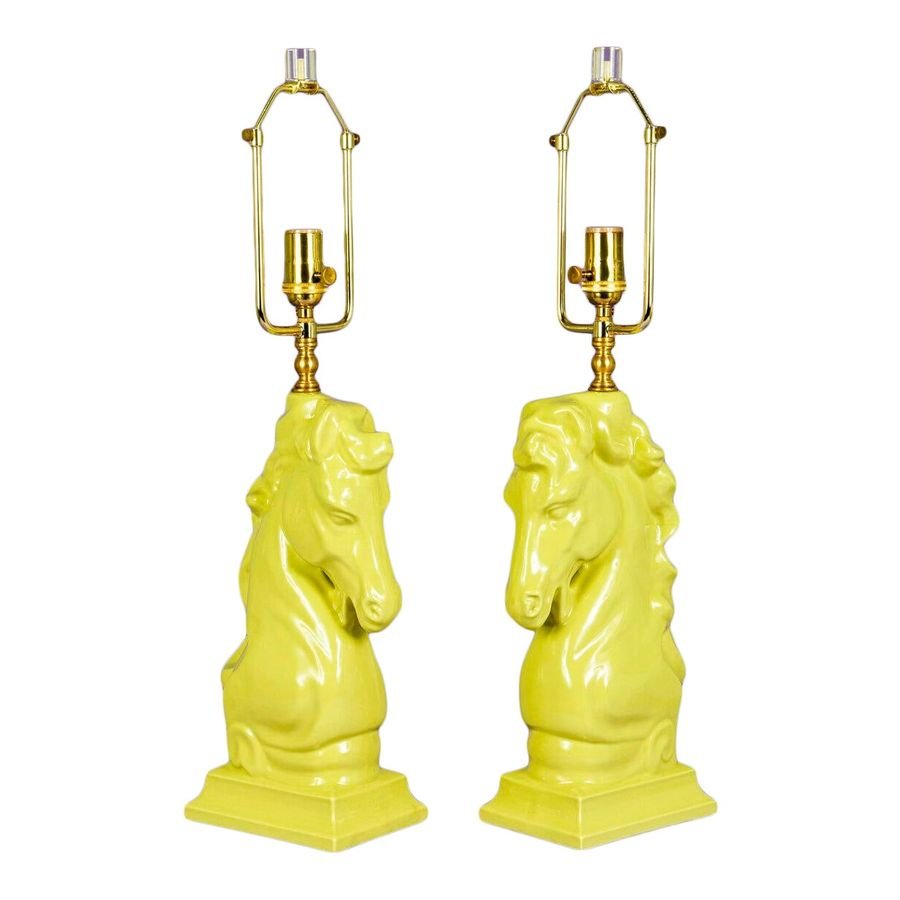
All that is required is that you keep your mind open and you listen to your instincts. Whenever I take on a new client, I ask them “What color do you secretly love but are too afraid to try?”. This is your moment to be bold and throw in some chartreuse.
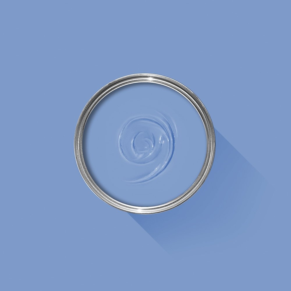
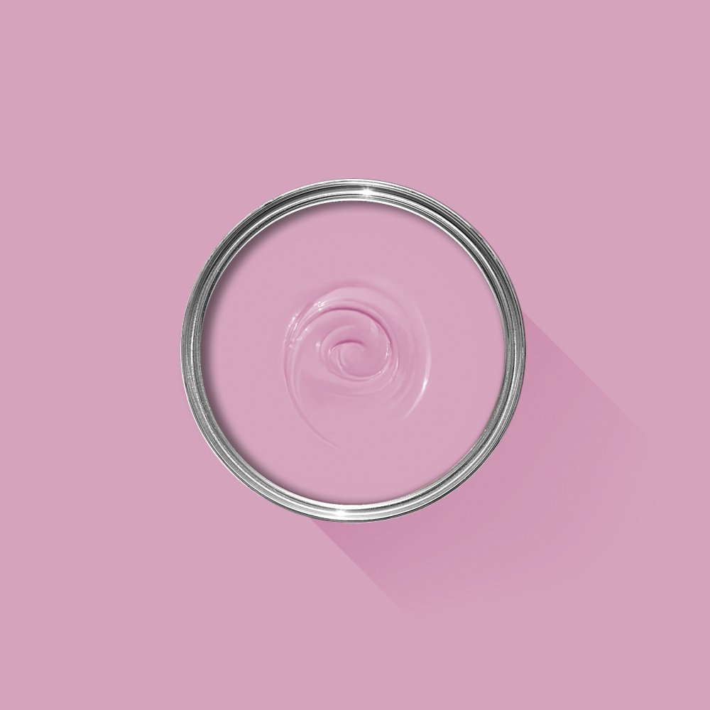
My only suggestion for a more successful result is to stick with tints and jewel tones. Anything high on the LRV scale. Hint, not muted or shaded like navy, brown, mauve, beige, white, or grey. The rest of the room can be muted - in fact, mute away! — but avoid decorating with similar colors. For example, if the rest of the room is pink, avoid red, purple or orange. We want impact, not camouflage.


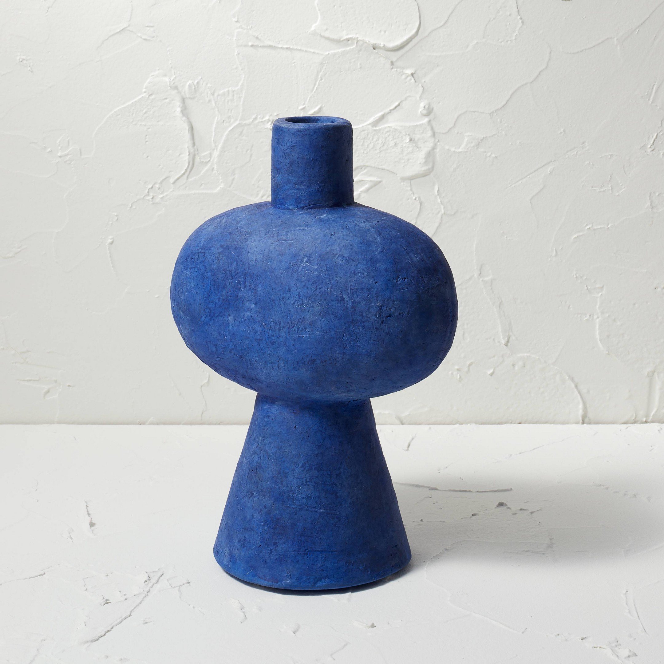
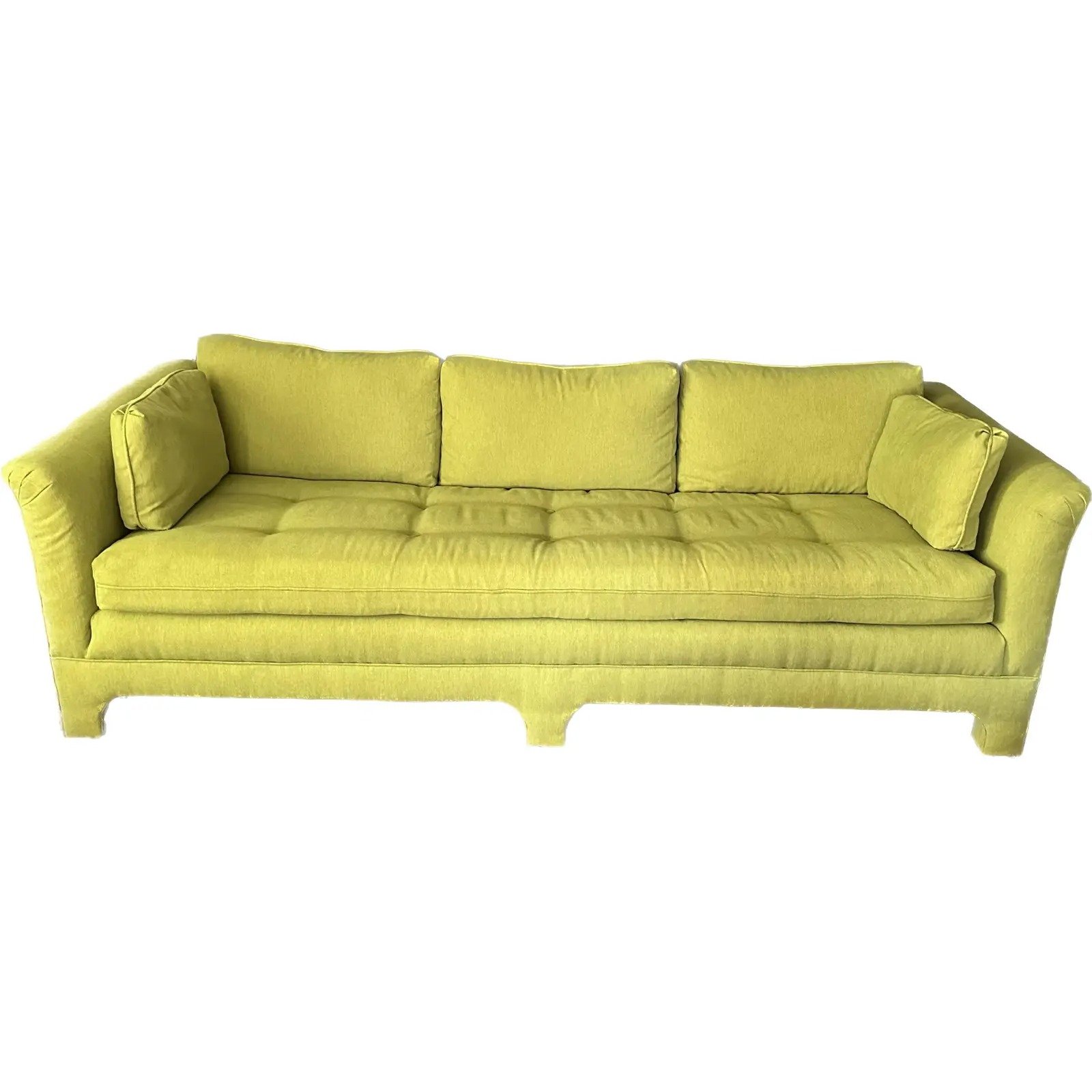
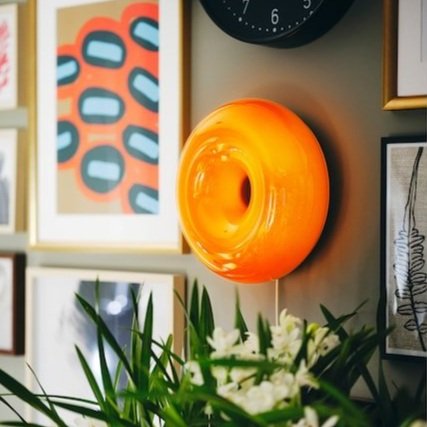
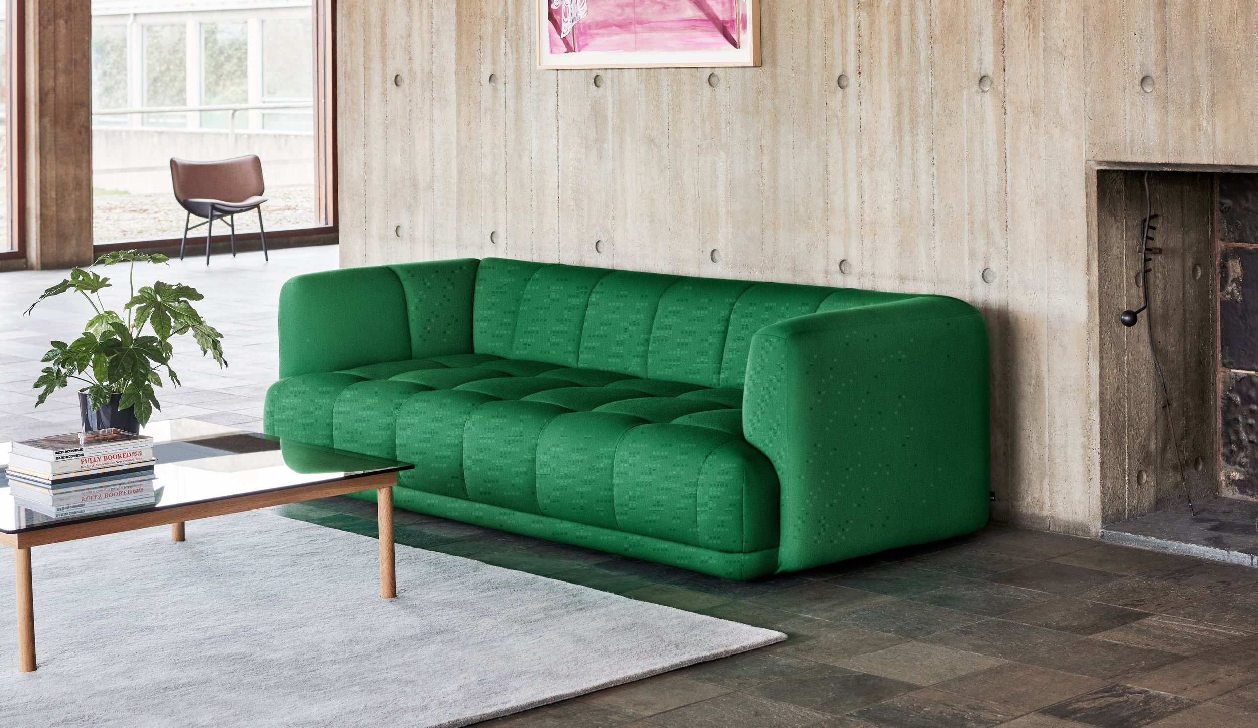
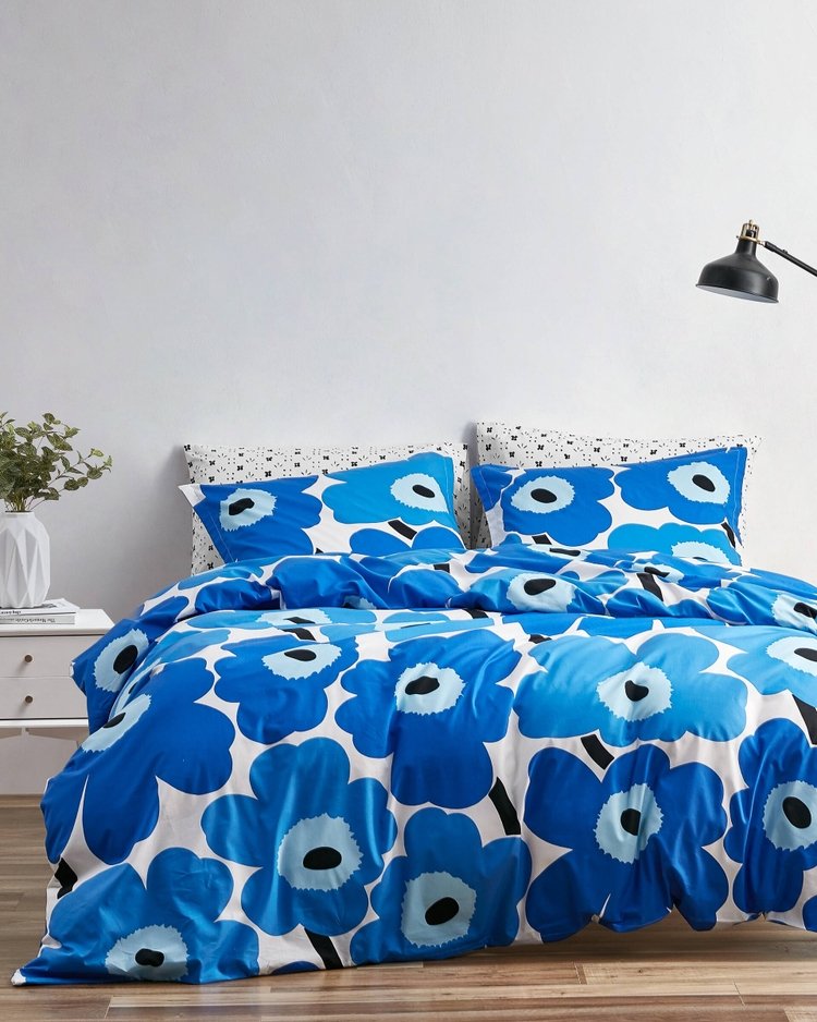
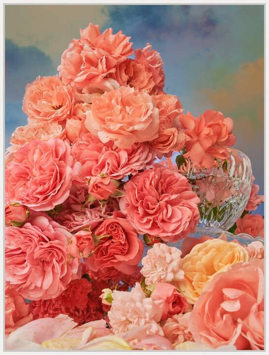
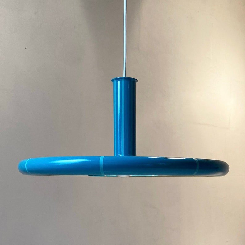
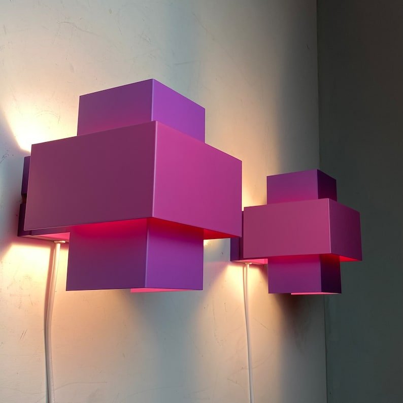
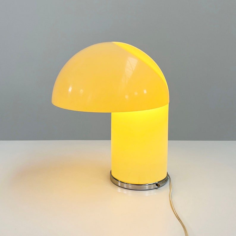
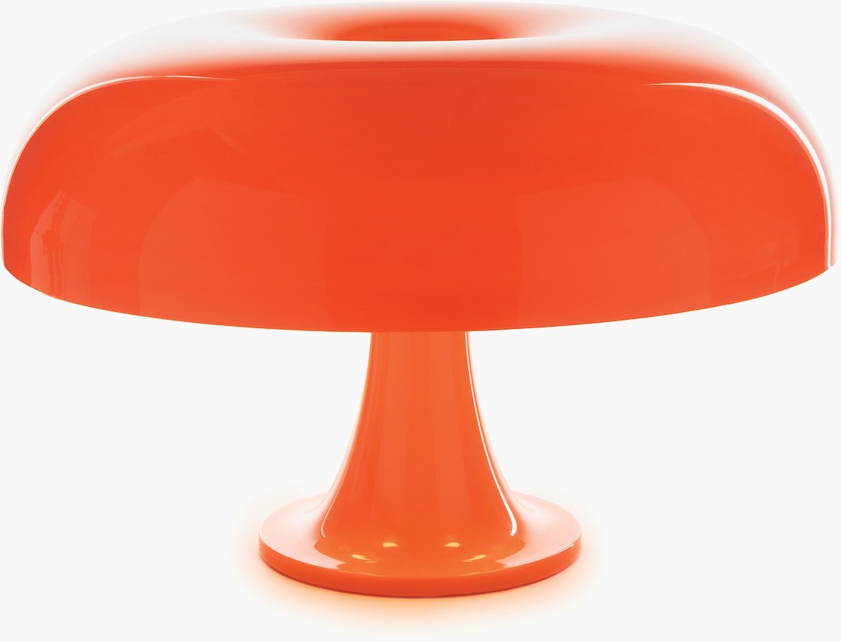
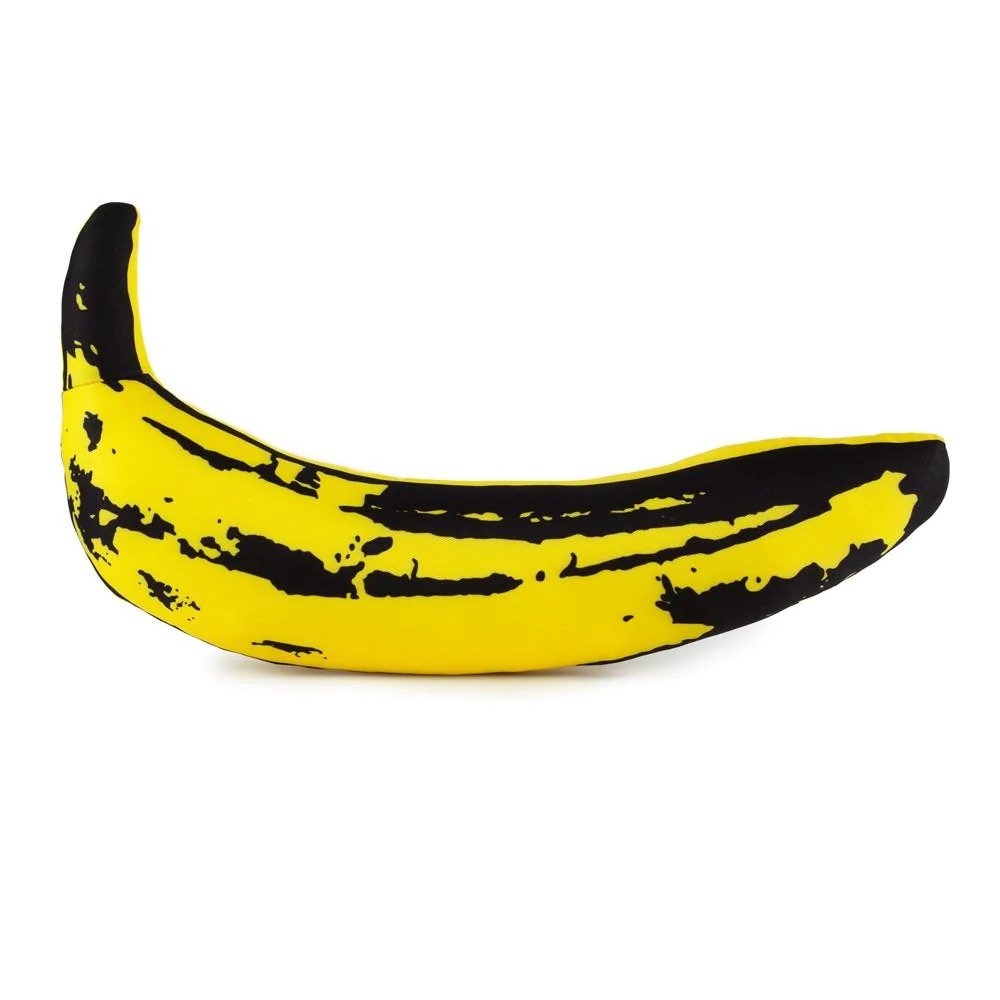
And just to get you started, here are some furniture and decor options to help get your mind churning:

want to try this theory out but too afraid to do it on your own?
Give me a shot.
Whether you live in Los Angeles or not, I can help you visualize your space and convince you to take the color plunge. After a brief (and FREE) 15 minute “get-to-know-me” phone call and a quick questionnaire, I can come up 2D designs to help you decide which bold color is right for you!

Greetings, fellow design rebels! If you’re like me, you’ve had it up to here with those snooze-inducing showrooms that are more "museum" than "home". I'm flipping the script on home styling, and let me tell you, there won't be any rulebooks or tedious style history lessons involved. Just pure creativity.
Why do I rebel against the ordinary? For seven years, I meticulously crafted and refurbished homes solely for their resale value. I dwelled in a universe of beige, grey, black, and white. But in 2020, I reached my limit and gleefully abandoned all that for a fantastical realm of vibrant colors and delightful oddities. Dive deeper into my journey right here. 🌈🤹♂️🏡
My work and advice has been showcased in prestigious publications such as Architectural Digest, Better Homes and Gardens, The Zoe Report, Real Homes, and Homes & Gardens, among others.
I know that I'm not everyone's cup of tea, but then again, neither are you…
Recent Posts