the british wave
Hello, sunshine! What are you up to today? If you've been following my Pinterest account, you will have noticed I've been pinning like crazy (my screen time is up 21% since last week AND I just got congratulated for my 10,750th pin... I think I might have a problem....). That's the thing I love about Pinterest -- those algorithms get me. My favorite thing to do is to fall down that rabbit hole and discover new and exciting things, because -- and three points if you guessed it already -- I have nothing else to do!
So what has caught my eye recently? Why, London interior designers, of course. Those crazy Brits have been revolutionizing the design world while we've all been brainwashed by HGTV. ...Must paint everything white, black and grey with pops of color....
For those of you who are averse to vibrant, in-your-face color, you might want to look away. You probably should not be reading my blog either.
For those of you who are a bit more adventurous, get ready and set your ojos to "stun":
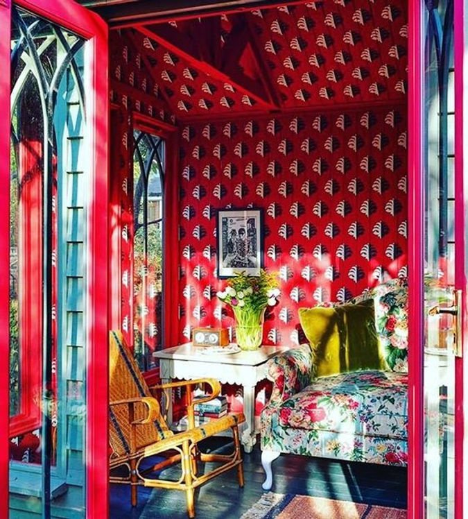
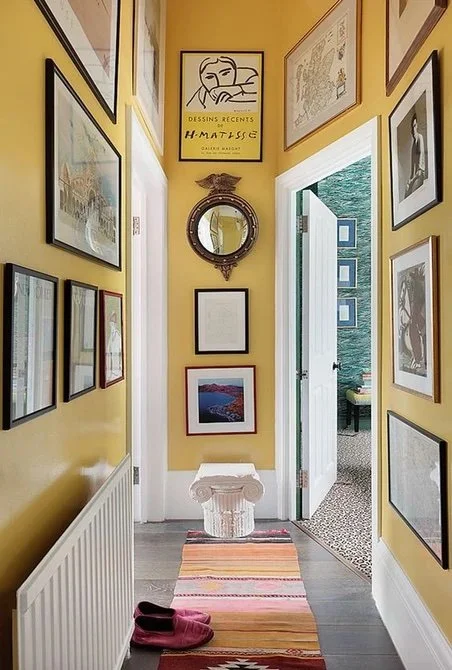
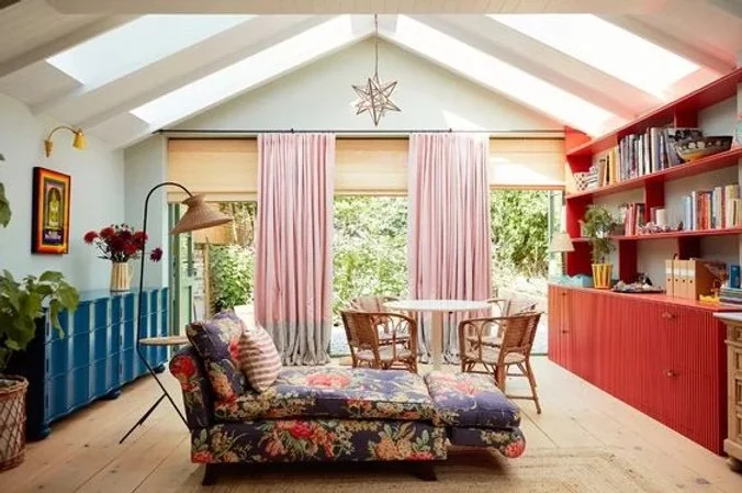
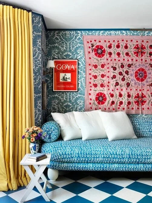
They're definitely speaking my language! Color? Check. Drama? Check. Globally inspired? Check check. Whimsy? Check check check. What I love about it most is their "dare to be weird" attitude while sticking with their traditional roots. It's the perfect mixture of fussy and cool and, oh, I just love it.
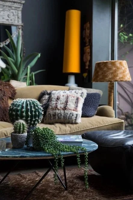
Probably one of the biggest design rock stars would be Abigail Ahern, known mostly for her dramatically moody interiors and fabulous FAUX flower arrangements (endorsed by none other than Goop CEO, Gwyneth Paltrow). What's more, she's a fellow weirdo when it comes to interiors. Her spaces are deliciously textural and deceptively colorful. She loves breaking the rules and is not afraid of a little sexiness -- she definitely gives Timothy Oulton a run for his money.
My next favorite is Swedish import, Beata Heuman. Her style is best described as "cheeky". Not quirky or eccentric -- which I believe is a bit dismissive -- but cheeky. Playful, smart, fun, vivacious... but don't let her fool you. She is a serious interior designer and here to stay. My favorite part of her design is her willingness to go all out. I mean, come on:
That deserves a standing ovation.
borrowing not stealing
If I'm being honest with myself, I was debating whether or not to post my recent design inspiration since I will most likely be "borrowing" from it with my own design. However, that brings up a relevant point. How do I take these ideas and make them my own?
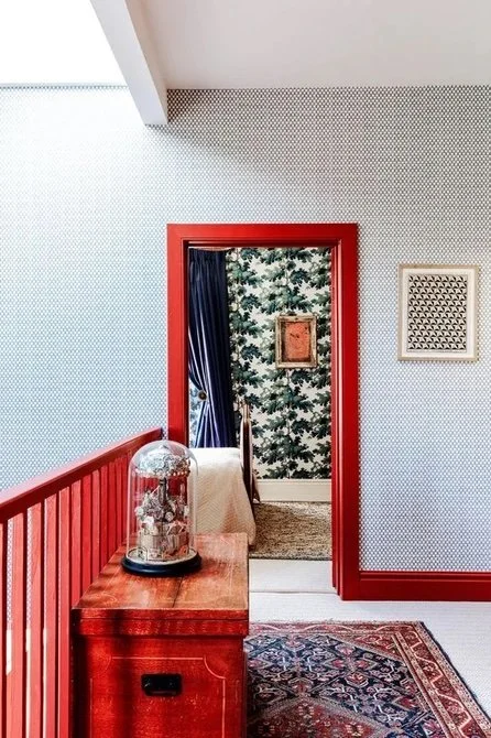
The best way to circumvent the cardinal sin of stealing is to break down what exactly I love about the designs and analyze the result. What really struck me the most was the unapologetic use of RED. Red trim, red walls, red wallpaper, red furniture. Not too long ago, I actually believed I hated the color red and would never use it in my own design. Now all I think of is red. Oh how easily I was converted. I was even thinking of buying a red velvet sofa!
But red, like many of its sister colors, can be quite a commitment. I actually have a lot of red in my accessories, especially for someone who had completely written it off but I also have committed to other equally extroverted colors (see my post here). And what I liked about the use of red in the pictures above was not just the color, but its boldness. The trick is take whatever color makes you feel "you" and start layering it in with your other design (I'm talking to myself, too, but this advice might come in handy).
Another lesson to be learned from these London lady dynamos is that art of the layer. For example, Abigail Ahern's interiors drip with soft, cozy textures and harsh, husk-like surfaces. I can achieve this look by layering sheepskin, sisal, kilims and pottery but I don't have to keep her color palette. In fact, I can use my own!
What I like most, however, is the commitment. That's #1, the most important element to any artistic endeavor. Head-to-toe commitment. From the flowers, to the books, to the trim, to the dainty flowers in the wallpaper, each detail is carefully considered.
Most of all, it's important to remember that not all designs fit since not every room is made the same. In my design journey, I realize I have to respond to the house and room, not the design du jour of the moment. Or you can just straight up steal if you want. Both Beata and Abigail have online shops if you are so inclined, but where's the fun in that?
how to get the look
Thanks to Pinterest, I know EXACTLY how to achieve my own "British" look... well, almost. First thing's first:
PAINT: Farrow & Ball is the number go-to for this natural but vibrant look, however, if you want American made and produced, try out my absolute fave Portola Paints & Glazes. They are both high quality and naturally pigmented, which makes the paint seem ultra luxurious and deep. Plus I love the fun names. Dancing Shoes... Tee hee.
WALLPAPER: I'm all for modern, contemporary wall coverings, but this calls for a special kind of traditional/sassy wallpaper -- PIERRE FREY is just the place to find it. Of course, you can use a shortcut and visit Anthropologie since they often have some of the most beautiful wallpaper, but you must be careful that it's overused. I did use an Anthropologie wallpaper in my own design but I had actually found it through Rifle Paper Co. before I realized it. It's still quite fun and cheeky and the trick is to layer it with other unique and interesting details so that it doesn't feel like an Anthropologie show room. F&B also has wallpaper, which is totally appropriate here. you can also try svenkst tenn wallpaper and fabric.
FURNITURE/ART: Let's just say for arguments sake, you can't visit the local antique shop and rummage for hours trying to find the perfect settee that needs some love. You know, for whatever reason, like a global pandemic for example. Let Chairish be your new Rose Bowl Flea Market. I would say 1st Dibs but I never can find a deal there. Chairish is still quite expensive, but there are different levels and you can find some lovely things there. And this, you can find this:
Yeah... I kinda gosh darn love it.
On that note, I would like to thank you for going on this adventure with me. Sure, I could just go to the local Pottery Barn and buy up the whole store to decorate my home. And there is totally nothing wrong with that. It's easy, it works and it still looks very nice and will impress your friends. But if you're like me, you need timeless, free-spirited design in your life. In a few months, I will have a few rooms completed and will have more to show off from my own home.
Thanks for reading. Have a wonderful week!


