get the look without copying
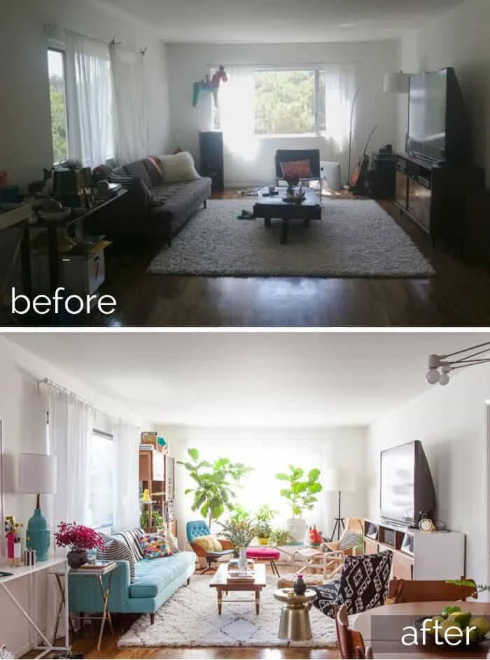
We've all done it. You're flipping through your favorite pins and you come across a jaw-dropper living room. A "stop everything and let's analyze every detail" living room that is absolute perfection. And then you get to the resources and you -- no judgments, I promise -- add everything to your cart. Or even worse, you pin the image and the algorithms deliver the exact products from the pin. That's how they get you! And boy is it tempting to just copy everything you see in that one photo, but I'm here to tell you: "You're better than that." I was definitely guilty of this when I saw Emily Henderson's redesign of Bri Emery's living room:
I about bought some version of EVERYTHING in this living room. And no, I did not have any shame. It was the first time I had ever seen an interior designer create something so accessible and yet so cool. A cool person lived here and I wanted to be that person. Of course, that white rug was impossible so it was the first thing to go, but you can see echoes of it in my previous house:
MTd
Of course, Emily did it a lot better... but can you see the similarities?
I know. It's hard to NOT copy. It's like you're sitting next to the smartest kid in the classroom and their algebra test is just right there, ready to be copied. But copying would not help you learn the material. And if you're like me, you want to learn the material.
Same with interior design. I see it as a spiritual journey. I'm not fully complete until I figure out what makes me happy. It's an artistic enterprise, peeling away the layers of what I think I want vs. what really represents my spirit. Hence the blog. Hence the never ending search for unique finds. It's almost a problem, really, this is a compulsion. Some people love cooking and food, some love movies and are always on the search for the next masterpiece. I just happen to be really good home goods consumer.
And on this spiritual journey, I'm not doing myself any favors cribbing someone else's style. Why do I need to find style that is unmistakably me? Well, I figure if I've got to decorate and furnish my home, I better have some thought behind it. There is nothing I hate more than walking into a home that is devoid of any of the owner's personality. It's like they have nothing to say about themselves. And in life, you've got to have something to say about yourself.
look for inspiration, not short cuts
So how does one avoid copying off the A+ 100% algebra test? Well, the good news is interior design is not math and there are no wrong answers or methods. A picture is just the starting point. And while I admit I'm not always innocent of this particular character flaw, I can at least extrapolate and avoid complete a total "jacking of style."
So what I do is break down a picture and try to deduce what I like about it.
1) moody hues punctuated with vibrant colors
2) lots of lighting sources
3) mix of different art mediums
4) layered rugs
5) pillows in different sizes and shapes
6) plenty of seating
7) layers of textures
8) generous use of plants
9) integration of outdoors
10) relaxed arrangement
11) whimsical accents
What I love most about this space the most is the warm and inviting atmosphere it creates. It just begs to be sat in and touched and ignored as friends share a delicious charcuterie platter and laugh over board games. Believe me, I went on a search for that star pillow as soon as I laid eyes on this beauty. And seriously considered painting everything black. And started researching "How to keep a plant alive if you have a brown thumb." I was crushing so hard on Ms. Abigail Ahern but I forgot one important thing:
This room works because of its uniqueness. Not everyone has a living room with this layout or light source or height. Not all rooms are made alike, so the copy would innately pale in comparison to the original. And this design does not exactly fit my aesthetic all the time.
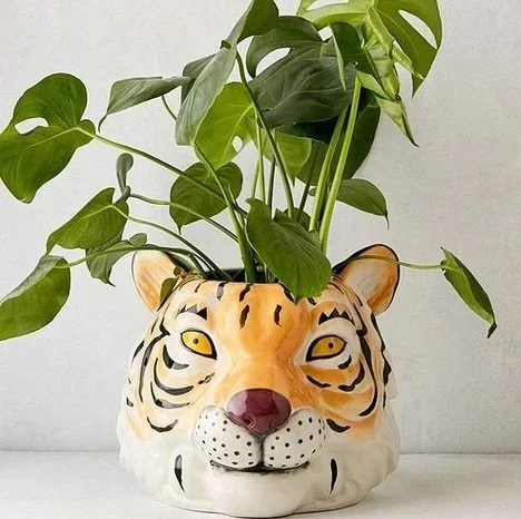
So how do we get the look and feeling without buying the same exact products? On my search for that star pillow I also found these:
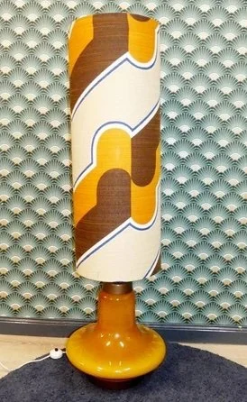
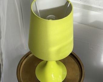
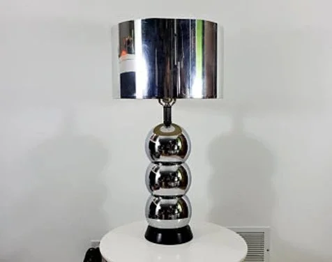
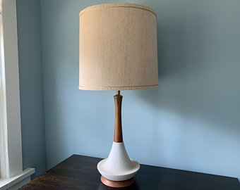
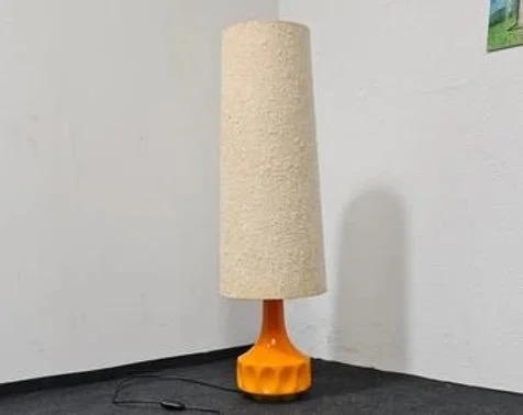
That fulfills a part of "11) whimsical accents". It's not a perfect match, but in my estimation, this is just as fun as the star. In my search, I also came across a bevy of vintage lamps:
A lot of them fulfill the whimsical factor, others fill the "mix of textures" and then others fulfill the "bright colors" quotient. It would be so easy to buy exactly what is in the picture here: https://abigailahern.com/
This is kind of fun... let's do anther!
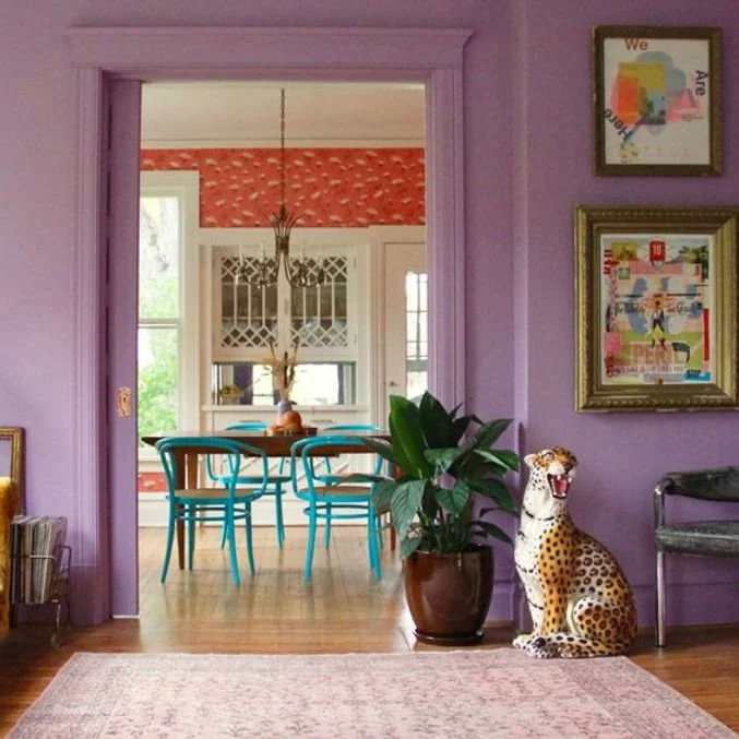
1) use of bold feminine colors
2) animal print patterns
3) painted molding
4) use of historical architecture and more modern furnishings
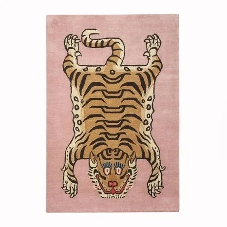
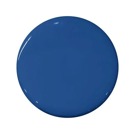
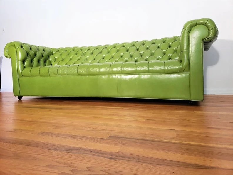
So here would be my list of potential products:
Got room for one more?
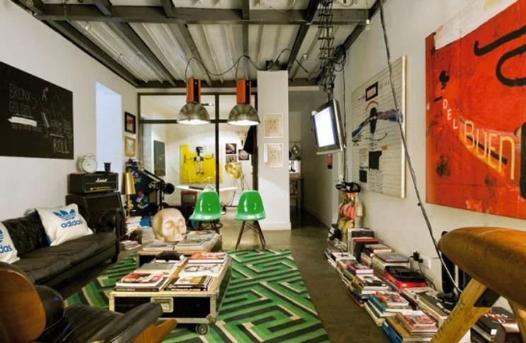
If you can't already tell, this is definitely *ahem* a more masculine take on interior design (note that lack of over-adorned furniture).
1) found objects used as storage
2) vintage furniture
3) industrial lighting
4) use of large graphics
5) primary color palette
6) pop art


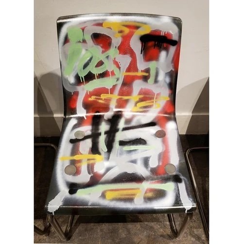
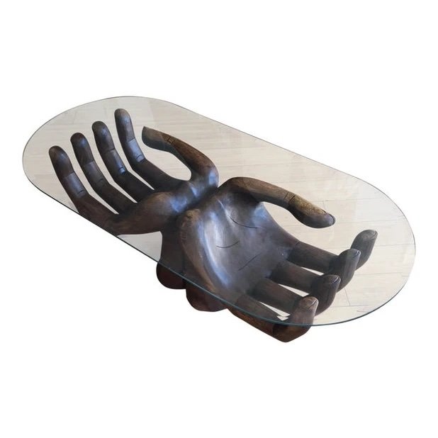

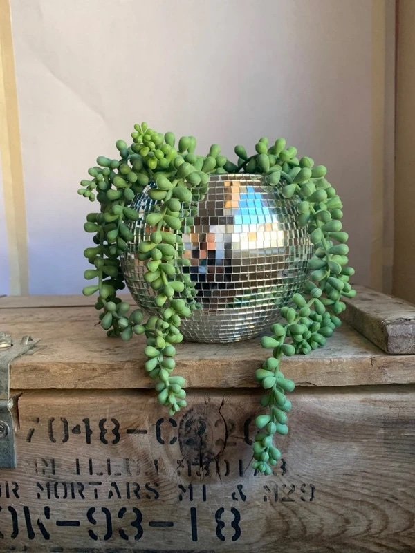
Believe it or not... this is actually my favorite!
So now that we have our three inspiration photos, what now?
let's be rock stars
You know what be a truly badass rock star move? Taking all the best parts of your favorite pictures and mixing it together. Let's experiment, shall we?
I love how the whimsical mixes with the raw materials and how the masculine balances with the feminine. I can safely say no one - and I mean NO ONE - has this configuration of objects in their home. It has all the greatest hits and what's more, I can feel proud that I created it with my own imagination and research. Is it me? Yes, because I stuck to what I was naturally drawn to and what my eyes wanted to see. I am feminine AND masculine, funny but tough, childlike but not naive, soulful and practical. I love exciting prints, patterns and colors and I am not afraid of a little grunge. And I like that about me :)


