it takes two (or more)
Good morning and happy Sunday! How are you doing out there? How are you liking the new AD this month? Loving the feature on Emmy Raver-Lamper and Daveed Diggs (I especially love the couple's embrace of color in lieu of the typical washed out California modern look) and also the article on JJ Martin's chic AND inspirational transformation of her Milan apartment (man, for a freshly divorced lady with no money and no time during a lockdown, she sure turned it out...). One thing that struck me about both stories and transformations was the sentiment that it couldn't have happened without help and partners. In fact, the AD article for Emmy and Daveed is titled "A Perfect Pair."
Too often, when I talk about design, I talk about myself and what I want. And for a time, that was how I felt. My dear husband, PB (again a nickname since he is very private), would quietly sit back and watch me design without much input from him. First of all, he doesn't quite have the patience to go through hundreds -- neigh -- thousands of pictures and samples. And secondly, he is way more conservative in my estimation. I attributed this to his lack of interest and eagerness to "just be done with it" as disinterest. And that was how we got this:
MTD
It's cute but... it's not a reflection of either of us really. Well, there's little peaks of me in there but it's a lot of restraint. And there is absolutely none of PB in there. At all. Like nothing. I would be hard pressed to say it even looks like he lived there. It was easy to dismiss his absence since it seemed he didn't care about having any input, but now I'm beginning to realize that he was just being polite and loving. I mean, we have a painting of a handsome mustachioed sailor. My husband is a saint.
But that was then and this is now... when we first moved into our new house, my first initiative was to make sure PB got most of what he wanted. That meant tearing down a wall and turning the new house from 4 bedrooms to 3 to accommodate a huge office for him; TVs in every room except the bathrooms (no duh); and finding a station for him to do his painting and models. Unfortunately, the projector did not work out due to technical reasons and not for lack of trying, and he mused that will be in our NEXT house. But then there were the unsaid considerations which, again, he was too polite and loving to mention. Part of being a good life partner is hearing the unmentioned requests and sometimes just doing things without a prompt.
pay homage to heritage
One very fun way to incorporate your partner into the design is to pull from their ancestry and heritage. PB's mother's side of the family hails from Madrid, Spain. We went to Madrid for PB's 40th birthday and it was thrilling to see him come alive and become "one with the people." And NOTHING is sexier than a man (or woman) who speaks another language fluently. One night, I think I might have even cried out of happiness -- it was so beautiful to witness his truth and the beauty of his mother country. Anyway, back to design.
Because we both shared a connection with his heritage, I thought it would be awesome to have some nod to Madrid somewhere in our home. Cut to our HUGE map of Madrid almost hanging above our bed (the map weighs 135lbs and literally has taken two tries for some very strong men to hoist it up and now we have 4 men coming today to finish the job):
There's something about maps that are so meta. They are graphic, they are colorful, they are grounding. They are the graphic representation of a time and place and memories. They put you in a place and time and yet are very practical. I mean, we stared at some version of this picture at least a hundred times when we were tourists, and now when we are at home and far away, it represents the place where I witnessed a piece of my husband's soul and happiness. Plus it's yellow!! Anyway, I love it and I couldn't imagine a better representation of my husband and couldn't be prouder to put it on my wall.
honoring their collections
By now, you will have noticed our obsession with films. Well, I'm going to be honest here and let you know it is my husband who is obsessed. I am merely along for the ride, much like a 1950s teenaged damsel alongside her delinquent boyfriend speeding down Sunset Blvd., headscarf whipping in the wind and flipping off old people. Because, according to John Cusack in High Fidelity, "It's what you like. NOT what you are like."
One of my many nicknames for him is "Professor [His Last Name]". Ever hear of the Leonard Maltin Movie Guide? Well, flip to any page, pick out any movie and PB can tell you the running time theatrically AND director's cut, the release year, the director, the leads, the summary, and how MANY STARS LEONARD GAVE IT. The same goes with Billboard's Top 100 for almost any year. Without skipping a beat, he can name the number one song the month you were born and how long it stayed number one, who sang it and who wrote it. He's never bothered to qualify it, but his knowledge of movies and pop culture is on par with any great film director or record producer. And that is just ONE of the many things I love about PB.
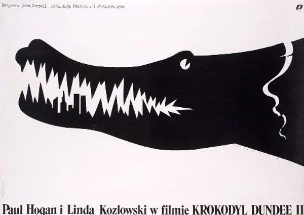
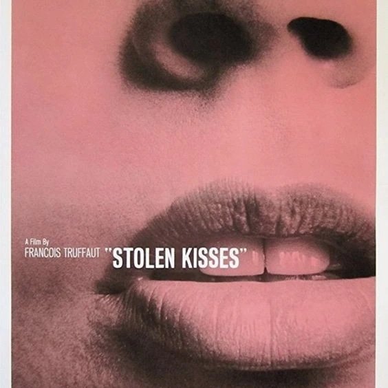
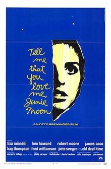
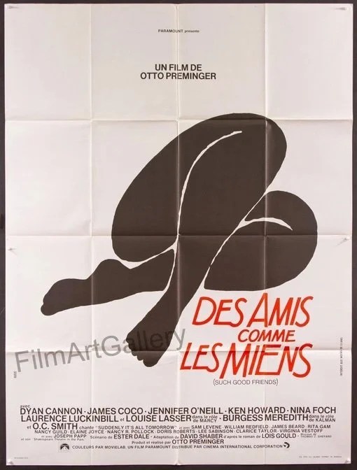
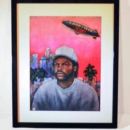
So why not celebrate this man's gifts by adorning our home with film posters? Here is our collection thus far:
Yes, his wardrobe
Remember when I said you should go to your closet for inspiration? No? Here's the link:
https://www.melaniethomasdesign.com/post/how-to-find-your-true-colors
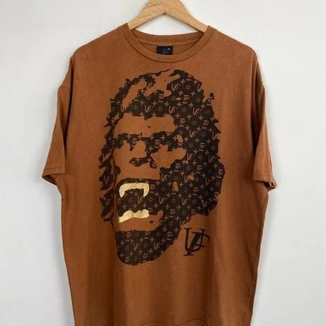
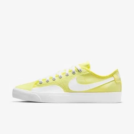
Now it's time to go to HIS closet and get some inspiration there. My guy, while not a fashionisto, definitely has a theme. Skater, graphic, fun, bright, colorful. He is pretty brand-loyal and loves two in particular: Nike and FUCT (Friends You Can't Trust). He likes controversial T-shirts and graphic patterns and COMFORT. He also loves in-your-face colored shoes...
I am proud to say that he even has mastered the monochrome look and gone out in ALL red on many occasions -- UN-ironically I might add. While not refined or restrained, his look is unstudied, fun and unmistakably his own style. He dresses for himself and I find that incredibly appealing.
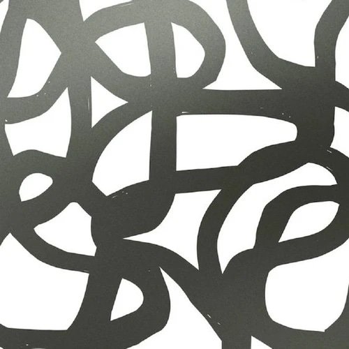
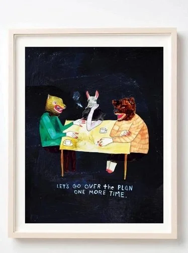
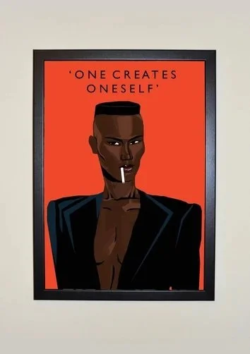
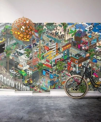
So, drawing from his wardrobe, I looked for patterns, colors and art that reflected his intrinsic style:
Full disclosure, PB actually HATES the first poster... BUT I think he'll learn to love it. In some way, it was inspired by him. Is it campy? Yes. Is it loud? Yes. But right now, I'm sitting across from him wearing a t-shirt with Ronald McDonald surfing a bright blue wave and I love it.
Of course this is all to say that design needn't be one person's vision or even a collaboration with two people vying to get equal representation in their home. Even if your partner does not have any interest in interior design and you do, you should always try to involve them in some way. For one thing, it is good for the relationship. And secondly, it will help you learn to appreciate their point of view. I want PB to feel at home and see himself in his surroundings even if he doesn't have the patience to go through the hundreds NEIGH thousands of pictures and I do. And what's more, there is a reason why I have chosen to spend my life with this man; his uniqueness, charm, artistic taste, sense of humor, wit and openness, and I want that reflected in OUR home. Honestly, I feel like I'm the luckiest lady and I get my own private connection to one of the more truly special people on this planet.
And I cannot forget his most attractive quality: his empathy and encouragement to let me be myself. I love you, PB, MWAH!!!


