the kitchen reveal
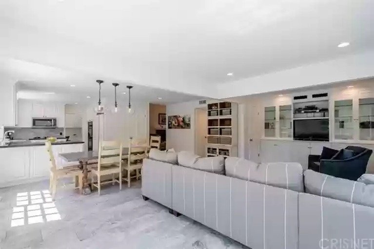
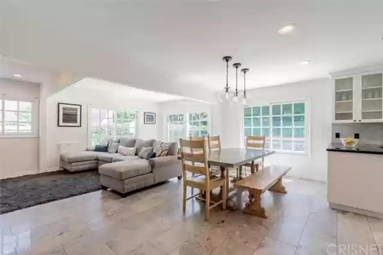
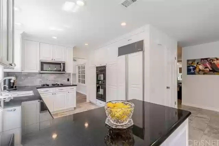
Hello! How are you today? I'm so excited to show off my new kitchen, but best part of any kitchen reveal is the "before" pictures:
Not bad right? And you can see more in this post.
It sounds totally crazy, but we started the kitchen in JULY of this year. I'm not going to lie - we took a pretty lackadaisical approach to this renovation. We were able to use the kitchen the entire time, even right up to the counter install. We didn't take the cooktop out until the new one was ready, the microwave was still in its little cubby above the cooktop, the fridge stayed put. So don't feel too bad for us that it took 6 months from beginning to end.
Instead, what I want you to feel is jealous. Jealous of this gorgeous kitchen. And let's talk about trends. I've seen on social media that the "Turn of the 20th century" kitchen is pretty popular with marble, and relaxing, calming colors, painted detailed cabinet doors and ornamental pulls. And yes it is so so beautiful and super posh and I wished I was that person. I imagine she wear lots of black Lululemon and has her nails done in neutral colors (mine are all cut up and one of my nails broke off down to the quick yesterday when I was moving plants around).
But I'm not that person. I barely pay attention to what I wear, but you know it's always going to be super bright and colorful. Same with my husband. So we need a kitchen that reflects us. We need some color, we need some in-your-face art, we need function, we need some rough edges and we need some irreverence.
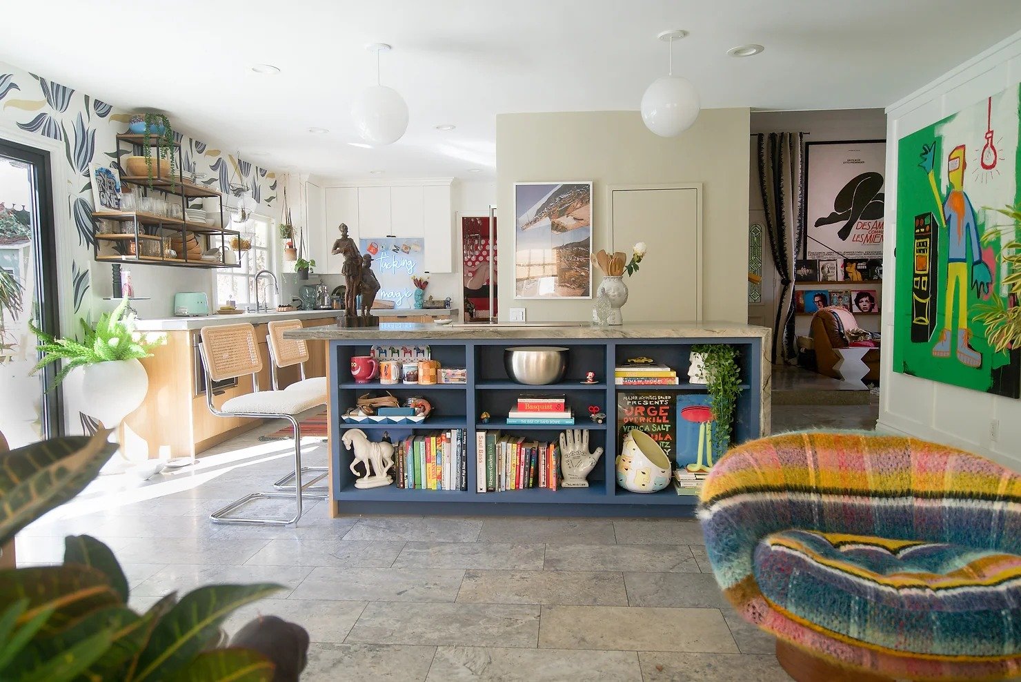
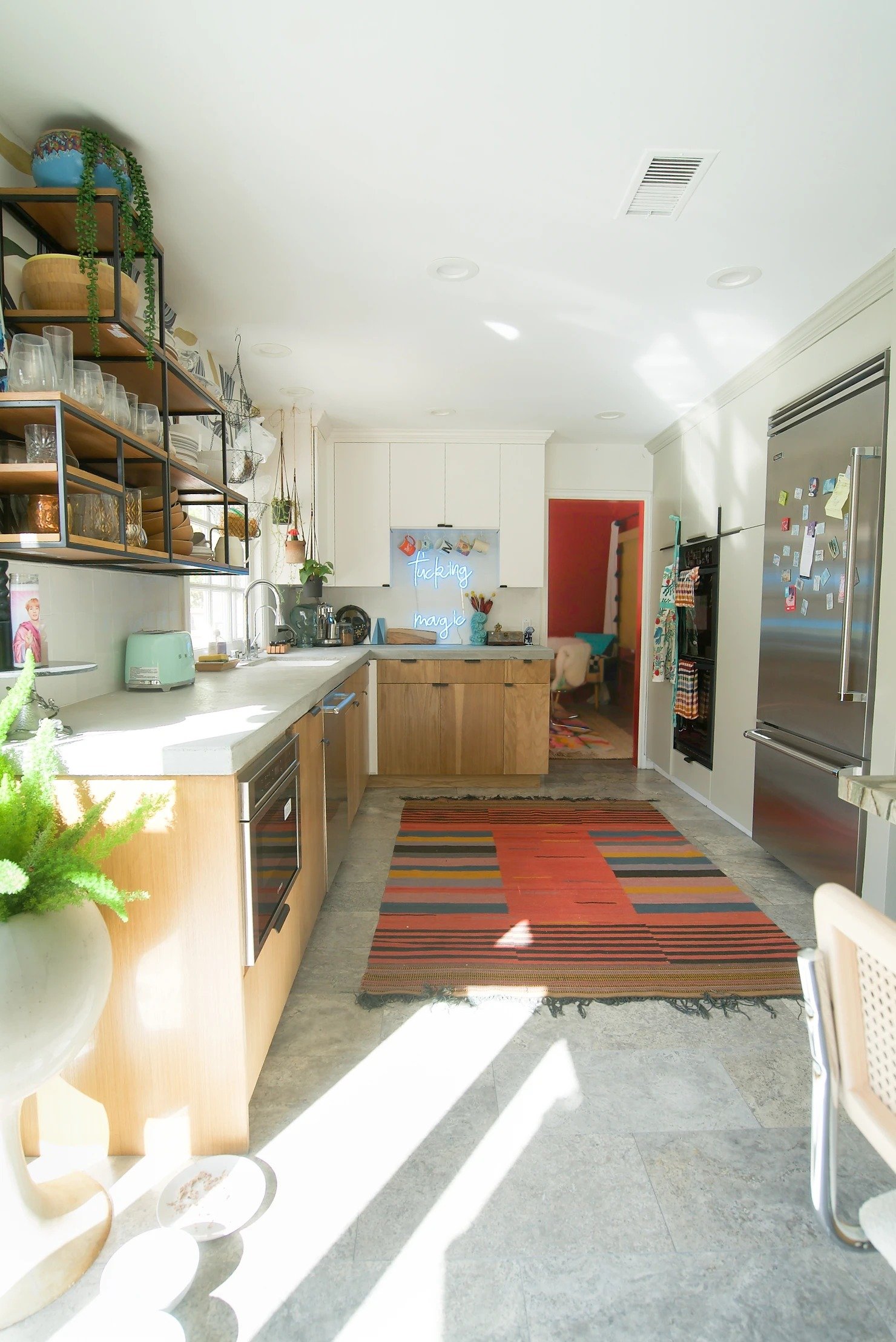
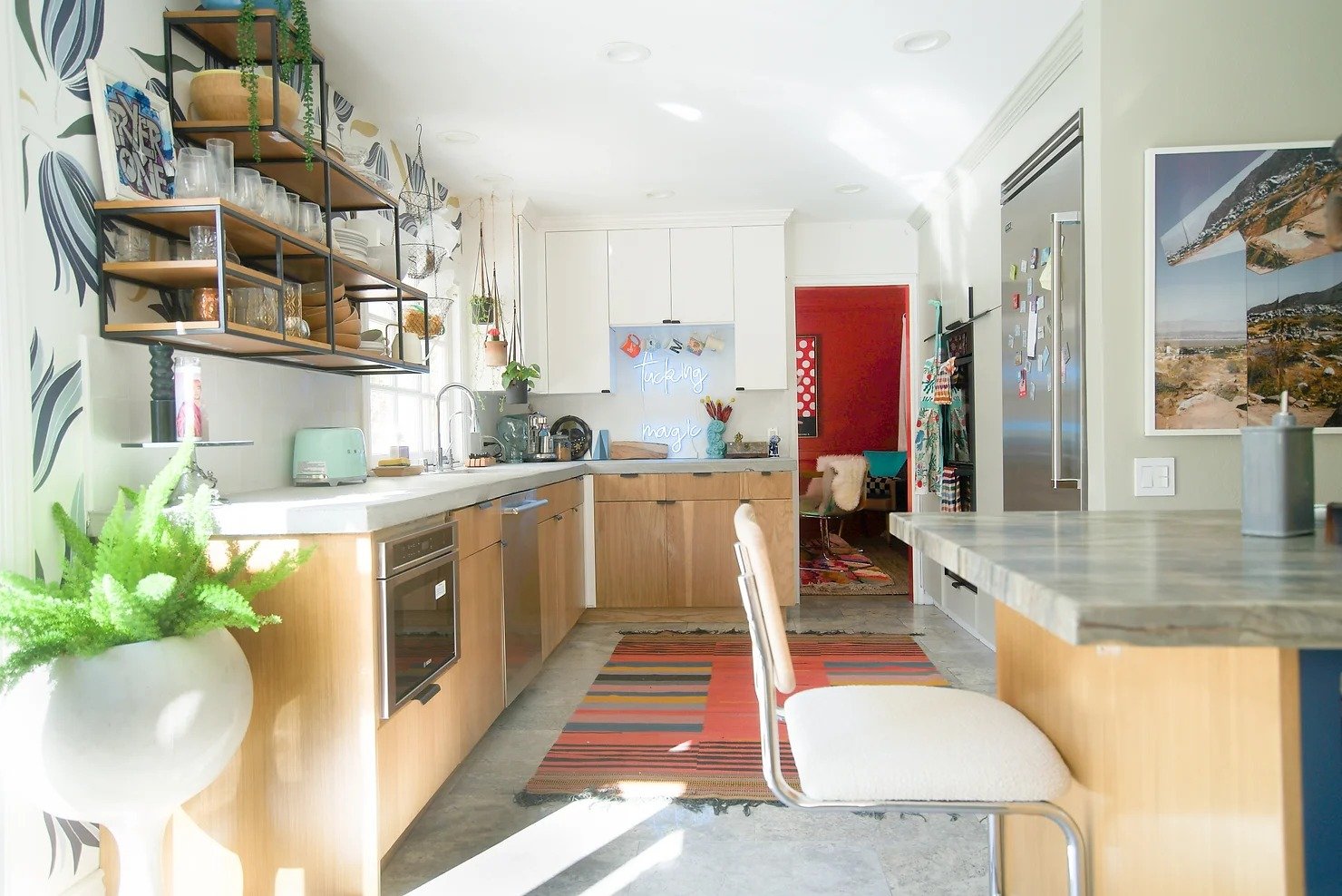
So without further ado, here THEY are (my kitchen's a "they" because they are EVERYTHING):
Jealous???
Layout
Here's why you need to live in your home at least 6 months before tackling a major renovation like a kitchen: you get to know your space so you can rethink problem areas.
When you buy a house, everything feels great because it doesn't feel like your house yet. And when you're in someone else's house, you forgive many things. You forgive that the door to the backyard is tucked into a corner behind the couch. You don't care that there is barely any room at the kitchen peninsula to do anything useful. You don't care that the TV feels just wrong.
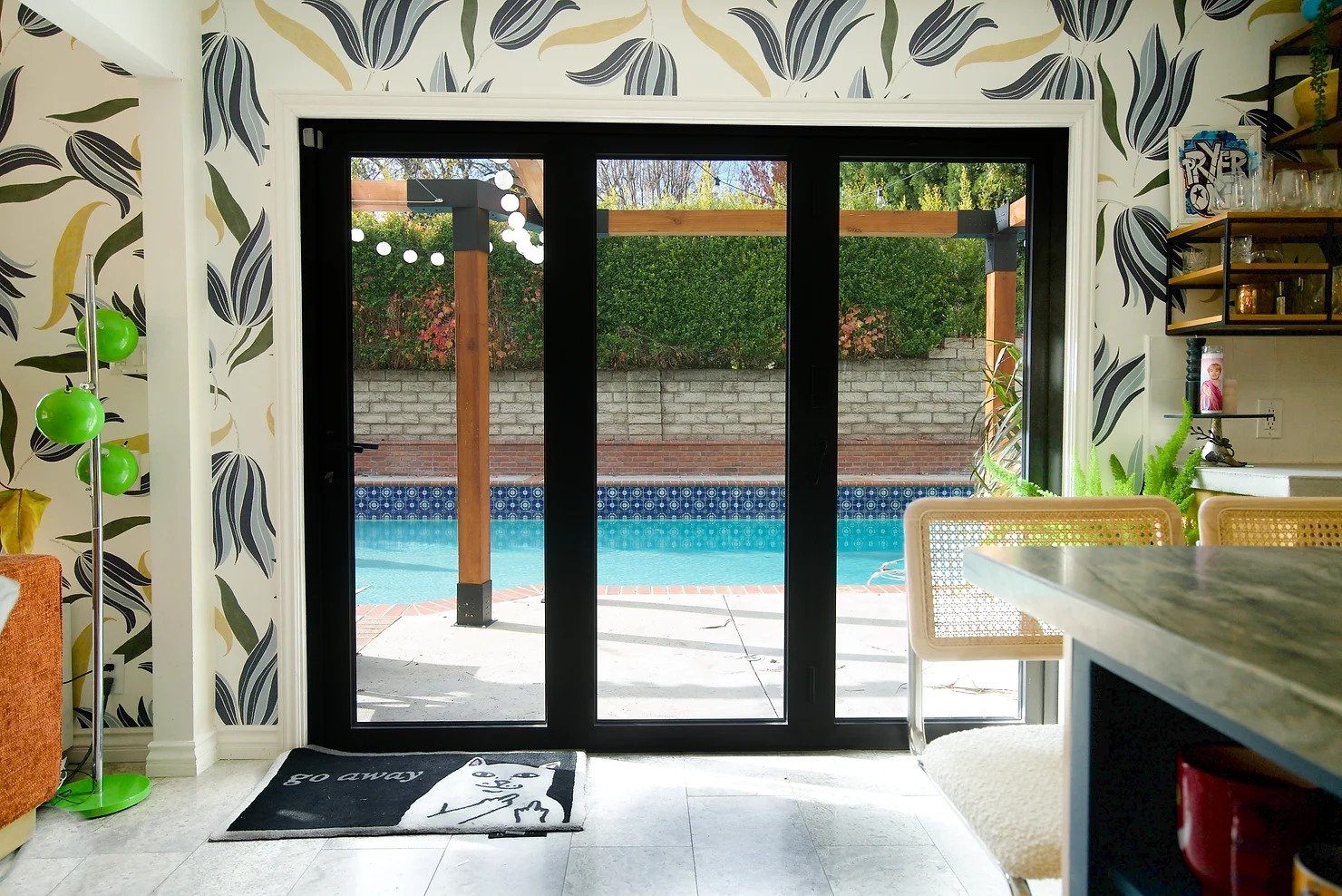
These are all the things I began to realize after a year of living in this new house. So what did we do? We moved the sliding glass door to the middle of the room and switched it with the window currently there. We made a storage closet of the TV cabinet nook and brought the wall forward.
After we switched the window with the door, we really wanted to take advantage of the openness and opted for an accordion door that opened completely to the backyard. We have a gorgeous GIANT 50ft pool WITH a diving board in the backyard and a giant ivy hedge behind it. It's like our own little oasis on a small 6500 sq foot lot in a planned community. This giant pool is rare here. So we wanted to SEE it.
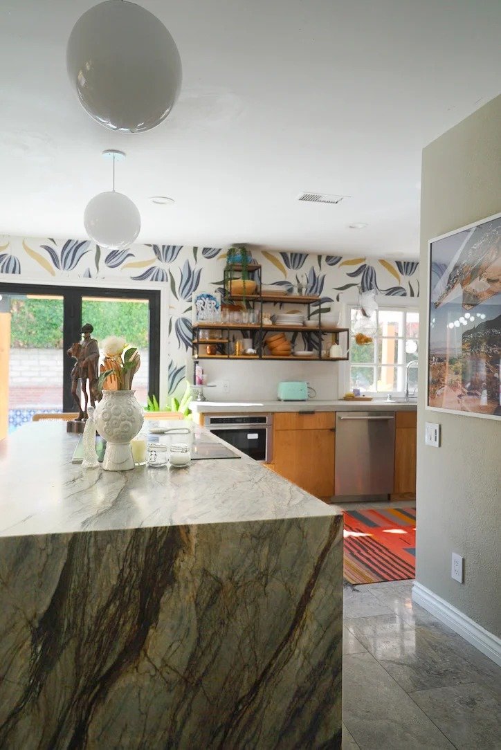
When we switched the door and the window, we then had a HUGE area between the TV area and the kitchen that felt like wasted opportunity. And what's better to fill wasted opportunity? An ISLAND!
We are on a slab, so we needed to trench to the outside for exhaust and then also electricity. We wanted our island to be a cooktop island. Although it's nearly impossible to hear anything while cooking, I like to be able to talk to my husband and watch TV while making my patented spaghetti. Cooking is like running, if you can't talk while you're doing it, you're doing too much.
At first, we were going to have the seating on the TV side of the island. We had everything built for the cabinetry and then we placed the template for the quartzite on top and it just didn't feel right.
You see, pathways are super important in kitchen planning. The quartzite would cut into the pathway from the garage to outside. So we pivoted and made the TV side a bookcase. We wanted shelving anyway. And when I really thought about it, I didn't want too much seating available next to me while I cook. I don't mind an audience but I would rather they be further away, NOT seeing that carrot I dropped on the floor and then dusted off and put back in the pan. This way, the island became less "island-y" and more of a transition from the TV area to the kitchen. Solved!
CABINETRY
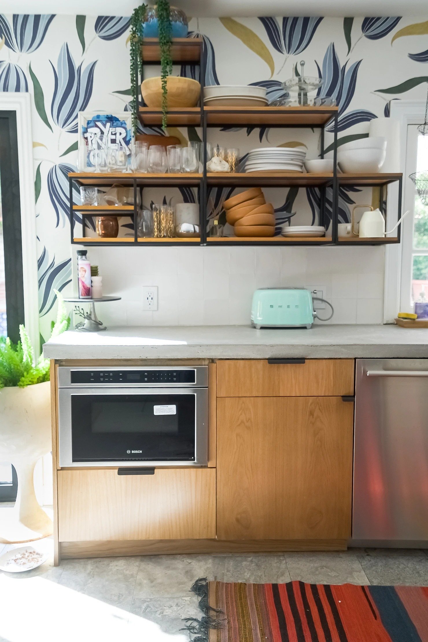
We loved our microwave drawer in our old house and and decided to use it again! Here's a little secret: I hate microwaves in upper cabinetry. I apologize if that offends, but if I have a choice, I'm going to nix it.
I decided to keep our upper cabinets in the corner but decided to use open shelves on the left side of the sink. Number, I love using open shelves as a transition into the kitchen. Number two, I wanted to show off the gorgeous Abnormals Anonymous Secret Garden wallpaper. I had it custom made to my color preferences since I felt the light blue in the standard wallpaper was a little too green. So I opted for "Stiffkey Blue" and "The Early Stuff" and kept the greens as is. I didn't want standard open shelves, I wanted something more sculptural. I have no idea how I found them, but I was browsing West Elm and came across these steel and wood modular shelves. Bingo bongo we've got a shelf-o.
Not having a microwave in the upper cabinetry also gave me an opportunity to put in another shelf above. However, my contractor stalled so much, it gave me a moment to think about what I actually wanted to do with this space. I'm a big believer that you should always have art in your kitchen. Otherwise it is too cold and just basic. But I didn't just want another painting or sculpture or color. I wanted something interactive. In comes Yellowpop. Now, what to say...
I don't think I say this enough, but I have a wonderful, delightful husband. For the most part, he is a pretty standard human being, full of doubts, fears, boredom, etc. But every once in a while, he does something completely magical and he leaves me floored. I ask him "How did you do that?" Or "How did you know that?" and he replies "FM." And that is our little joke since we both know he means "Fucking magic." I wanted to pay homage in some way, hence the neon sign.
color and Countertops
Are you worried about using two different countertops in your space for fear it will feel too disjointed? I know I was. I was worried that if the kitchen island cabinetry is a different color then the rest of the kitchen, then it would feel like it was off floating in space and not connected. Looking at it now, I know that this was just some remnant of "expert advice" I read somewhere. I mean, my refrigerator wall is greenish greyish brown, my kitchen lower cabinets are white oak, my uppers are white, my open shelving is steel and wood, and my island is Stiffkey Blue. It sounds crazy, so I can't really fault my hesitation.
But here's the key to mixing elements: as long as you stick to a color palette that's been established either in a wallpaper or a piece of art in the room, you'll be ok. Repeat after me, if I stick to the color palette I'LL BE OK.
In this case, the cohesive piece of the puzzle is the Abnormals Anonymous Secret Garden wallpaper. I knew I wanted to use quartzite, so I picked out a quartzite with the right amount of green and blue in it. The fact that I wanted it leathered came later. And it came out AMAZING if I do say so myself.
I wanted to counterbalance the poshness of the quartzite with something a little more "working man." And what's more working man than cement? Read this post about my decision, but I'm so glad I did. And I even left all of the imperfect edges when it came out of the mold. I'm such a rebel.
To counterbalance the grey rough edges of the cement, we opted for white oak cabinets and simple cabinet pulls. I already had my SemiHandmade TV floating cabinets in the TV room, so we color matched and got some new ones put it in. By the way, did I mention that besides adding a new island, we didn't change anything else about the kitchen layout. My contractor wanted me to open the doorway from the kitchen to the dining room, but I just felt like that would ruin the dining room vibe.
Probably the biggest accomplishment I made on this kitchen design was the color on the cabinet/refrigerator wall. I know it sounds like it wouldn't be much, but everything else was simple in comparison, but let me explain. The cabinet/refrigerator wall is the same wall that wraps around to the staircase in the living room.
And there is a huge piece of art there with DIFFERENT COLORS than the kitchen: lavender, hot pink, red and gold. But there is ONE color that is the same: khaki green. I also wanted to find a green that was very very muted, so that it didn't call attention to itself. At first I chose November Rain by Benjamin Moore. But the color wasn't a good enough foil for the other colors in the room. Drum roll please...
Backdrop Mojave Gathering. Now, I know what you're thinking: that's not green. But in my house it is. Beige has the habit of taking on the color closest to it. That's why it's important to TEST every single color in your own home. I like Backdrop because their colors are usually on point and pretty close to my palette and then also the samples are only $3 whereas Samplize samples are $5 and $8.
With all of that, there was still one color not represented in the kitchen that was visible. Red. The easiest way to incorporate was to then take the kilim rug from the dining room and put it in the kitchen.
Voila. Red, blue, green and gold. And some pink, but mostly red.
Here's a round up of the resources:
COLORS: Stiffkey Blue, Mojave Gathering, Simply White
CABINET PULLS: Barrington Edge Pull
LIGHTS: Luna Cord Pendant
SHELVES: West Elm Streamline Shelves
WALLPAPER: Secret Garden in custom colors
ARTWORK: Tommy Lei Desert Reflections, Robert Langley Looking for Tonyo, Yellowpop Custom Sign
ESPRESSO MAKER: Nespresso Original Line
APPLIANCES: Viking Counter Depth Fridge, Bosch Microwave Drawer , Thermador Dishwasher, Viking Induction 30" Cooktop (for more drama about the cooktop, please read THIS)
COUNTER STOOLS: Walsh Counter Stools
RUG: CB2 (discontinued) but replica sold on Etsy
I've written a lot and I think I've mostly covered it but I'm sure I'm missing something. Comment below if you have any questions! I would love to answer them. There's a lot to digest. Phew.


