Think Like an Artist, Not Just a Designer
Hi again, friends! I can’t tell you how happy it makes me that you’re here, reading this. As anyone who has spoken to me knows, I love talking about design and being creative. It is my way of problem-solving in a world full of unsolvable problems. War in Gaza and Israel that never seems to end and thousands of innocent people that suffer as the result? Figure out what color to paint my client’s ceiling. Trillion dollar debt? Plan the perfect layout to a difficult living room. Balance a healthy lifestyle and be happy with my current body situation while dreading every iPhone picture despite my body positive attitude? Devise a way to DIY a vintage lamp into a wall sconce. It is my way of controlling my own little piece of the collective world we share. It might seem trite and sure I could volunteer but this is my way of making the world beautiful. I am soooo much better at relating through unspoken gestures than pleasant conversations. When someone tells me that I’ve taught them how to listen to their own creative impulses, I feel like I’ve saved another soul. So in other words, thank you for being here.
Speaking about being creative… I wanted to write a little about my observations on interior design vs. interior artistry. For me, there is a HUGE difference between designing a room with all the rules and regulations vs. CREATING a sanctuary. I guess the most accurate analogy would be “paint by numbers” vs. free-styling. Both can be visually attractive but arguably one is more about expression and emotion while the other is more about hitting bullet points. I’m not going to lie — I get stuck in that bullet-point-thinking as well. And I’m also not going to discourage it. Hit the bullet points. But just like with cooking or any other creative endeavor, reserve just one little bit for magic.
Avoid shopping at one store
I get it. Anthropologie makes it so friggin EASY to shop all of their products and add them to the cart. It all matches and vibes together and 99% of the work is done for you. And I’m not saying you shouldn’t. BUT rather than adding everything from one store for convenience, shop vintage or even try different stores. Part of going on the artistic adventure is to make your environment a bespoke experience. It’s what separates us from the AI overlords. DIY it, thrift it, repurpose it, rethink it. That’s the first step to thinking like an artist.
plan everything but then throw in a curve ball
You might not know it but… I’m a bit of a planner. In fact, I wrote about it in this blog post. I knew this from an early age — whenever I played World of Warcraft PC version (back in 2003), I would stock my camp to the absolute brink, past the point of guaranteed victory, and then wait some more… then ATTACK with all my forces and crush my enemy into obliteration. I was not one of these who liked to roll the dice with what I had and test my strategy skills. Does that make me a wee bit of a coward? No. I just like to plan if I have the option.
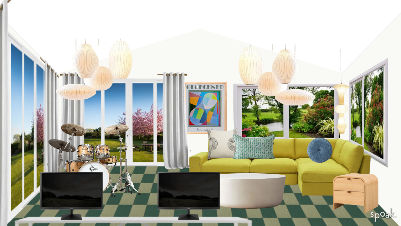
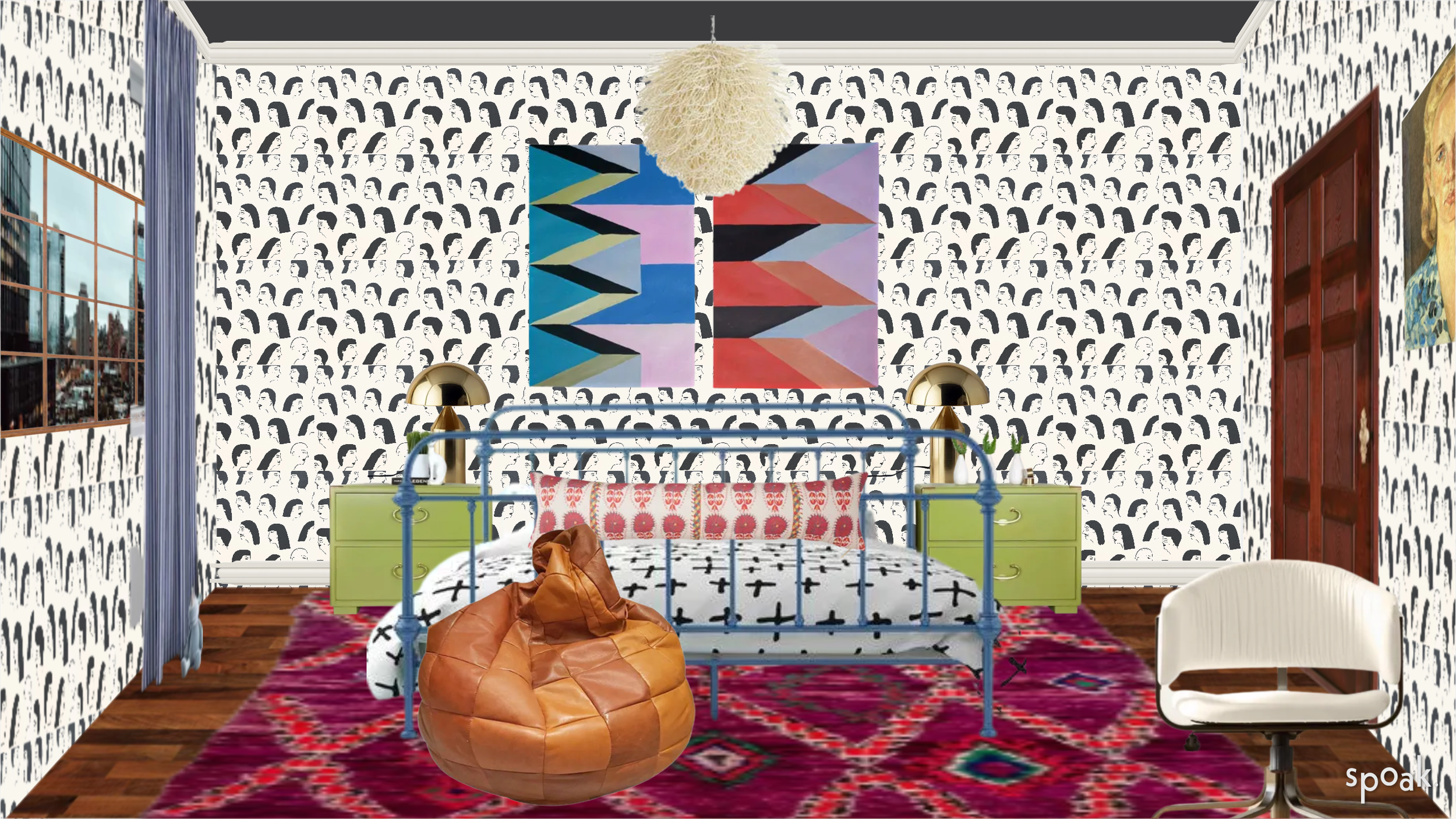
The same goes with my house and my clients’ projects. I plan everything to the nth degree with my handy-dandy design platform, Spoak (this is not a sponsored post). I absolutely love Spoak. It is not the best at designing and making a pretty picture. However, it allows you to add products from ANYWHERE, create budgets and shopping lists and fill walls with actual wallpaper (not just images) AND adjust the lighting and angles. It is truly my lifesaver!
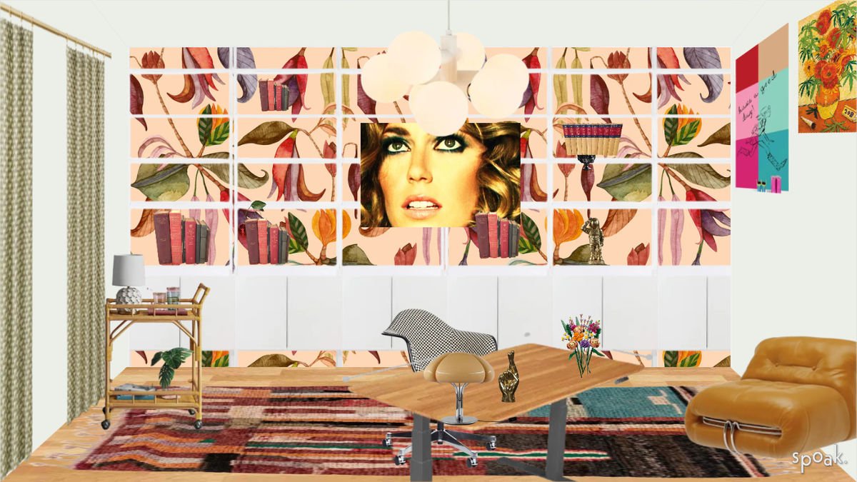
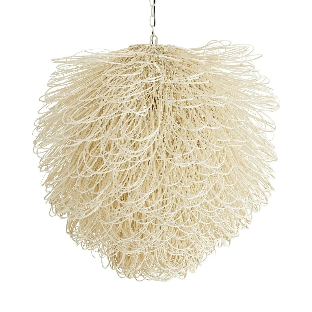
Ok I totally used the same chandelier twice but I LOVE this chandelier:
Planning for me is like a puzzle. There are the basics I need to take care of first and foremost, like the furniture, the rugs, lights, art etc. Layout is the definite priority here. But then… where’s the magic?
The magic happens when you add an unexpected element that does not quite fit with the basic elements but it still just magically works…
I have struggled with my main bedroom for an extremely long time. Embarrassingly long, actually… One Room Challenge. There’s just something about this room that makes it incredibly hard to figure out. I am not ashamed to admit it. Well maybe a little, but I am here to show everyone that being an interior artist vs. interior designer is fraught with indecision, embarrassing failed attempts, and works in progress. But it is through trial and error that I discover my bliss. If I did not fail so much, victory would not be as sweet.
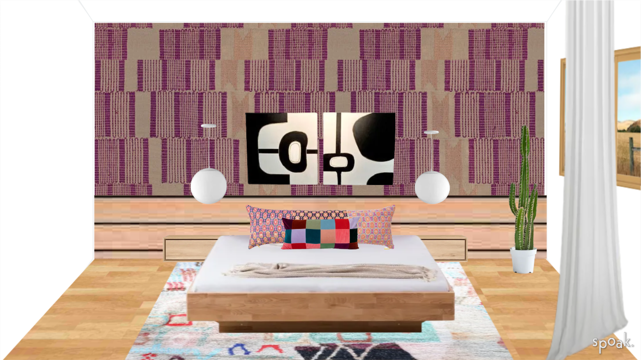
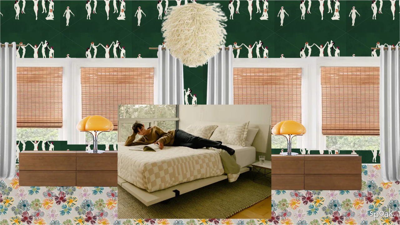
For the example above, all signs have been pointing me in the direction of adding yet another pattern on the wall. I am obsessed with pattern (please read this post right now if you haven’t). The colors in this room are grass green, schoolbus yellow, rose pink, tomato red, antique light blue and cobalt.
It’s hard enough finding a pattern that fits ALL of those colors, but also one that fits the aesthetic.
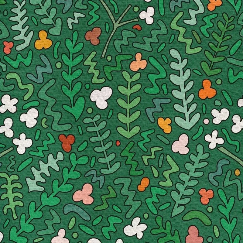
I mean… it’s kinda perfect, no? It’s bright, it’s happy, it’s arty/cartoony. Just my aesthetic. But something about it was just too perfect. And that’s the kinda feeling I get when I know it’s not right. It’s like going on a date with an independently wealthy guy (or girl) in your age range who likes to travel and laughs at your jokes. Perfect on paper, but you’re not in love.
This is still a work in progress, but the COBALT. Now this sings.
Now you may be asking… okay, so you’ve planned all of this. Where is the magic? The magic is the blank space above the headboard. The magic is when I decide to put that yellow portrait somewhere else. I am reserving that for inspiration in the moment when everything is put together and I have to use my gut to either fill it with something or be brave and leave it blank. That’s the thrill. That’s the good stuff.
So stay tuned on what I decide!
go big and scary from the word “go”
Believe it or not, but I didn’t plan one stitch of this room ahead of time. Everything you see here was a fly-by-the-seat of my pants decision.
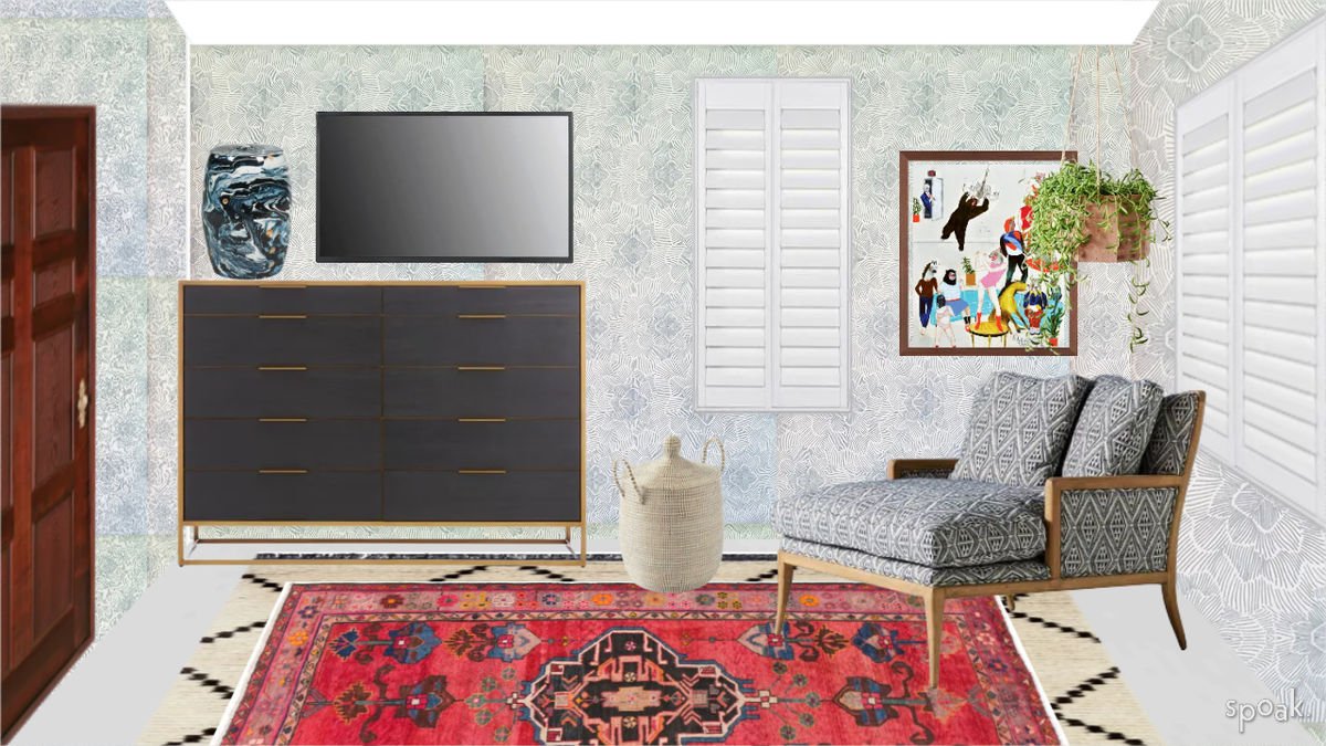
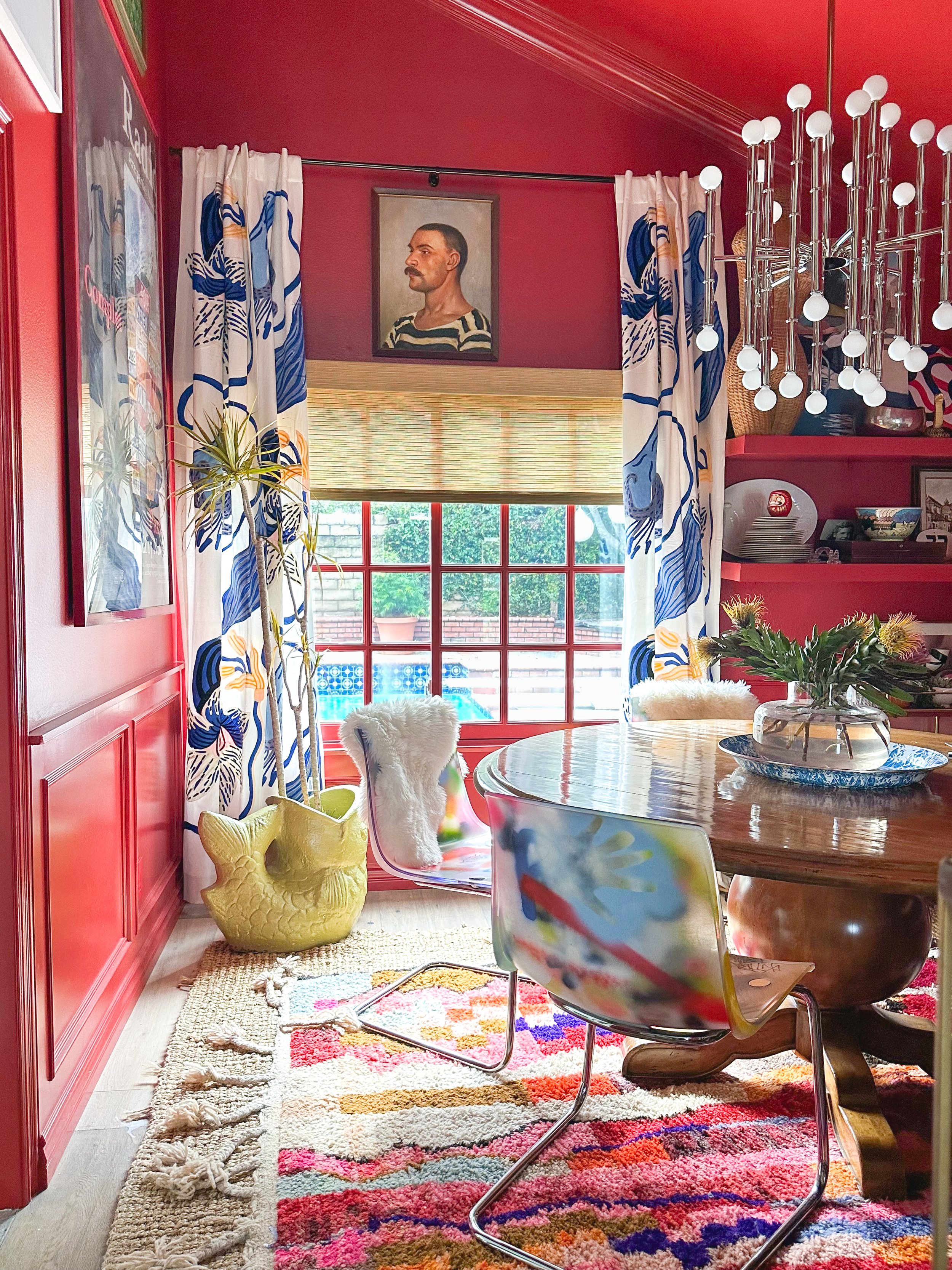
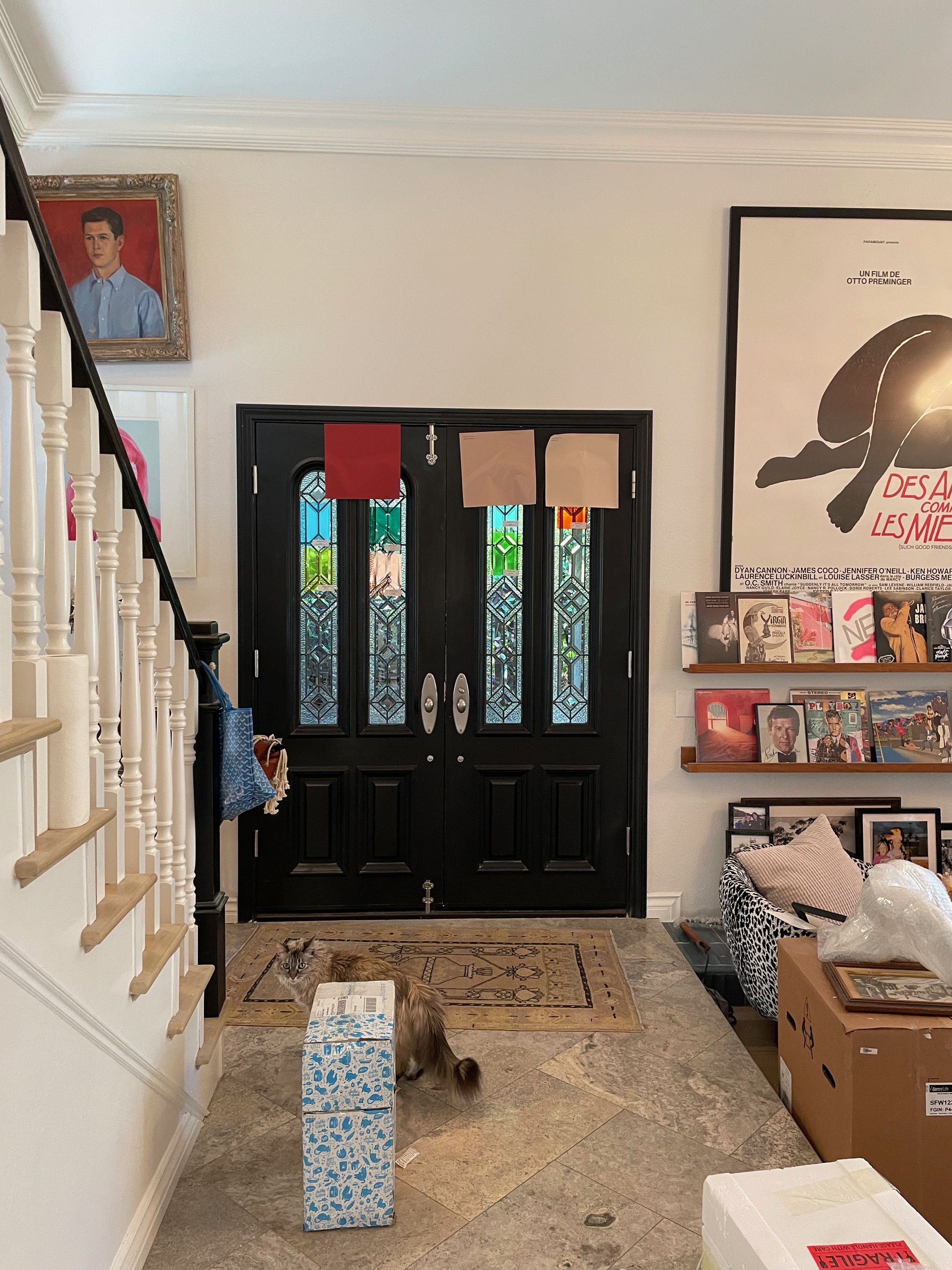
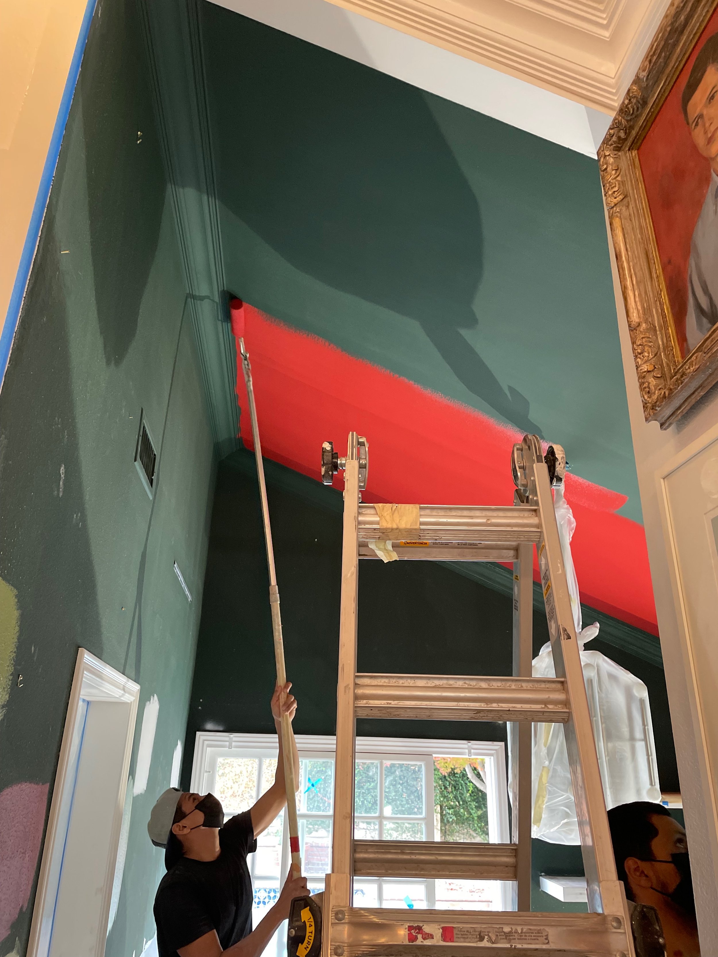
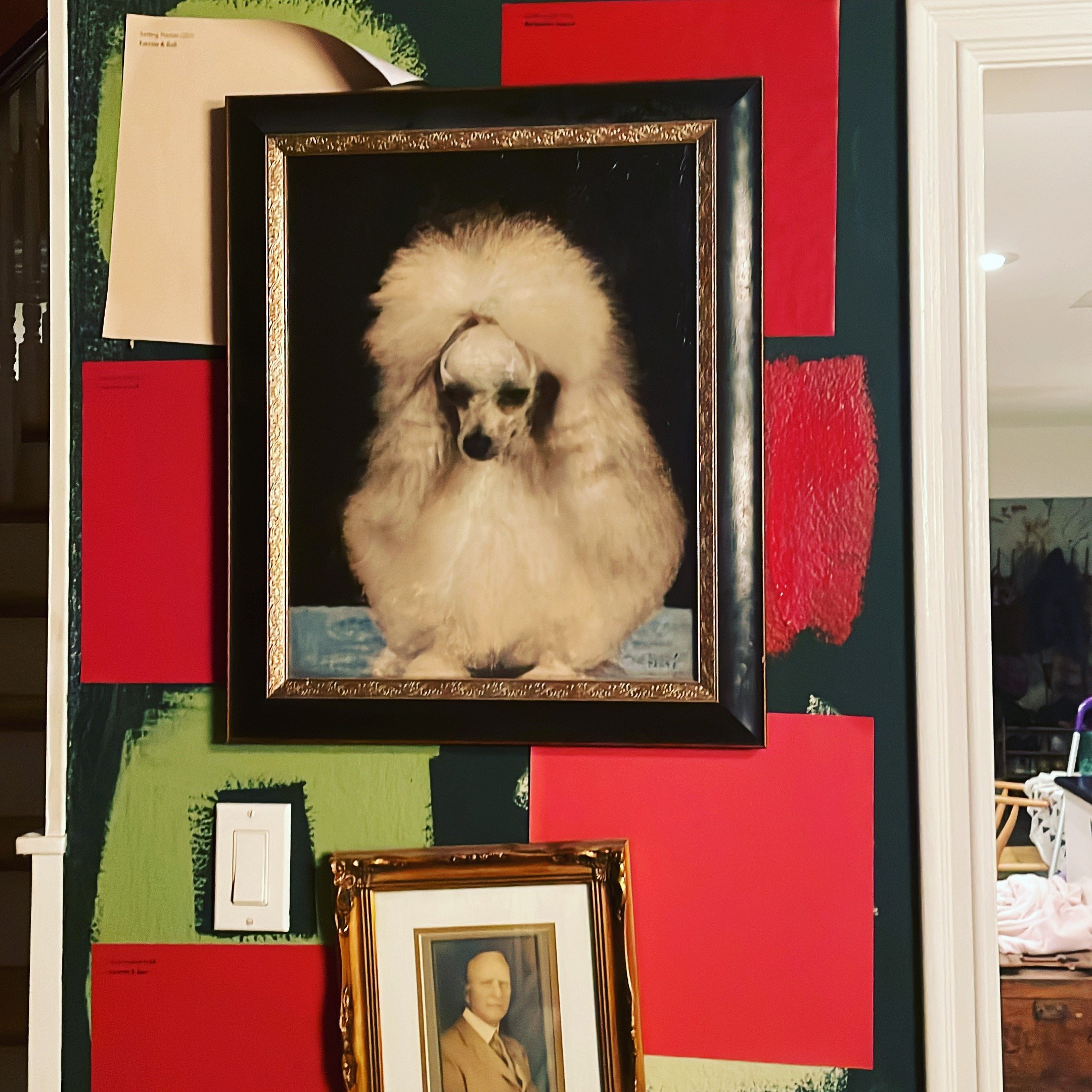
At first, we painted the room a deep dark green. I thought that would give it a luxurious library feel. Library was what I got, but not the good kind of library. Dead. Dusty. Boring. I wanted that luxurious feel but not at the expense of my inner spirit. A few hundred samples later, I landed on Farrow & Ball Incarnadine. How did I know it was the right color?
It scared me.
It was that comfort zone thing that got my blood going and my imagination firing on all cylinders. The boldness allowed much more mundane choices — like curtains and rugs and chairs and blinds — to seem all the more bold.
The lesson is to start with something that trips you up a little bit. One of the questions I ask on my client intake form is “What color do you secretly love but are too afraid to try?” I have to be honest — I didn’t even like the color red, but that’s because I had an inner limitation. It was because I trusted my gut to tell me what felt wrong instead of what felt right, that I learned to distrust my “design eye” and instead tap into something more primal. And that’s where we get into expression vs. impression. And here’s where design differs from art.
Did you know anything can be art?
The saying “Think outside the box” is so dumb IMHO. True creatives know that the box doesn’t exist. The box is just an amalgam of preconceived boundaries devised from a place of fear in order to keep everything in order. From a very early age, I always felt like other people’s opinions on how to do things never really applied to me. Don’t get me wrong — I’m not some fearless rebel here shucking tradition to the wind, but I just was never comfortable. Everyone else would say their priorities were “family, friends, and education.” My answers were always “Creativity, freedom and connection.” To stick out would be a risk, but stay within those imaginary confines would be suffocating. I felt suffocated. The box is a justification of why those boundaries exist. It identifies this proverbial “box” as an actual boundary that is there to serve as a marker for those who wish to go beyond it.
It irks me beyond comprehension when others try to imply the same “box” rules on design. A sofa is a sofa, a sconce is a sconce, a curtain is a curtain. I love taking those ideas and expanding functional objects beyond the easily consumable products, especially with art.
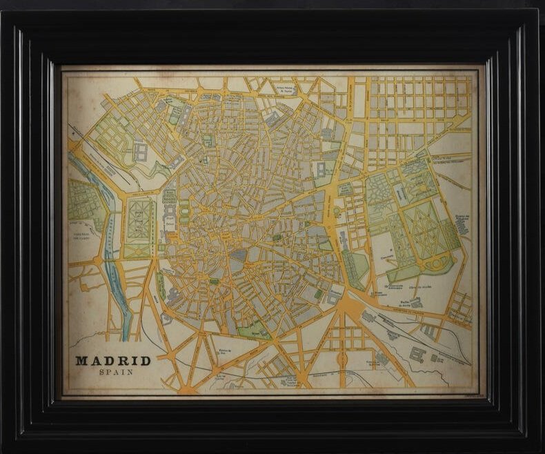
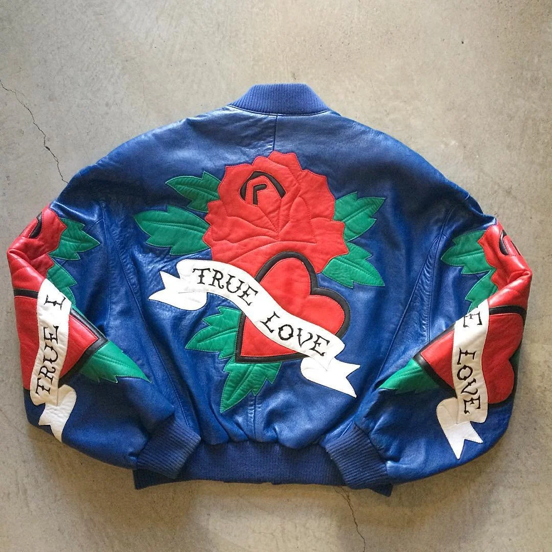
The next time you need to find art for your wall, look at unconventional materials. Call me crazy but I’ve been thinking about putting something like this on my walls:
Exaggerate
One of my absolute favorite things to do is swap meet shop with prospective clients and friends. I have this wonderful knack of figuring out a person’s style and find the PERFECT item for their house. It takes an hour or two for me to absorb a person’s tastes but when the codes are locked in, I am able to hone my eye and spot one of those “one in a million swap meet finds” a mile away. I feel like a superhero… Swap Meet Treasure Finder Girl.
Such an experience happened at PCC this weekend with my friend, Cornell. Cornell is probably one of my favorite people to hang with, especially in a creative setting. We love talking about feelings, making plans for the future and just generally sharing our different but completely in-sync world views. When he shared with me that he just LOVED these very simple and pervasive scenery paintings, I was a little crestfallen. I would not pick those out personally, but I took a step back and allowed him his fantasy. Through allowing him to pick and choose his favorite things when we finally ended up on two TREMENDOUS orange, yellow and pink lucite lamps. I spotted them for a few hundred yards away and immediately knew they were right for him. Swap Meet Treasure Finder Girl saves the day again!
But back to those simple scenery paintings. They were not my personal favorite and on their own, I would not feel they were emotion-provoking enough to be the star of the wall. However, I thought “Well, wait a minute. These things are everywhere and they are CHEAP. What if we got a whole bunch of them and just created a sort of collage on the wall of every scene imaginable? It would be so incredible and such an artistic choice vs. placing one solo painting on the wall.” Then, we could get a cool looking modern chair and paint it some vibrant color like chartreuse or neon orange. Bingo.
I have come to realize that exaggerating anything, whether it is a wall of very generic forest paintings or a giant mural, automatically becomes more artistic. Even exaggerating something’s smallness makes it more interesting.
Just a vision board
My best advice for creating an expressive, exuberant, eccentric, totally one-of-a-kind place to call your own is to listen to your gut. Forget what your brain is telling you — leave room for divine inspiration to carry you into a whole new dimension.
The other lesson learned here? FUCK WHAT OTHER PEOPLE THINK (including me). That attitude will carry you far into your journey to make a more life-filled space.
I would love to hear your thoughts! Do you have any special shortcuts to create magic?


