wallpapers I’m digging that aren’t floral, future projects and other fun stuff
Hi from my comfy recliner on a Saturday morning! I just had my coffee and ready to spill some thoughts on my recent wallpaper faves and let you in some exciting projects. Are you excited? After my second cafe latte, I am!
my new favorite wallpapers (that aren’t floral)
In my world, finding new wallpaper is a little like finding a new show to binge. I’m all about it and can’t wait to share with everyone around the proverbial water cooler. Small snag though - my friends aren’t into wallpaper and I work from home. So that means you get to read all my super gushy fan girl thoughts about some pictures on pastable paper.
By the way, have you had a chance to sign up for my FREE wallpaper resource catalogue thingy? If you haven’t, you simply must. You just simply must.
It’s free of course. Did I mention that?
So without further ado, here are my faves in no particular order:
Natalie Papier has partnered with Mitchell Black and created a new wallpaper line!! I feel like I’m watching a star rise and I am so, so excited to see what’s next. You can find the entire new line here. Let’s give our girl a hand!
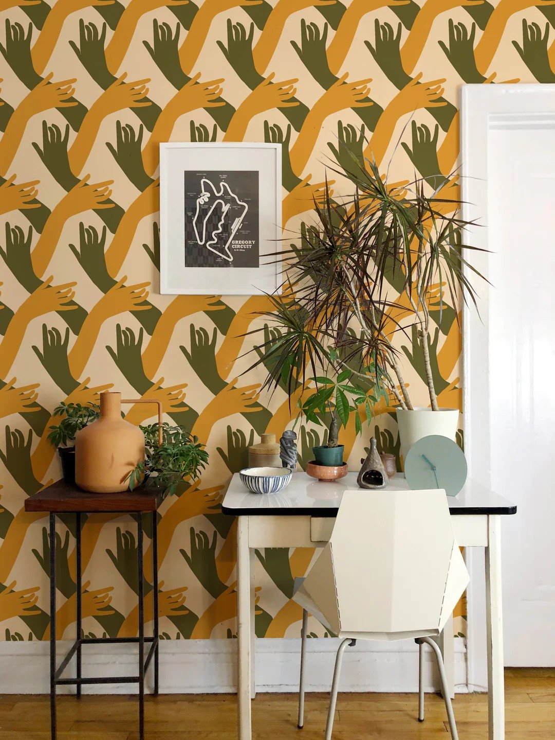
And speaking of hands, I love love love this wallpaper. It also comes in several other colorways, but this particular color combo is my favorite.
why I love it:
scale - so many patterns are usually teeny tiny. Not this one!
graphic pattern - I love how strong the pattern is and the striking repeat
unique motif - give it to Natalie to employ her favorite hand motif. If you’re not a fan of flowers or birds or any thing else that seems to dominate the wallpaper world, then this might be a refreshing option
peel-n-stick - for you renters, this pattern also comes in peel-n-stick. Huzzah!!
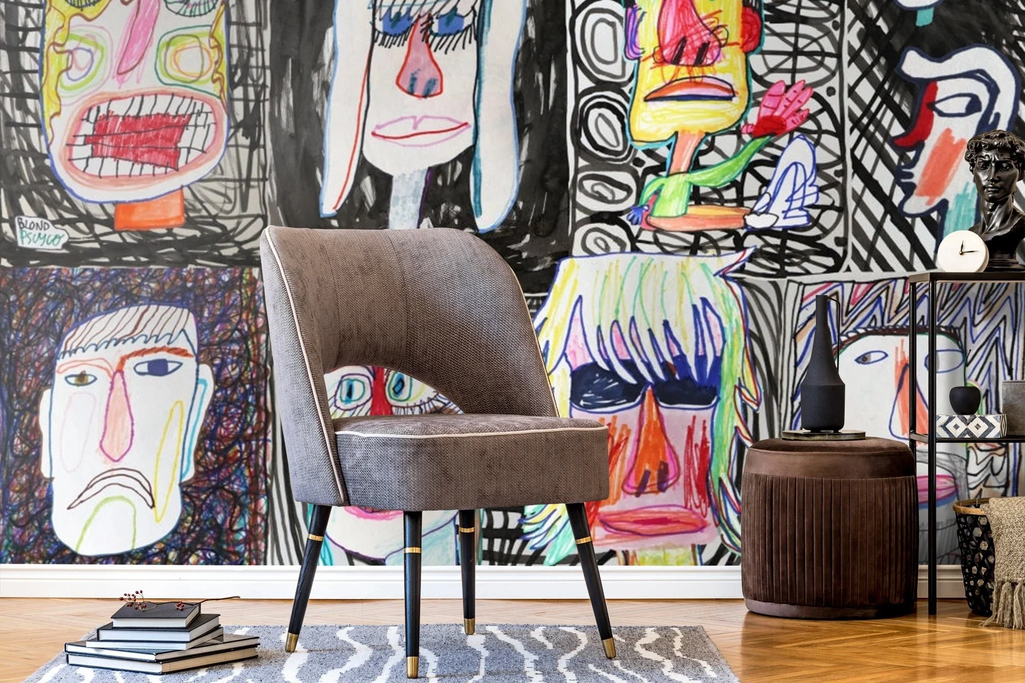
Call me crazy but I kind of LOVE this mural wallpaper. I’ve never seen anything like it and I can’t wait to find a client who is crazy enough like me to let me use it in their space. Will it be YOU? Please, someone let me design a space for you with this wallpaper?
why i love it:
super unique - I dare you to find a wallpaper like it anywhere else
not flowers or birds - please above
Basquiat-style - one of my favorite artists from the 20th century. I love pop art
available - normally something as unique as this would be a “request price” situation. Not this one… it’s on Etsy!
peel-n-stick - this one is ALSO peel-n-stick. Yup!
Craving something a little romance in your wallpaper but not full of flowers? This wallpaper design and sold by Maison C has a feminine edge that isn’t saccharine sweet. I’ve been eyeing this wallpaper for YEARS ever since I saw it used by the Pierce and Ward design duo.
why i love it:
not busy: so often I refrain from using wallpaper because they are so pattern-heavy. This one allows the design to breathe and stand on it’s own!
NSFW - I love a dash of nudity in my wallpaper, how about you?
hand-painted - sometimes I prefer that my wallpaper appear painted vs. printed. It just gives it that extra touch of class.
weird but not off-putting - this pattern is just unique enough to make it stand out but not go totally crazy town
my next design project(s)…
If you follow me on instagram - wait, do you? I’m guessing you do, but if not head over there now while I wait.
But IF you follow me on Instagram and watch my stories, you know that recently I took to my followers and plead with them to send me inspiration for pool tiles. Thank you so much, for your help! If you didn’t, well… I don’t know what to say now. I thought we were friends?
Anyway (awkward), I finally came up with something really spiffy and can’t wait to get started. I’ll give you three hints: it will be colorful, graphic and quite expensive but worth it.
my bedroom…
I know, I know… I thought I was done, too. I redid the room for the One Room Challenge, and even though I love it, there is still something “off” about it. I just feel like I’m missing an opportunity here but I’m so close to it I can’t see it. I’m a little ashamed about this predicament. If I were a client, I would know exactly what to do…
There are few factors that are boxing me in:
there is giant print of a Madrid map that cannot be moved
the irregularity and orientation of the room
the shades on the skylights are black
the Persian rug
tiles in the bathroom
North-facing room
These leave me with only a few choices: not blue. Not green. Not yellow. Not white. Not red. No ready-made murals. No wallpaper.
I’m toying with some ideas now that will maybe correct the issues. If you’re interested in following along on my Pinterest journey, check it out here:
https://www.pinterest.com/MelanieThomasInteriorDesign/mural-ideas/
HINT: my next design phase is in the title! I love the idea of illustrative large objects floating in space, and I’m contacting my arsenal of artists to come up with ideas. Please cross your fingers that this time it will stick!
What’s next?
That’s enough about me… I wanted to check in with you? What subjects are burning a hole in your google search engine? What do you want to learn about next?


