One Room Challenge: the big reveal
I know what you’re thinking… what?! It’s reveal day already?????!! Relax… I’m not there YET, but I am a bit of a tease.
No, this reveal is to let you know which room I decided to redo. And you might be shocked, since MOST of you wanted me to do this:
First off, I appreciate everyone chiming in and letting me know your preference! I really do appreciate the feedback and the encouragement!
HOWEVER, a garage is a much different thing to accomplish and actually pull-off. First off, there are several non-negotiables when it comes to the design. The garage door, the lights, the washing machines, the shelves, the hooks, and basically everything that is a potential eyesore MUST stay the same. Plus, these things are incredibly hard to disguise and make pretty unless I spend mucho dinero and replace it all. Secondly, we literally just had a ceiling leak from a defunct bathroom pipe and the damage to ceiling would need to be addressed if I were to repaint. That can wait for another day. It IS just the garage afterall.
Also, the timing for one of the construction elements I plan to do in my first choice could not have been more perfect. My contractor literally texted me on Sunday that he could start on Wednesday (April 5th, the first day of the ORC) and I thought “Well, if that isn’t the universe telling me to go with my preferred choice, I don’t know what is!”
I was going to play it all off like I planned it this way, but, Dear Reader, I am a very honest person. I really did not know what to do! You see, I’ve been dreaming about participating in the One Room Challenge for YEARS. I eat, breathe and live interior design every day of my life and I have so many anxieties about how to make it to higher echelons of those lofty aspirations, I was getting in my head. In my own mind, so much is riding on this decision, I forgot to go with my heart. And my heart said to me:
main bedroom makeover
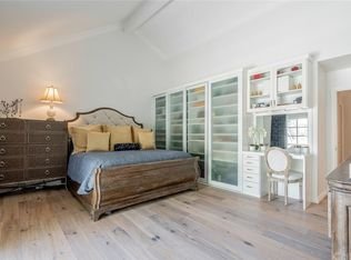
Real Estate photo
**Ahem** let me quote from my blog post:
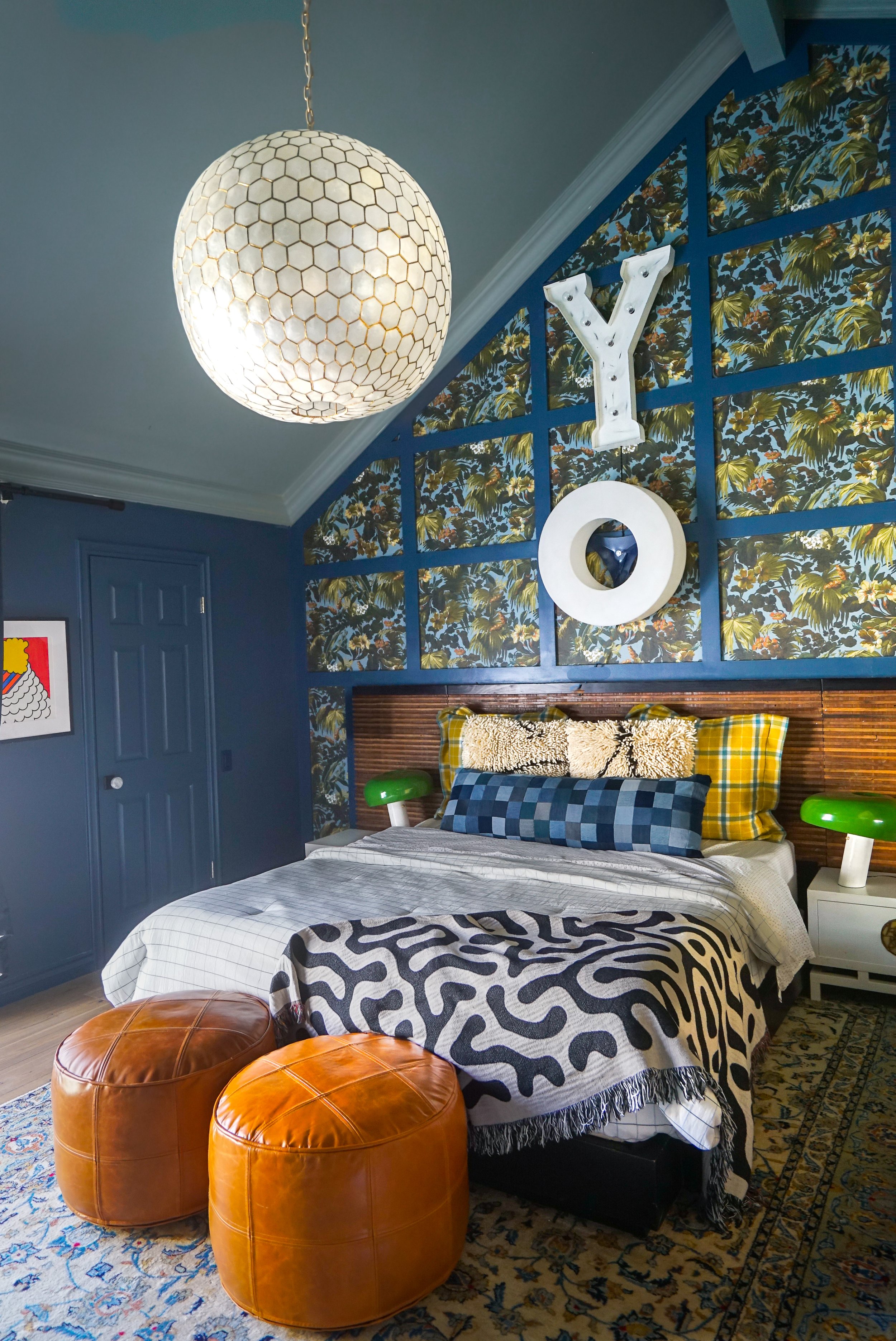
I’ve never had a vaulted ceiling bedroom before that was this big. I loved the grandeur immediately but was also a little afraid of it. I’ve done clients’ vaulted ceiling bedrooms before, but I mostly kept them white and airy. And I wanted to try something different. I would never suggest a risky design move to any of my clients, but I wanted something unique that I had never seen.
My answer? Paint the walls and ceiling a different color! The walls are Stiffkey Blue and Oval Room Blue from Farrow and Ball. For some reason, I didn’t think it would be such an issue. Oh, the hubris.
I knew deep down it wasn’t working… so I added wallpaper! It’s a very beautiful print Limerence by House of Hackney. #facepalm. It just started dragging it down even farther down the dismal path. And that’s how I feel when I am in this room: Dismal. It feels NOT fresh. The colors are like a bad unwashed clown suit. And I love feeling fresh. The problem is I just kept on making bad decision after bad decision trying to fix the mistakes, but never really corrected the initial problem: the wall and ceiling color.
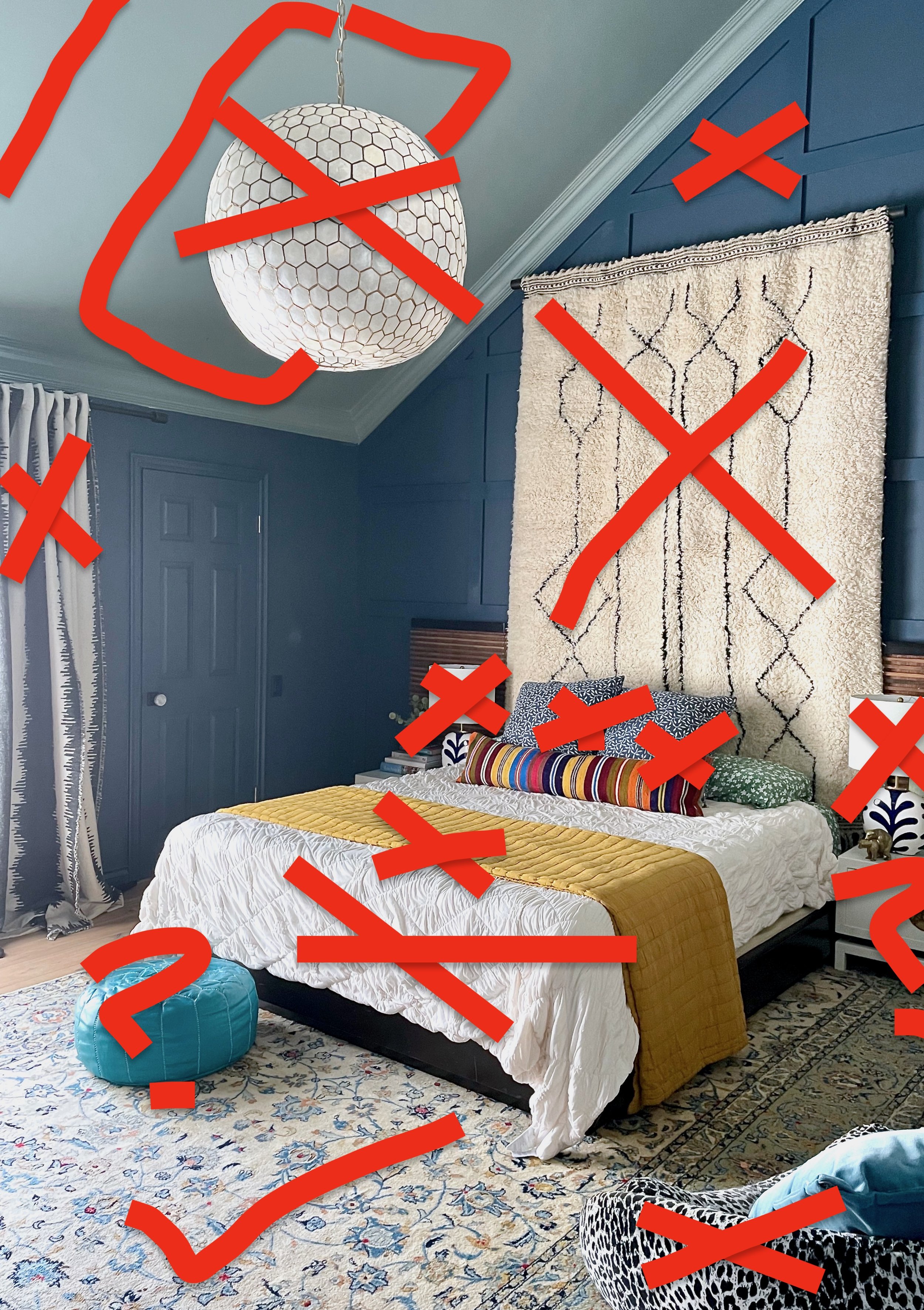
the plan!
The plan is to erase the sad clown costume that is my main bedroom right now and replace it with… hushed play reverence.
How do I impart that? By doing what I wanted to do in the first place and go BLACK. The reason why the blue is not working is because it simply is too dark in this room in the first place. The blue appears hazy and unintentionally dirty. It is a North-facing room with minimal light. These rooms are notoriously hard to paint the right shade and any colors turn out grey-ish, ding-y tone. This is ok if you like that malaise or film-y look, but I prefer a crisper/sharper aesthetic. I also don’t it to veer too boho and prefer it go more elegant/industrial feeling. Basically, I want it to feel very cathedral-like in this room.
But keeping with my personal aesthetic and the artwork I already have, I also want to introduce color. The great news is that going completely black, those colors I do choose to use will stand out even more. You see those stained-glass windows? Colors in otherwise neutral rooms appear even more special and purposeful when used sparingly.
Wallpaper
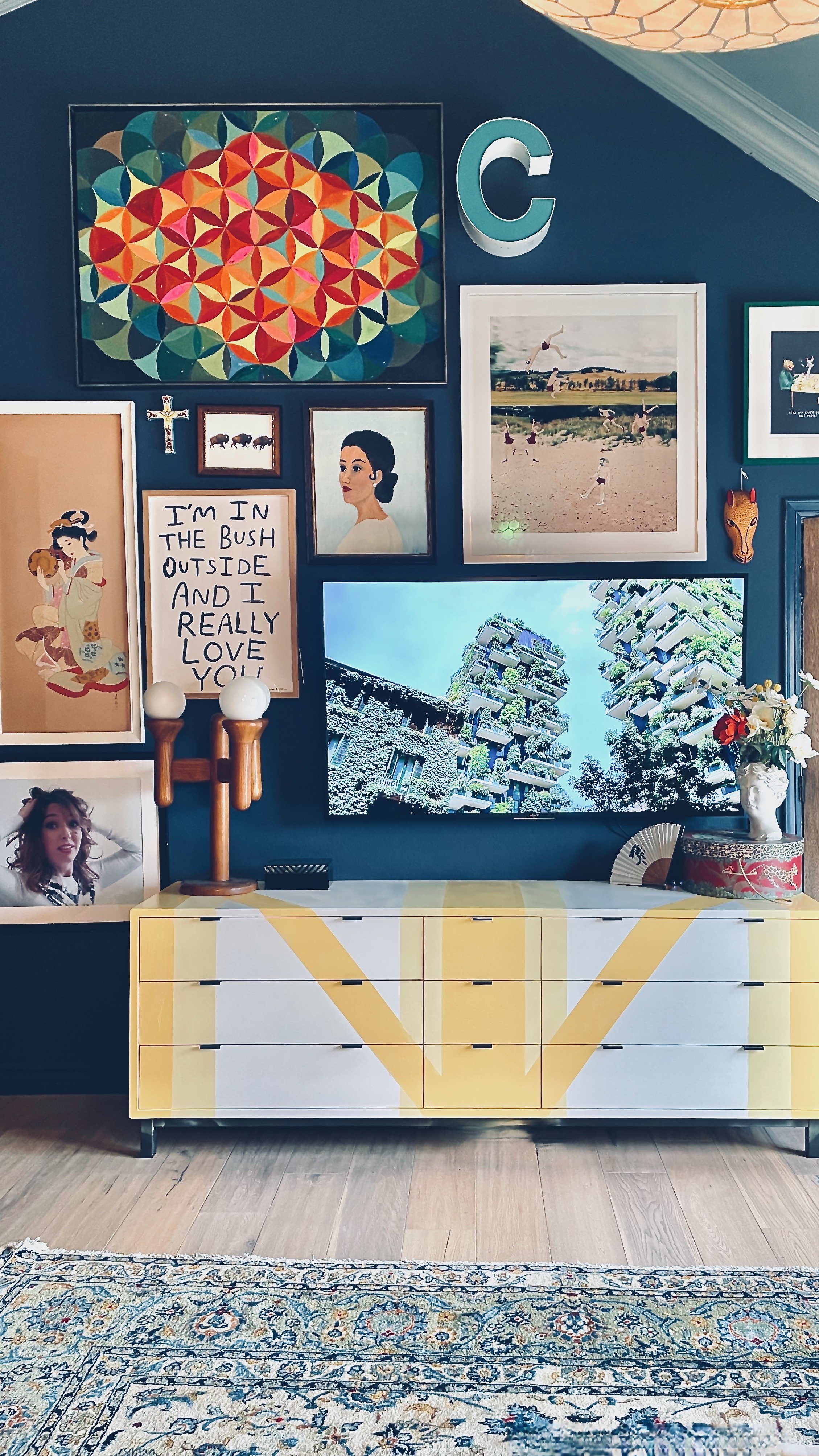
Another new element to the design will be new wallpaper. Yes, everyone loves the Limerence wallpaper I chose, but it just does. not. sing. for ME. There is a filmy, hazy quality to it and I just don’t enjoy that in my design. That is a bit of a hypocritical thing to say for me, too, because I really love the vintage aesthetic. However, since I’m using a lot of wood and vintage looking pieces in the room, all I see is drab.
more light
Probably the biggest part of the new plan is introducing a big construction element: skylights.
Basically the first thing you see when you enter the room is a gigantic ROOF. And did I mention the room is North-facing? It is in desperate need of some additional light so we’re installing THREE new skylights. This will knock out that “cathedral” element for sure!!!
bedding
I am ashamed to admit this, but I am terrible at finding bedding. At least for this room. Every other room is a breeze. Even for clients, I am amazed at the alacrity and skill I show when it comes to choosing THEIR bedding.
But for this room in particular, it is on my one achilles heel and I vowed to myself that I would perfect this art. I can’t get too mad at myself, however, because I have a humongous California King that I need to factor into the design. It is incredibly hard to find cute bedding that will fit those dimensions and drape nicely over the side. Much like fashion, the designer dresses only come in sample size and us regular sized girls have a harder time finding anything truly unique. In the coming weeks, I will discuss my solution to this age-old problem and explore what options are out there for my Big Tall and Husky bed.
chandelier
Probably the first thing I bought for this house was that chandelier from Serena and Lily. I am going to be honest here and let you know I bought it because it was cheap and big. I actually wanted the Restoration Hardware version of the lamp but that one was very very expensive comparatively.
Now that I’m redesigning this room, I can now revisit that pendant and un-choose that choice.
And boy it’s going to be stunning!!!!!
night stands or head board
A good designer knows when something is not working, and this combo that I have right now is NOT WORKING WHATSOEVER. I like both elements independently - the dimensions are perfect, the colors are great, and the textures are awesome - but together… they are just not getting along. So I have to decide. Do I change the headboard or do I change the nightstands? To change either will drastically change the feel of the room, so I must tread lightly into this area.
week 1: skylight installation
week 2: painting &wallpaper
week 3: nightstand and/or headboard transformation
week 4: art selection
week 5: bedding selection
week 6: curtains & chandelier
week 7: adjustments
week 8: the big BIG reveal
My raison d’etra
It is a very sobering thought that I failed at the one thing I eat, breathe and live: interior design. Believe me, posting about my failure is extremely uncomfortable for me but I believe there is value in mistakes. Making mistakes is imminent if, like me, you are trying something new. It means I’m pushing myself past my comfort zone and ignoring even my own rules. Who knows, maybe by making mistakes I will discover that some rules are not always applicable! It also illuminates and hones my taste. It’s ok to not like everything.
I have made so many real mistakes in this room. Many told me I should just let it go, that I should just live with the unwashed clown suit that I currently sleep in. “It looks fine” or “You’re crazy.” Let me repeat: I eat-sleep-breathe, drink-pee-poop-dream-repeat interior design. I can’t let myself go out with “fine”. I want to dream bigger, strive for my vision and slam dunk this room. In. it’s. FACE.
Besides, people like a good underdog story, right????
Please be sure to check out the other One Room Challenge projects for this year’s spring event and comment below! I need your encouragement!!!


