The dreaded blank wall…
Or is it more exciting to you? I’m with you — whichever option you choose — because it’s a little of both. Because isn’t a little fear a bit exciting? It wouldn’t be fun if it were easy!
But we’ve all been there — especially if you live in a pre-planned community like I do. When I was house shopping initially, every single home looked exactly the same. Let’s just say the folks in my neighborhood really like Lululemon, white BMWs and modern interiors. Black and white and grey, every single house blended together, including mine. But the moment I stepped into my house, I felt like it was a little bit different and special. Number one, it has the MOST spectacular giant pool. And number two, it had major potential — soaring ceilings, flowing-but-not-necessarily open floor plan.
Before I wax poetic about it, however, I have to really fess up. Decor-wise, the place was a snooze fest. Talk about blank walls, this was a blank house.
Call me a snob, but I just. don’t. understand. Where is the art? Where is the eccentricity? Where is the giant wood dragon??? How could anyone live without these things? Every day, I get to imagine my best self reflected in my surroundings. The self that I see in my heart because I have carefully selected every color and object and weird thing deliberately because it sparks some sort of reaction inside of me. That’s how I know I’m in interior styling for the long-haul, even after the AI takes over and we’re all out of jobs. Now THAT’S scary.
As such, the blank wall doesn’t scare me. I love a blank wall, because it means that I get to decorate it. It’s the apathy that doesn’t see the blankness as an opportunity for expression that scares me.
where to start…
A blank wall is an opportunity to curate an expression of self. Luckily, John Cusack’s character said it best:
I agreed that what really matters is what you like, not what you are like... Books, records, films - these things matter. Call me shallow but it's the fuckin' truth, and by this measure I was having one of the best dates of my life.
So in his wise words (even though throughout most of the movie he is a complete putz), a curated wall will be the direct interpretation of what you like.
This would be a good time let you catch up on another blog I wrote: “Put the me back in home.” The more I read it, the more it sounds like a cheesy pamphlet title. I’m sorry for that, but I thought it was cute at the time.
The reason why I bring it up is that there is a section entitled “Know Thyself.”
Have you ever noticed that most interesting and cool people you know often have the most interesting homes? Their coolness just seems to eminate from within and blossom wherever they go. That’s because these special unicorns have done the work to get to know themselves. It’s not that their ideas are popular or beautiful or even people-pleasing.
In fact, even if their lives are seemingly normal, they have figured out what works best for them. So if everyone is wearing blue, they might wear green because they feel THAT color works best for them. They do not fall for trends (although they aren’t afraid to use trends and then reinvent them for themselves). They are AUTHENTIC.
I employ the same idea here, in this lesson about to approach a blank wall.
go to your closet
The biggest short-cut to figuring out what you like is to go to your closet. Even though fashion is typically far more trend-driven and temporary, it’s a great way of gauging your general taste. I’m not talking about those chunky bedazzled dad sneakers or rolled up mom jeans (isn’t it weird those two things are back in style at the same time?).
For example, do you like more floral, feminine things? Or do you like dark and moody stuff? I dress like I’m in kindergarten most days, so that’s my look. And typically a person’s color palette is predetermined in their wardrobe. I like sherbert, muppet colors. You can bet that I’m going to have that in my decor. I find that these built-in tastes never change drastically once a person has committed to them. Sure, every once in a while I’ll throw in a over-sized black Megadeth t-shirt in the mix, but that’s what we call “un petite surprise.”
no really, where do I start???
You’ve gone to your closet, got a good idea about your color palette and/or basic design style. Great. Now what???
The next step to decide is whether this wall will be painted, wallpapered, gallery-walled, tapestried, built-in shelved, or whatever else you can think of that would fill a wall.
This requires a little bit of homework… you should read my blog “How to Pick Art: Part II”. In it, I go over the different arrangements of art and such in a room.
Photographed by Anna-Alexia Basile for Lonny.
In the example above, the room works because the interior designers, Lara Apponyi & Michael Woodcock, used a combination of tapestry, large pieces and a clever gallery wall to play with the space. Your eye is drawn to first to the yellow daybed, then the red tapestry, then along the line of square mysterious shapes, then the solid lilac painting in the corner. Each piece might be a little boring on its own, but together, they amplify and echo each other so that the room tells a story. A beautiful story.
There are no hard and fast rules (and you all know how I feel about rules), but I generally like to vary each wall with a different arrangement. Gallery wall, bookshelves, one giant piece of art, architecture and tapestry. Those are my main choices when it comes to a room.
Gallery walls are great for small hallways, social gathering areas, staircases. I typically avoid gallery walls at entrances since they typically feel more claustrophobic
Tapestries can go in any room, but I love them especially for areas behind the sofa, over the headboard and in large empty hallways.
Bookshelves are best for dens and studies and anywhere you would like to show off your stuff. I also love a bookshelf in a bedroom, dining room or even kitchen, but keep in mind that bookshelves can get very busy looking. To make it appear less-busy, opt to keep it the same color as the walls.
One giant art piece. These are great for making an impact, so I like reserve these “moments” for entrances, large empty walls and just unexpected places.
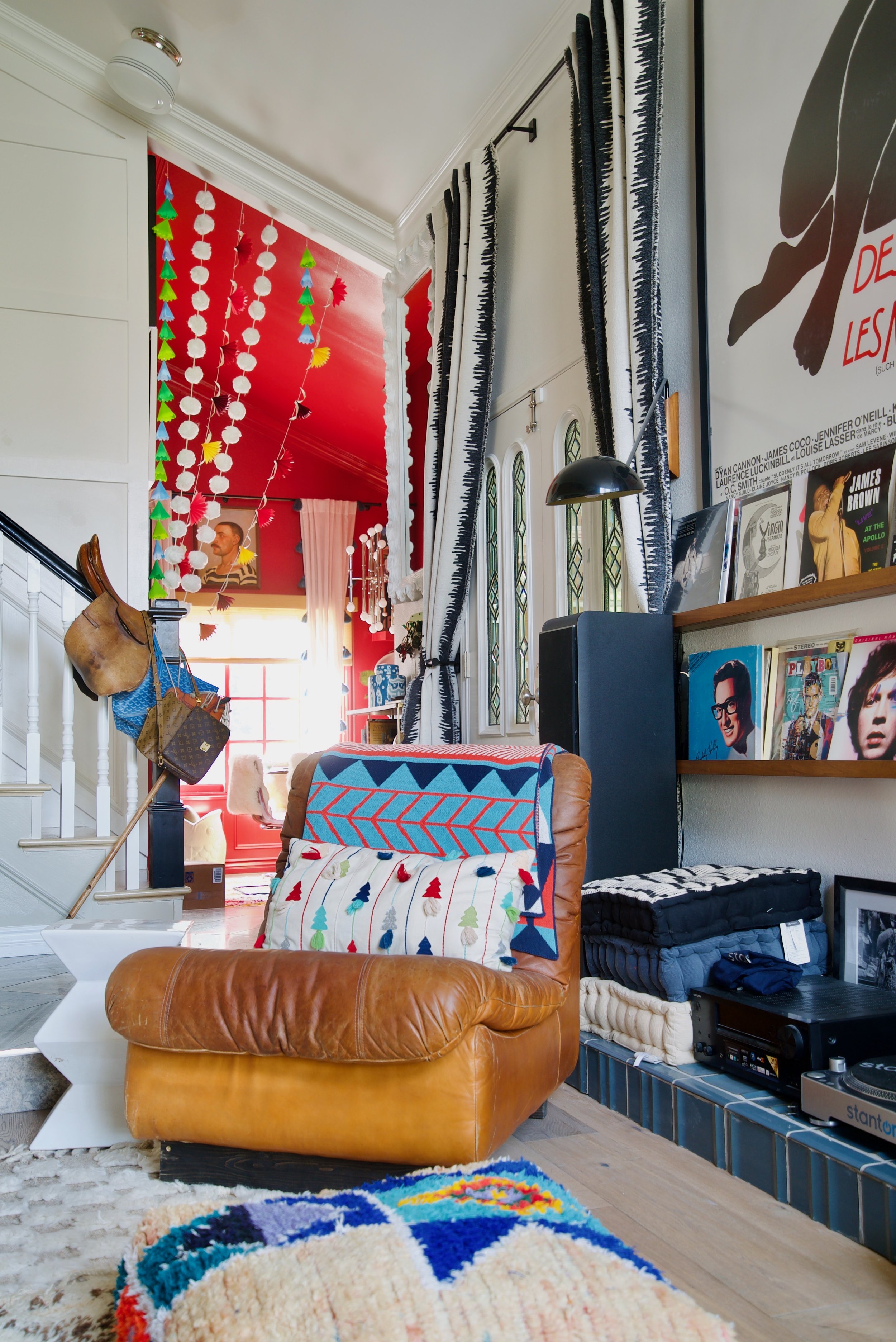
Of course, there are other ways to adorn your walls, but those are the basics. Your blank wall is no different. Is it a hallway wall or a entryway wall. Is it a vaulted wall behind a small seating area, that’s also connected to the entryway and the dining room?
Another way of thinking of it is to figure out what the human brain likes to see. Did you know that most of what you’re seeing at this very moment is made-up and interpreted by your brain? It’s true. And it’s upside down to boot.
So the brain is really in charge when we talk about what we see. And the brain LOVES “visual” interest. It loves jumping around from one thing to the other. For some people, this brain activity is way more pronounced. In other words, keep the brain guessing with varying the size, shape and texture of wall decor.
Which brings us to the next question:
Wallpaper vs. Paint vs. leaving it white
Did I mention that the eye/brain likes visual interest. This is also true when it comes to patterns. More homework!
How to mix patterns like a pro!
Decorating your home is like one of those 80s “choose your own adventure” books. Here’s my own personalized maps of how to decorate each room of your home.
Let’s start with the entryway. For sake of argument, I’ll use my home.
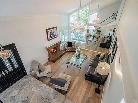
I opted for keeping the entryway white since this was a large, tall room. I wanted it to feel open and uncomplicated.
Then you have one of two choices:
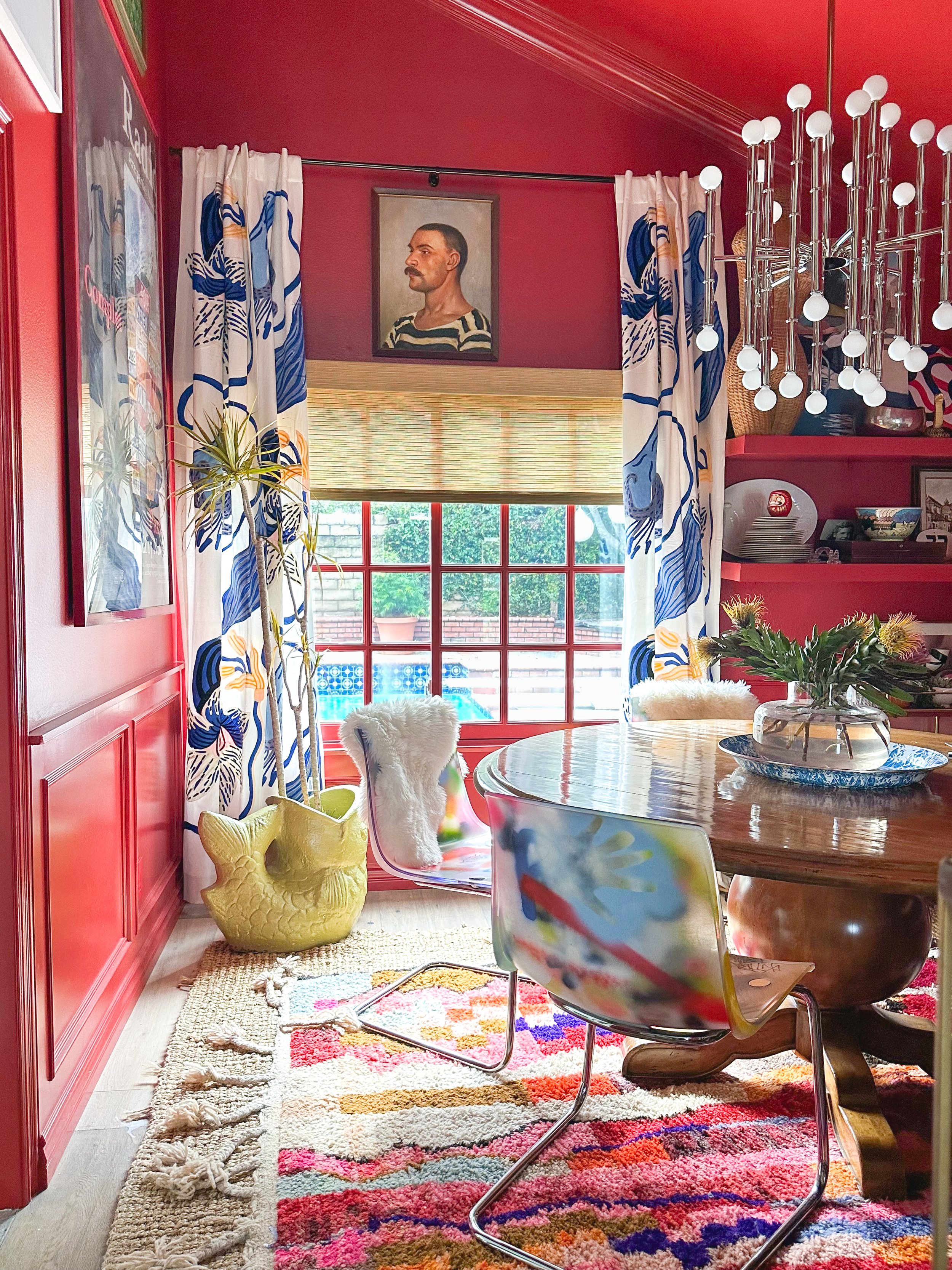
Option 1 on the left, is the dining room. I opted for a very saturated Incarnadine from Farrow and Ball. The vibe in here is more intimate and enclosed for dinner conversation.
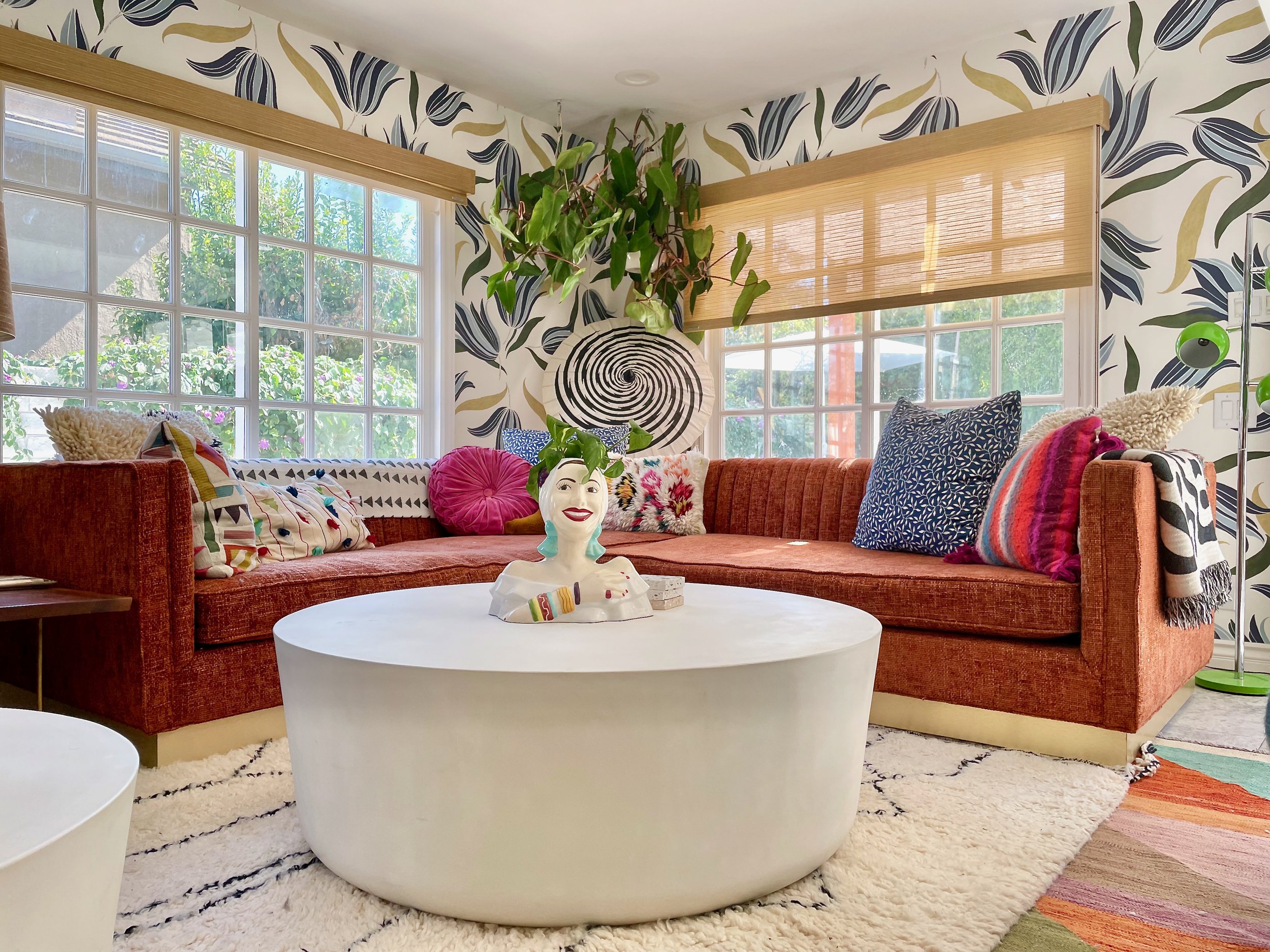
Option 2 on the right is the bright and sunny TV room. For this room, I use Abnormals Anonymous wallpaper with large scale images and a white background.
The idea is that these two rooms will draw the onlooker in with their visual interest. I started with bright white, then draw the onlooker in with its enticing color and pattern. If you have a smaller, more confined entryway, you can start with a more saturated paint color or complicated wallpaper pattern. Let’s say you go with a dark green wallpaper’ed entryway and you’re having trouble deciding what to do with adjacent study and sitting room. Try a saturated but lighter color in the study and a bright white in the study with lots of art. It’s kind of a formula. Let’s call it…
Peanut - Pattern
Butter - Bold Color
Jelly - Just White
It’s a stretch, but I figured it might be easier to remember. Let’s try it one more time.
You’re in your hallway and it leads to two bedrooms and a bathroom. From your wardrobe, choose a bold color that you wear often. In my case, that would be green. I love Arsenic by Farrow & Ball. So let’s say you pick Arsenic. Arsenic is a pretty saturated color, so go super dark and patterned in one room, just white with lots of art in another, and then a light patterned wallpaper in another.
You can also leave out the Jelly and just have Peanut Butter, but just like PB&J it’s kinda nice to have a little sweet with the salty. I like to give my eye/brain a break. And that’s me talking. ME.
I would love to hear if this helped you at all. I feel like I properly broke it down based on my internal instincts, but it always helps to hear other people’s opinions. Let me know in the comments below!


